Up and down the river

Client

Bounce

Services

Web Design, UI/UX, Product Design

Up and down the river

Client

Bounce

Services

Web Design, UI/UX, Product Design

Overview
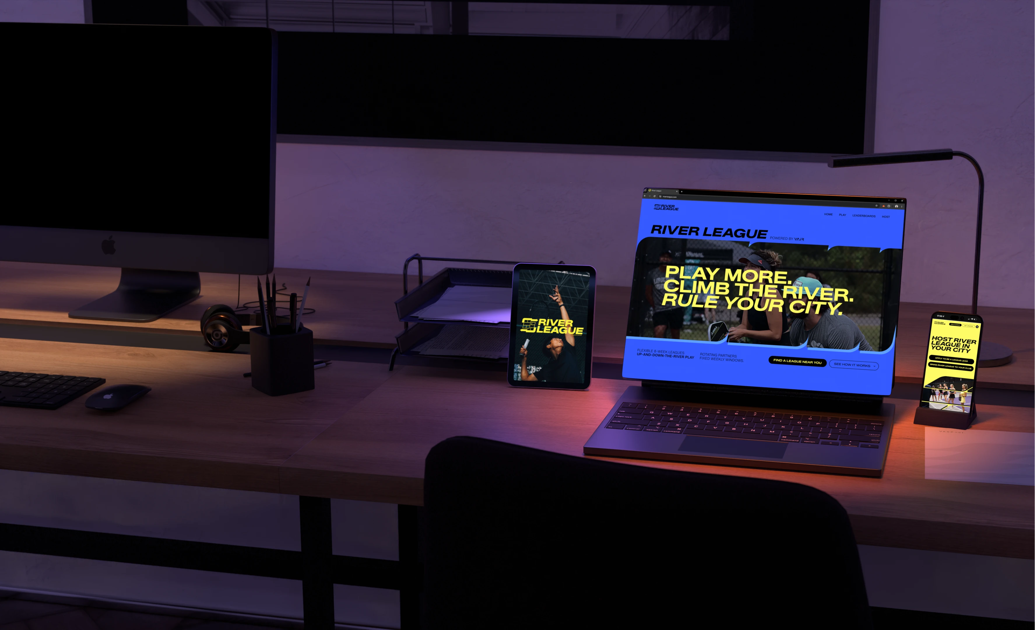
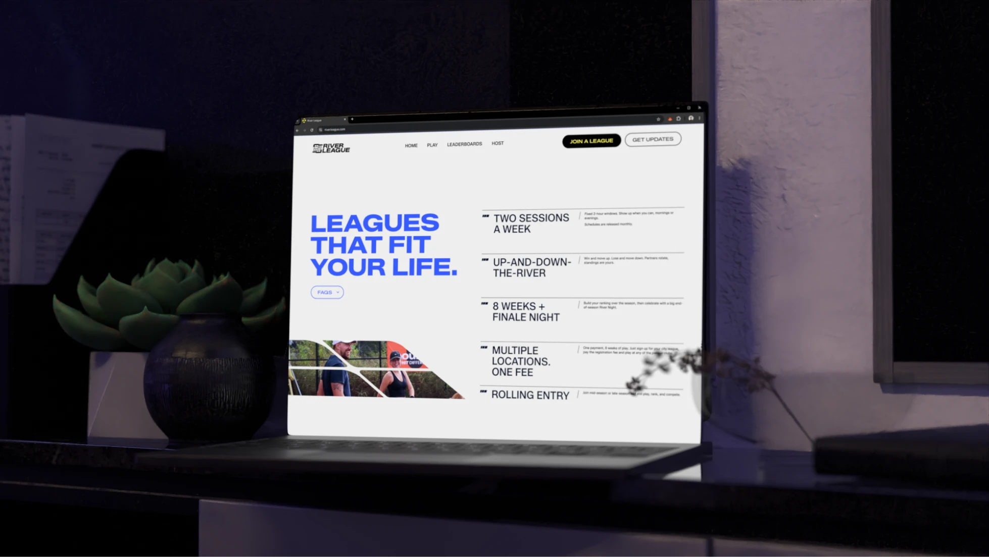
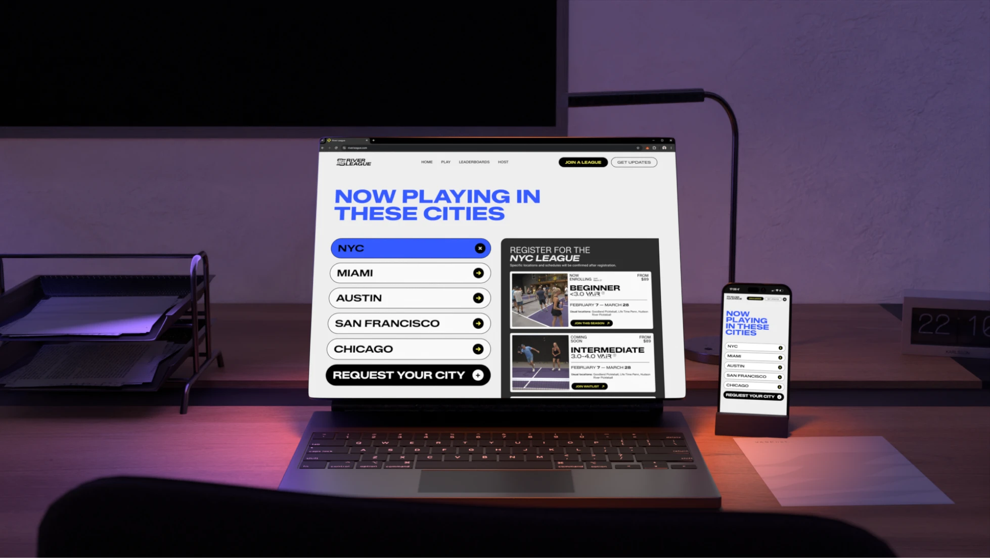
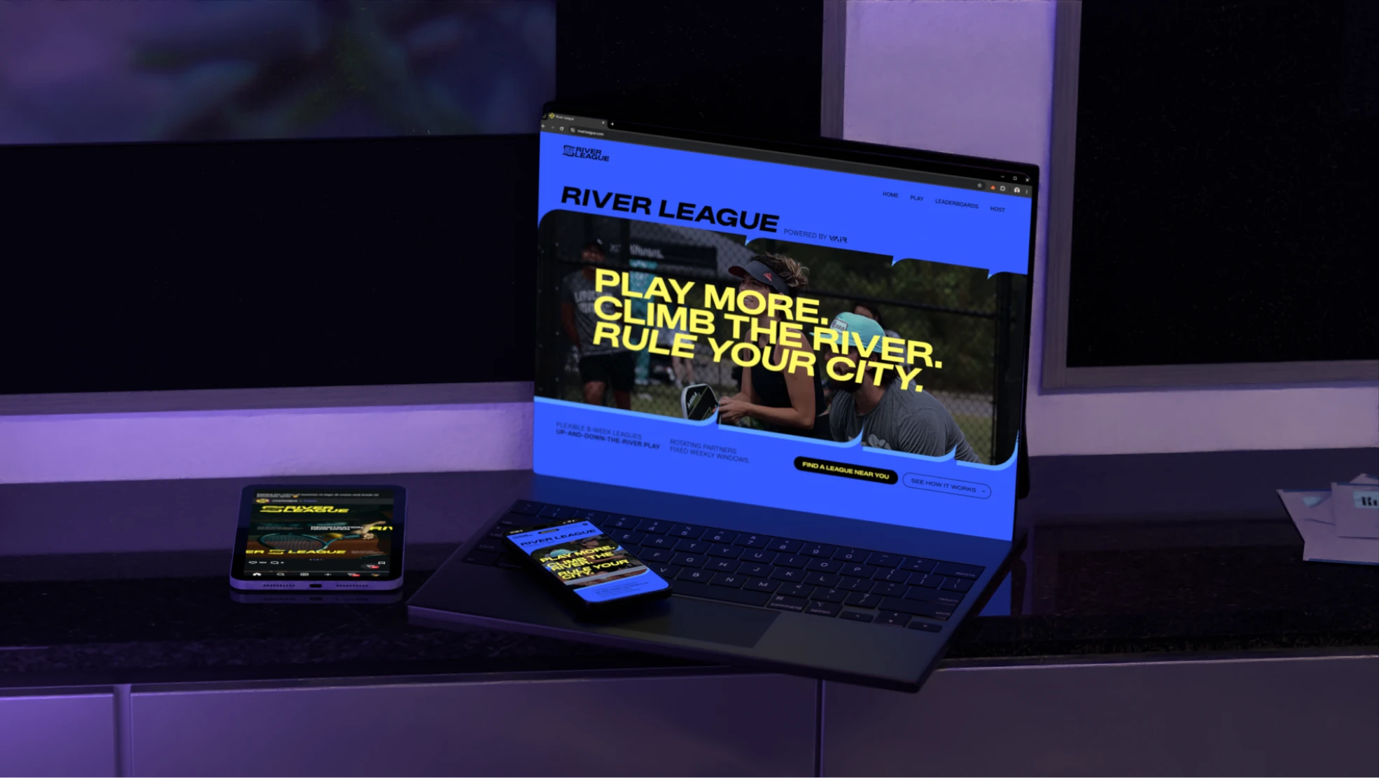
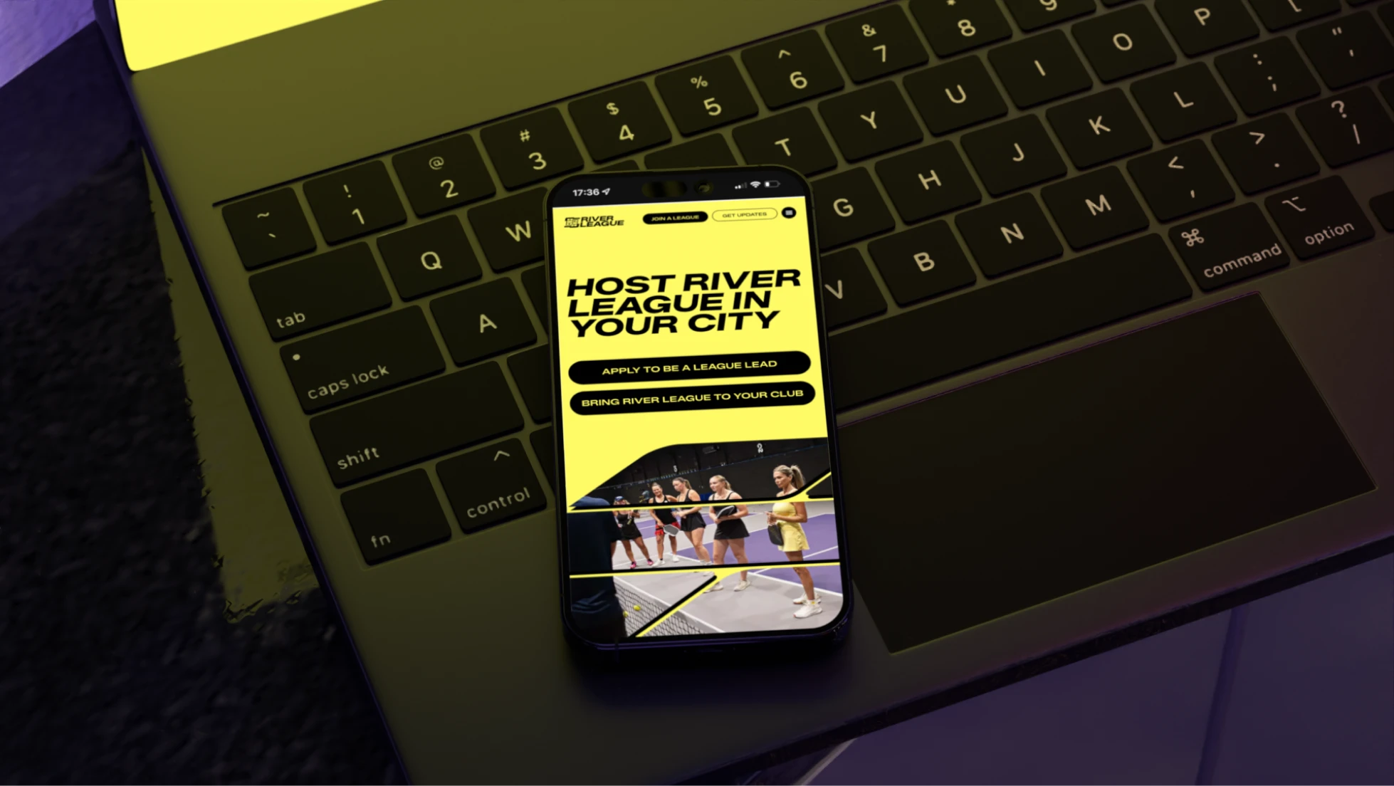
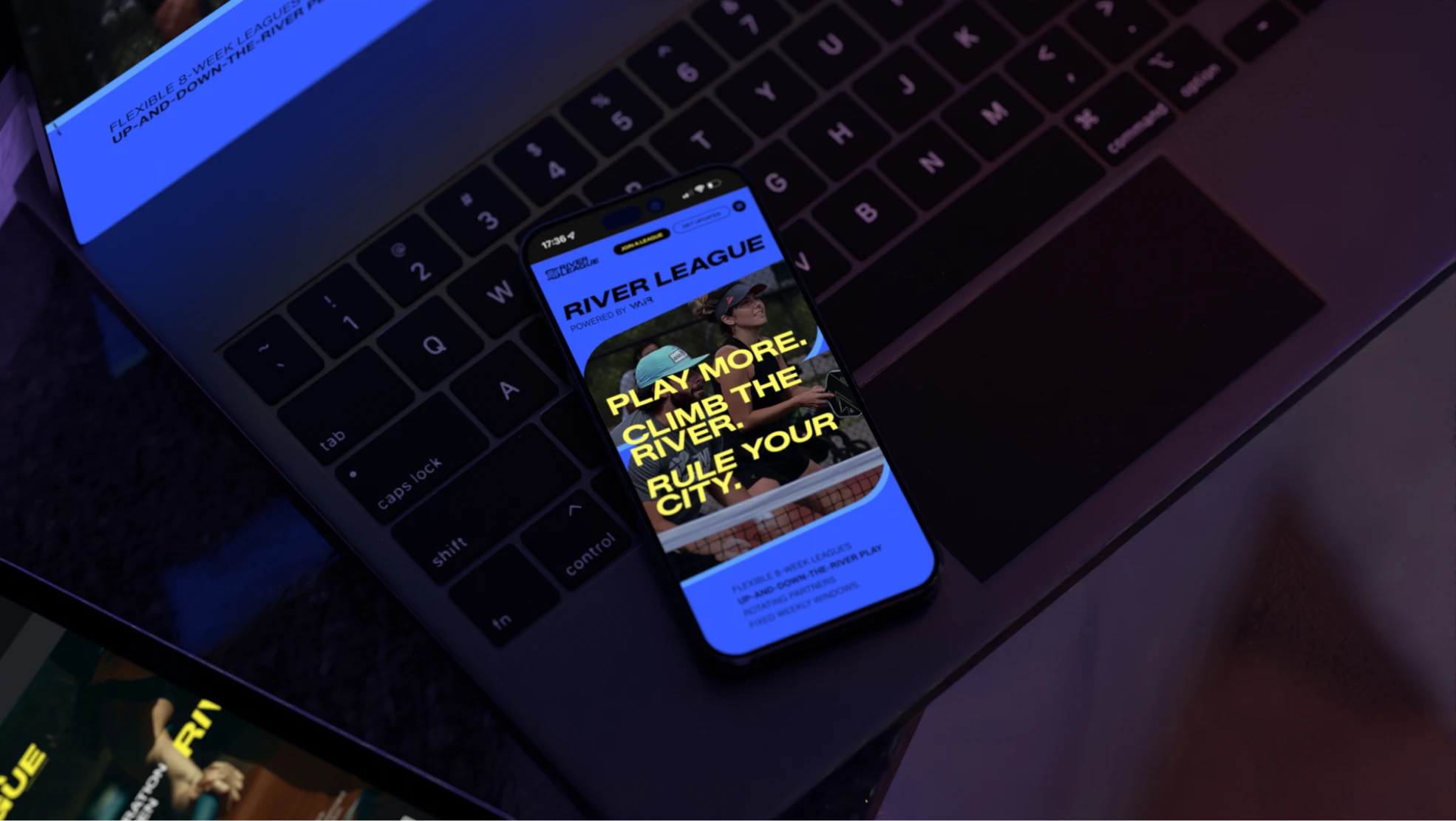
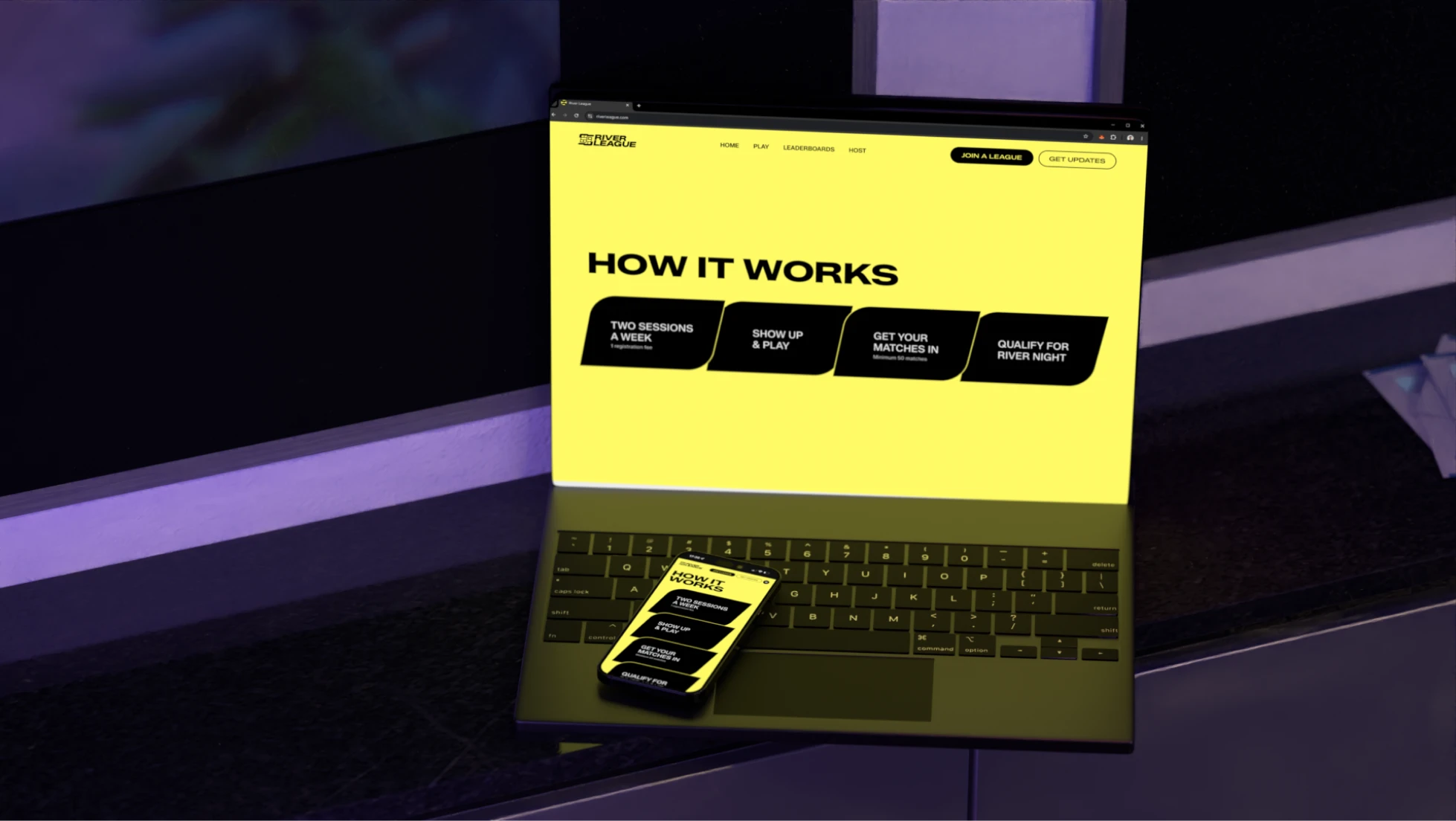
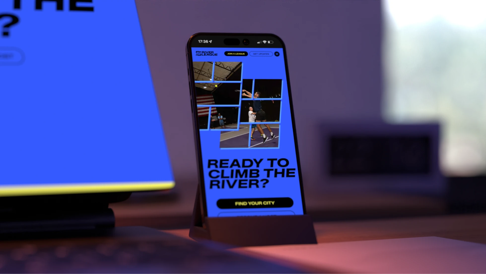
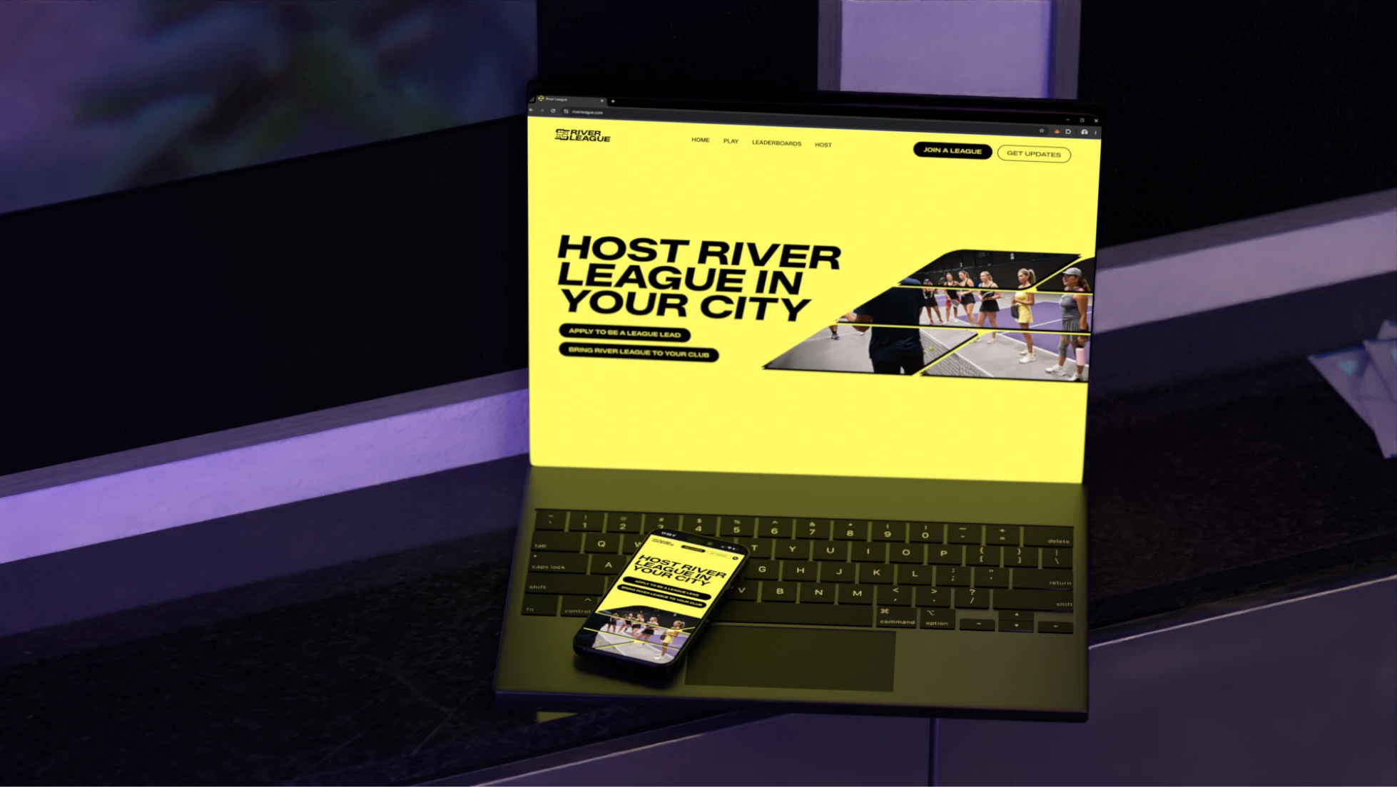
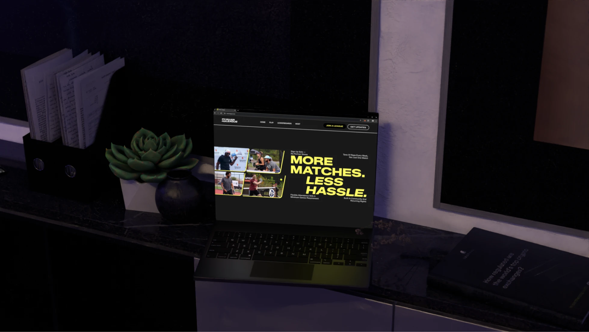
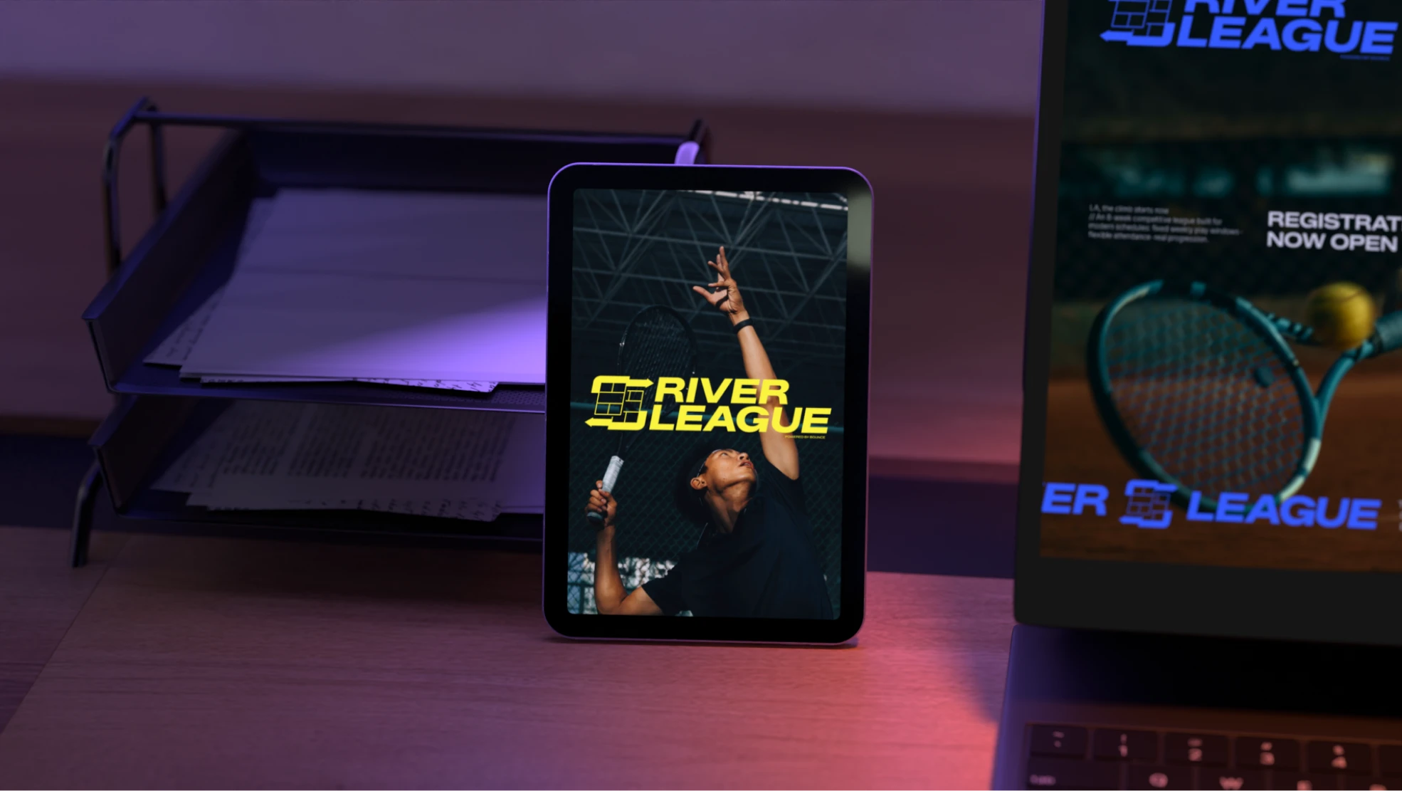
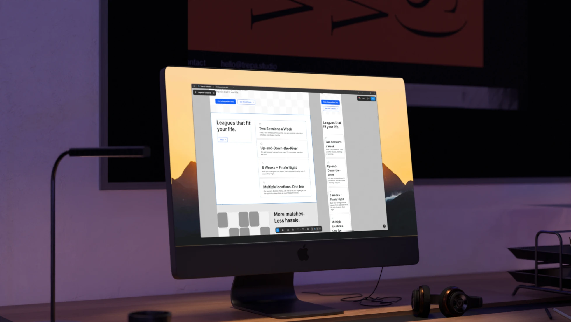
Trepa designed River League's website, a high-converting landing page built to attract both league hosts and players, with clear sign-up flows, city-based league cards, and skill-level guidance powered by the VAIR rating system. The goal was to remove every single obstacle standing between a visitor and registering for their very first league.

Date
Feb 2026
Duration
1 to 3 months
Pricing range
3k to 5k

The plan

Timeline

Strategy

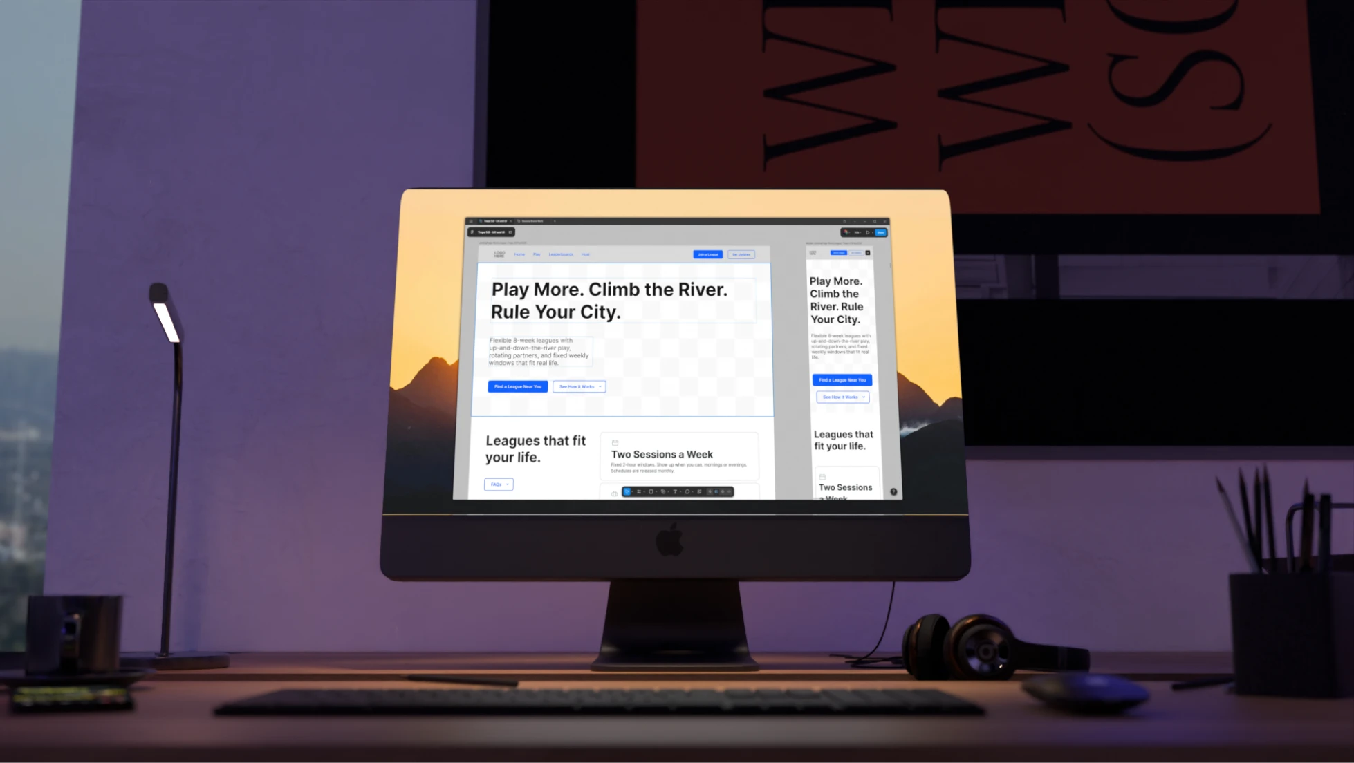
Wireframed the full site to define the expected experience.

Drafting & Reviews

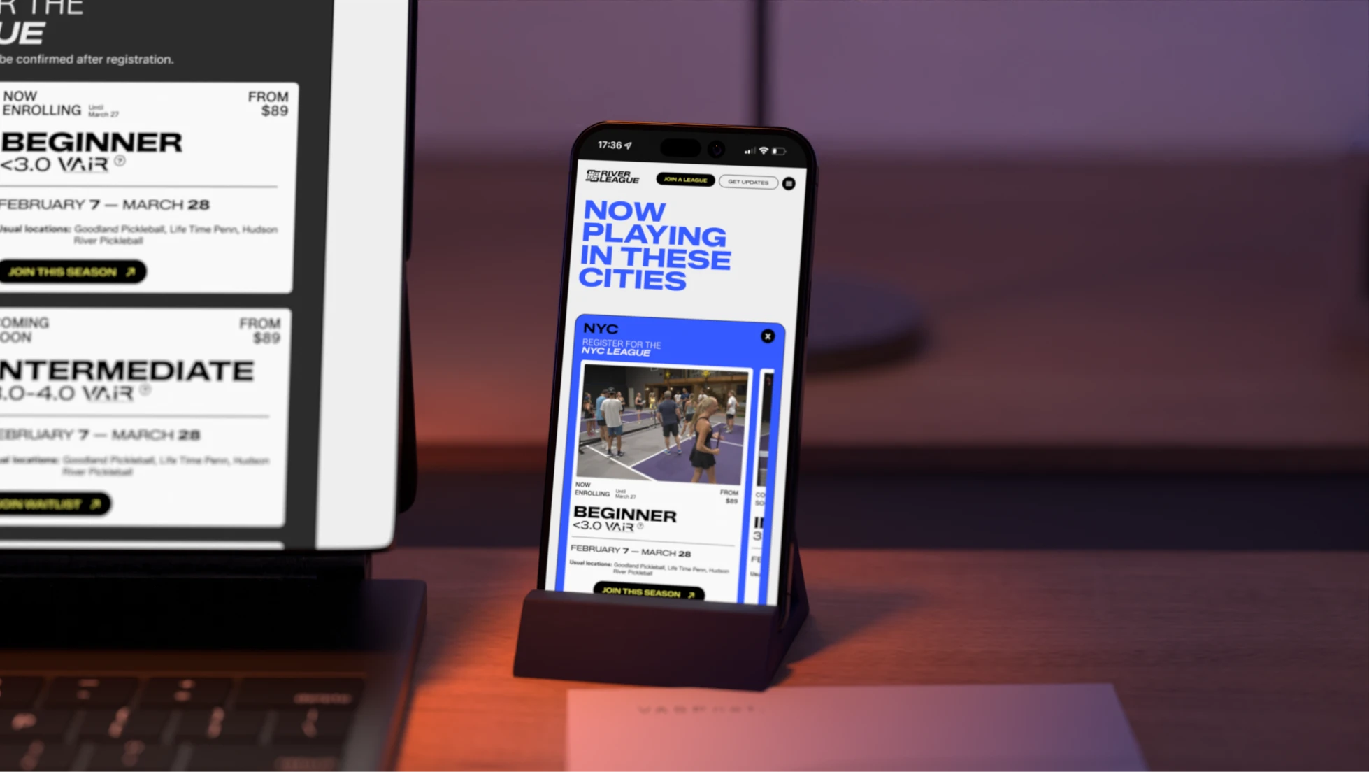
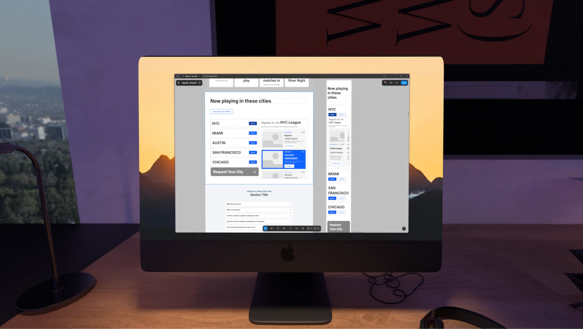
Mapped the city league flow and each event card's details.

Development

Built the hi-fi prototype and iterated on hero section.

Delivery & Support

Prepped the complete prototype to hand off to the developers

Pain points & solutions

Most challenges centered on the hero section and user flows: the page needed clear visual language and extremely simple paths for both league hosts and players, without unnecessary obstacles in the way.
The hero section went through multiple iterations to stay engaging and powerful while still surfacing enough information, including partner logos like VAIR, without overwhelming the already-strong brand or forcing visitors into extra scrolling.
The league registration flow needed several rounds to clearly highlight availability, since a league could already be underway, and to help players quickly confirm or learn about their own skill level before confidently signing up for their league.
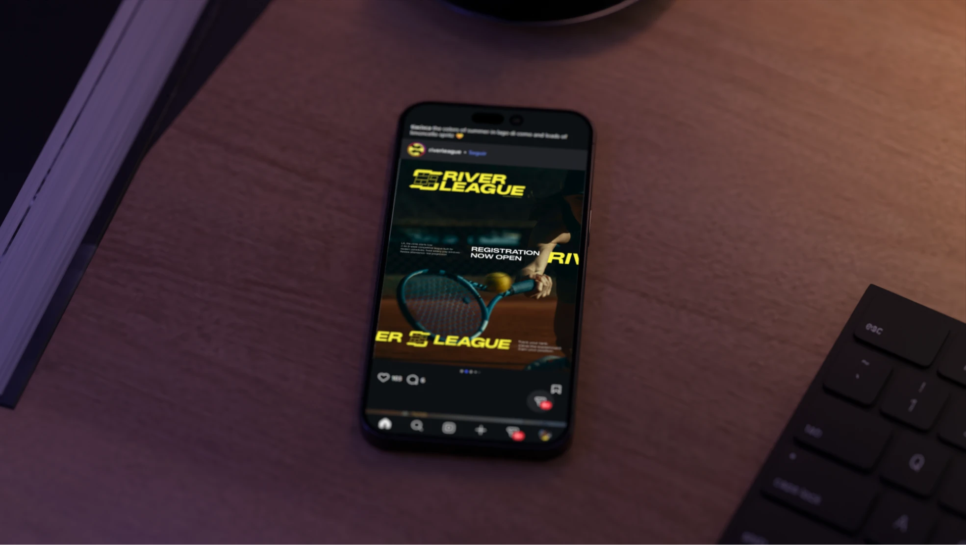
Deciding between being highly technical and fully detailed versus subtle and progressively revealed, required intentional choices to keep user flows efficient and smooth. This process was challenging and priorities had to be very well defined.
Solutions tested

Engaging wireframing and user paths

Proper, detailed wireframes were essential to refining every single user path and establishing engaging flows that made real sense and directly responded to the client's needs, well before any visual design work ever even began, laying a solid foundation for everything after.

Strategic typography hierarchies

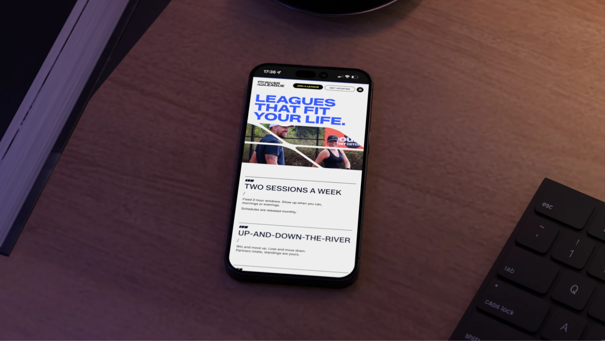
Typography hierarchies displayed multiple types of information clearly: bold all-caps text, background color highlights on key words like the date and city, and generous negative space grouping information into digestible sections for genuinely quick, effortless reading.

Strong CTAs (Call To Action)

Bold, clearly separated calls to action were designed for both audiences. 'Find a League' for players and 'Become a Host' for clubs, each impactful and unmistakable enough to drive real engagement and sign-ups, without either one ever competing with the other for attention.

Info icons and a dedicated contact form

Small information icons were added next to elements like the VAIR logo, with a question mark indicating players could learn more about their own skill level there, alongside a dedicated 'more questions' form for anything the FAQs simply hadn't already covered for them

Adaptable structures

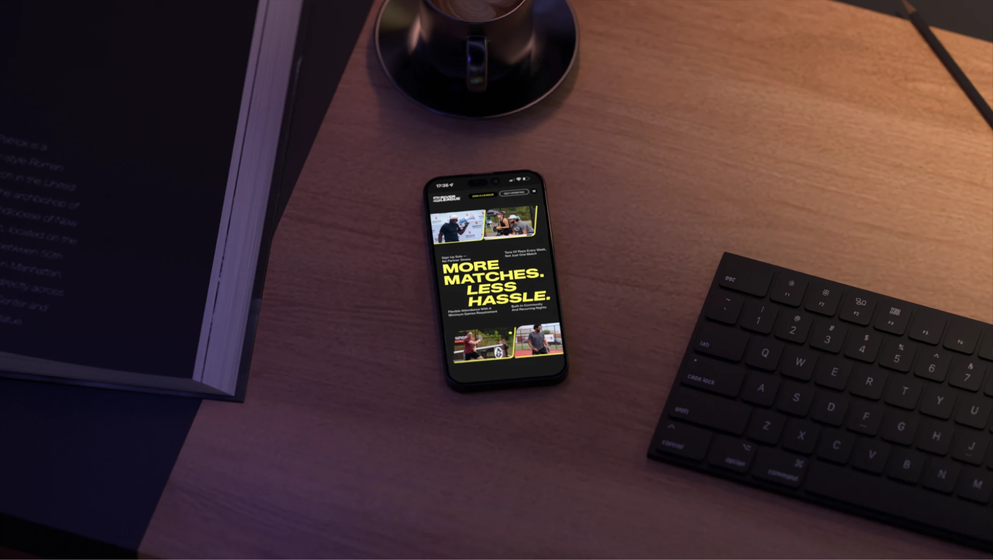
The final solution is a dynamic, engaging site that displays information in meaningful, strategic ways, ensuring every essential detail is captured by readers while providing easy, obstacle-free paths to sign up for a league.
The brand and page structure are also highly adaptable, letting new leagues and cities be added smoothly while staying fully consistent across every location. Detailed wireframes, clear typography hierarchies, and strong, impactful CTAs for hosts and players together create a genuinely high-converting page, city after city, league after league.
‍
Related Work
Contact us

Are you looking for something similar?

Get in touch to discuss a solution for your project.
Let’s talk