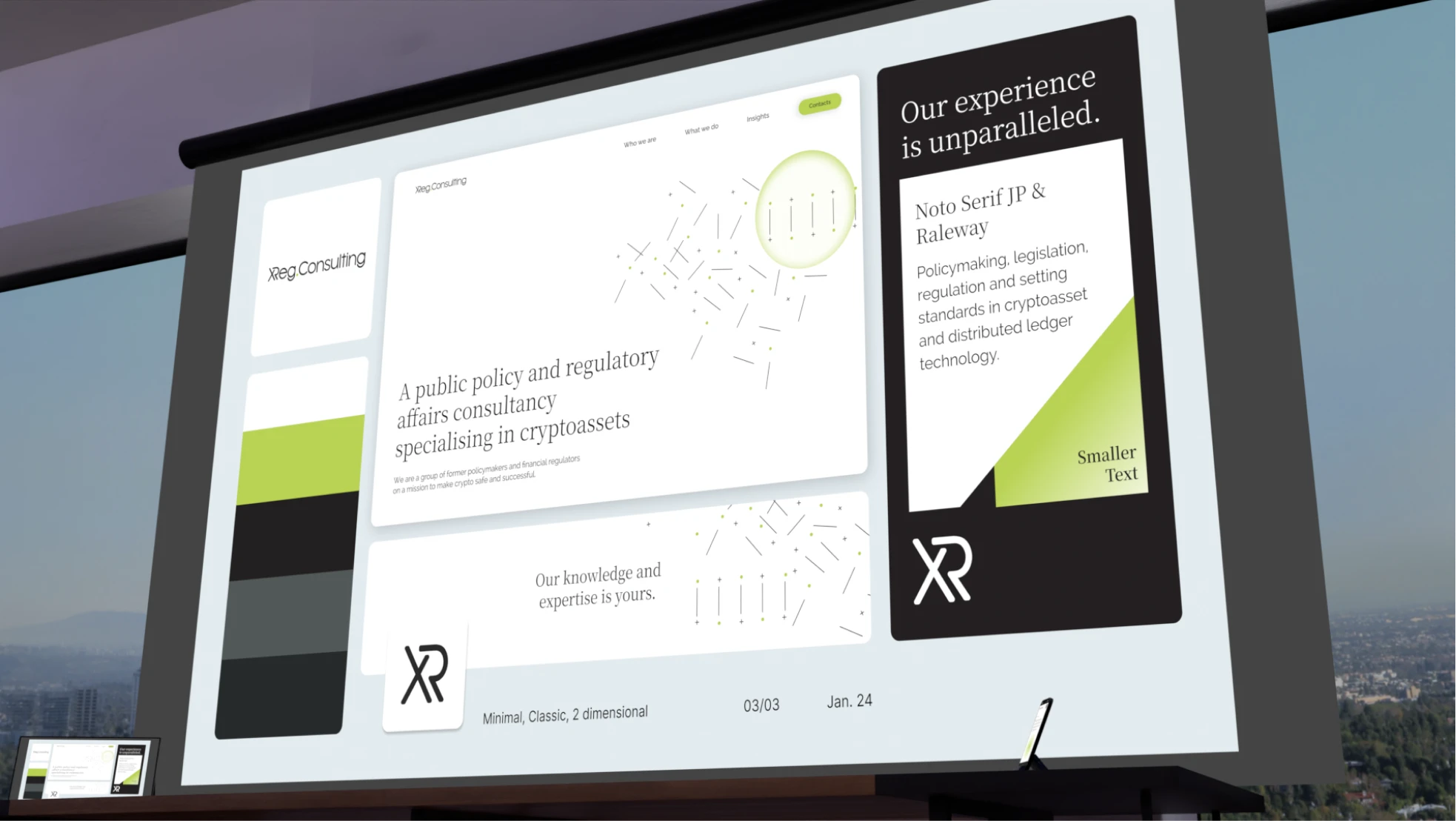
Pain points & solutions
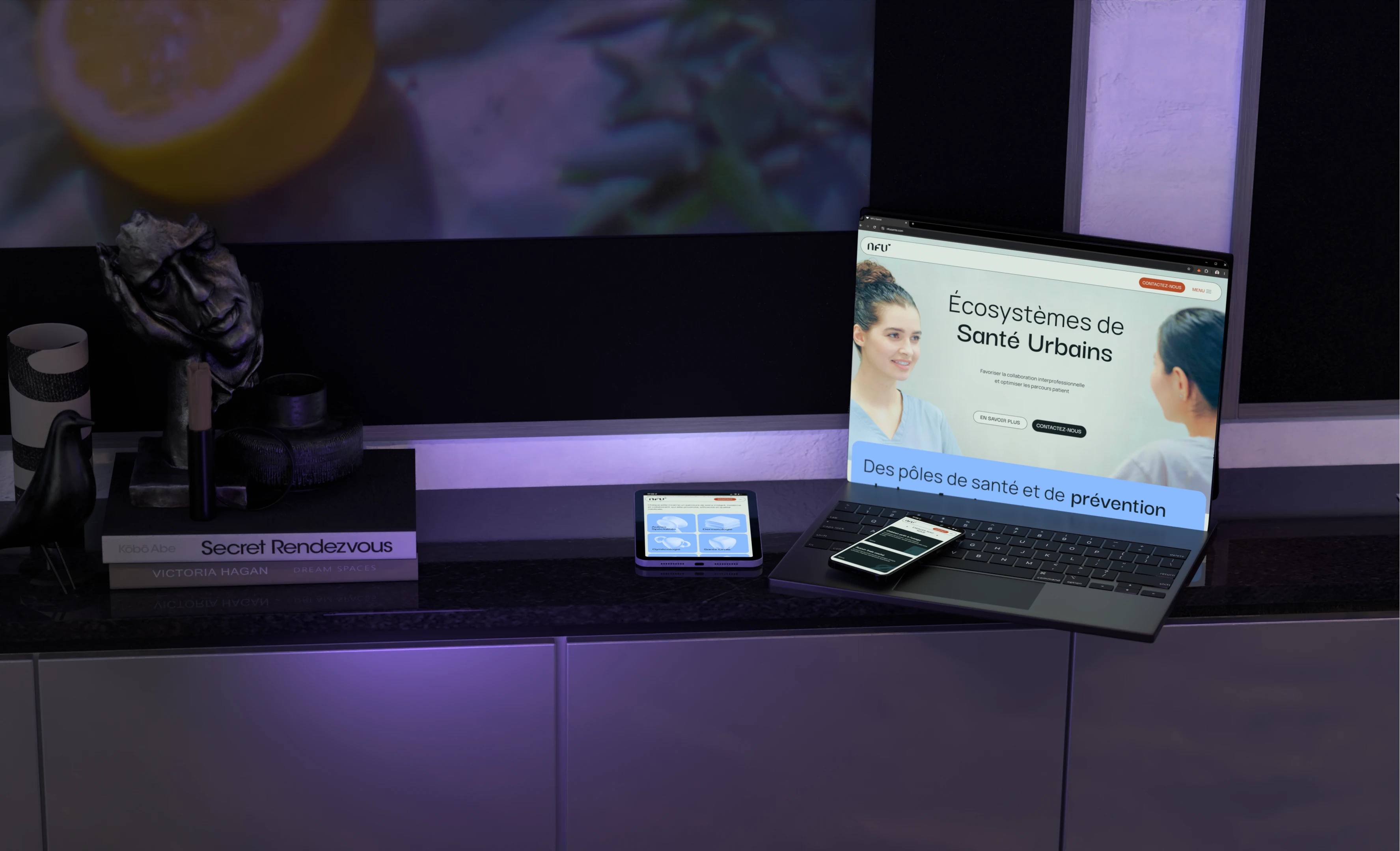
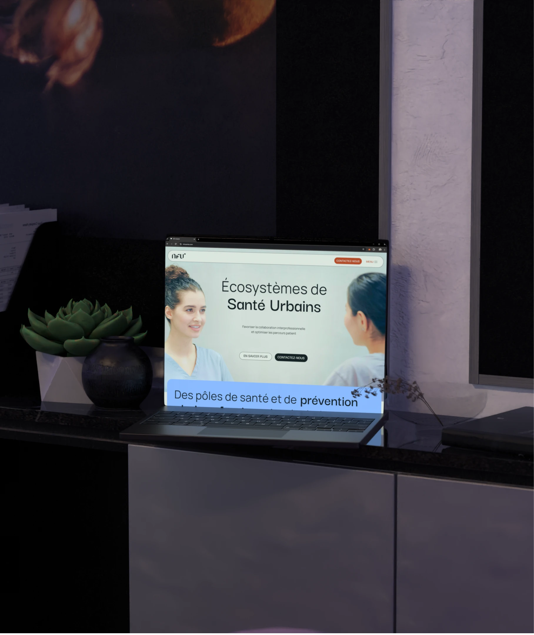
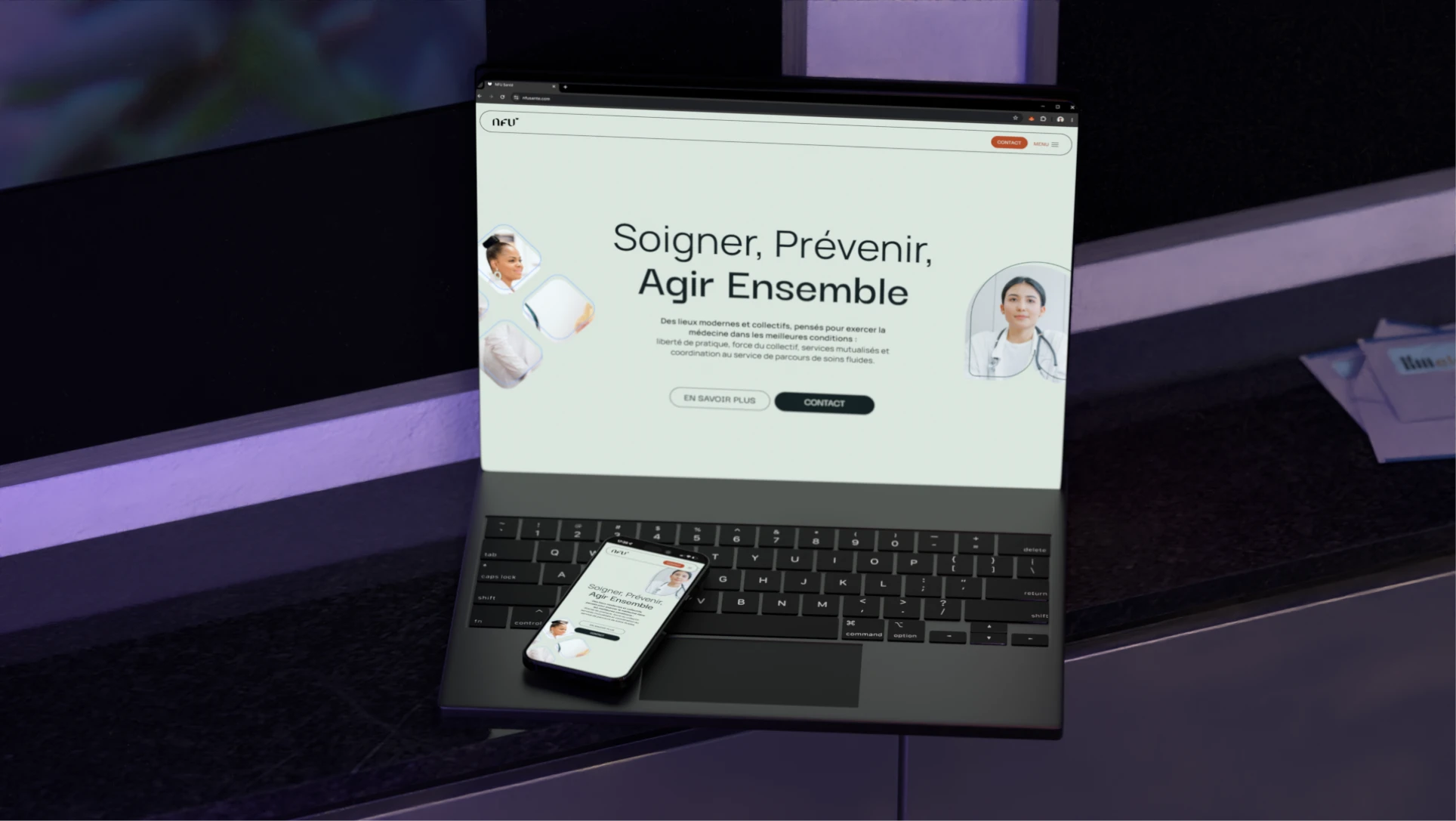
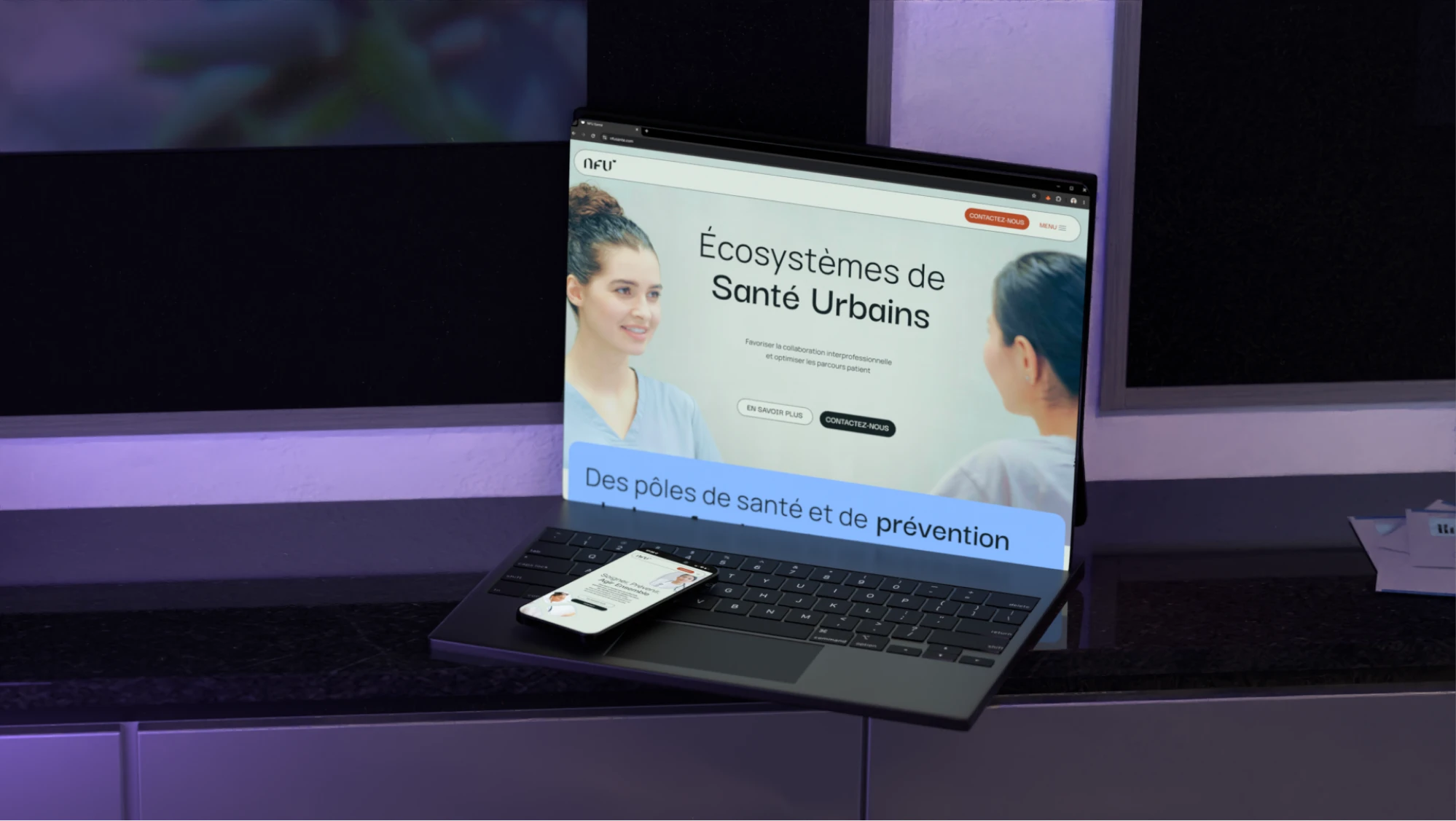
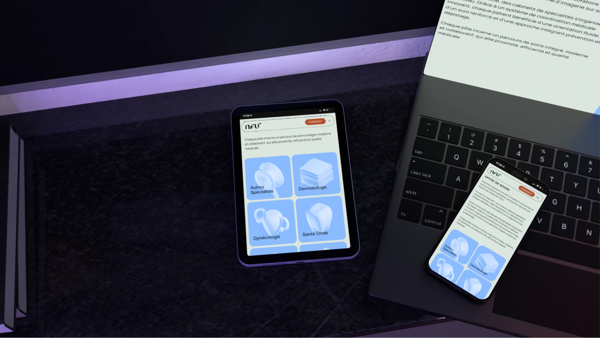
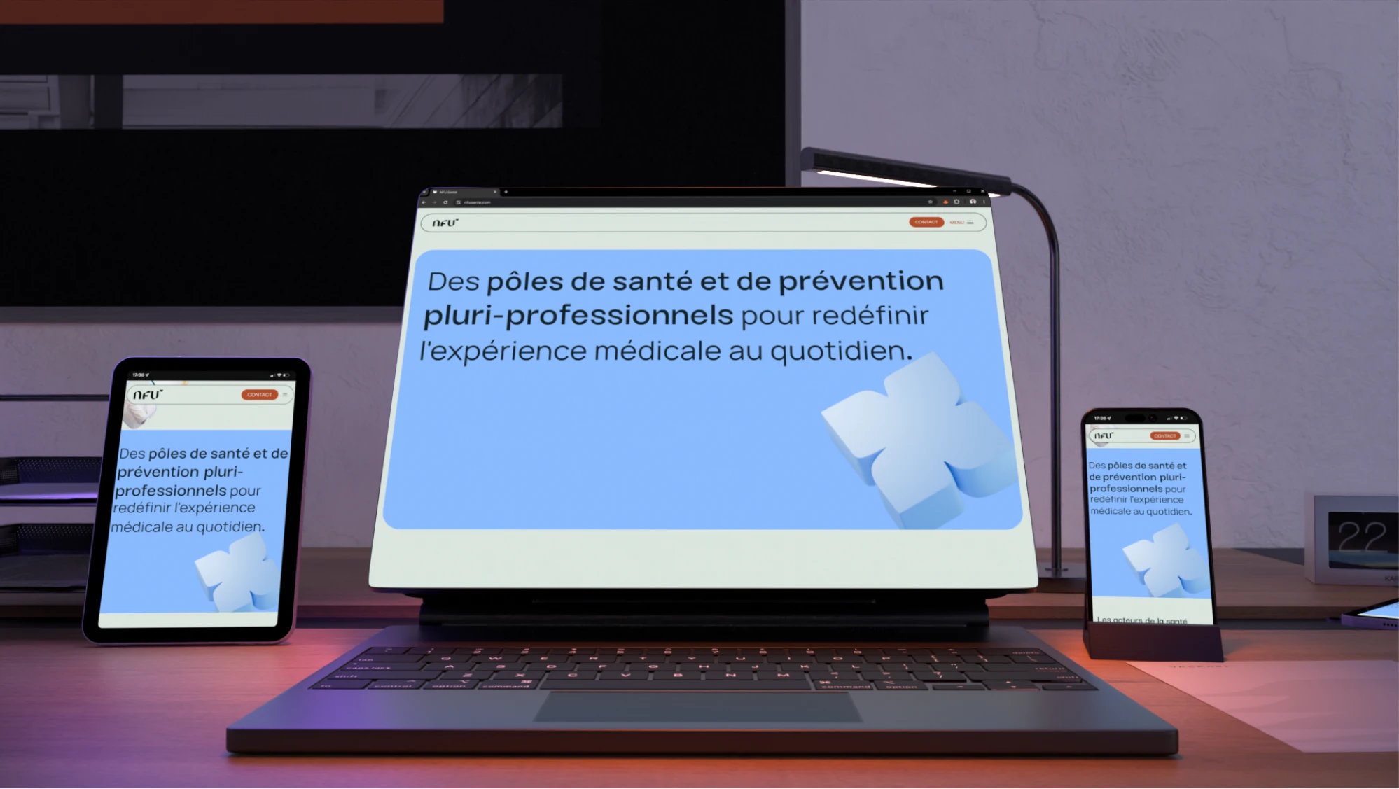
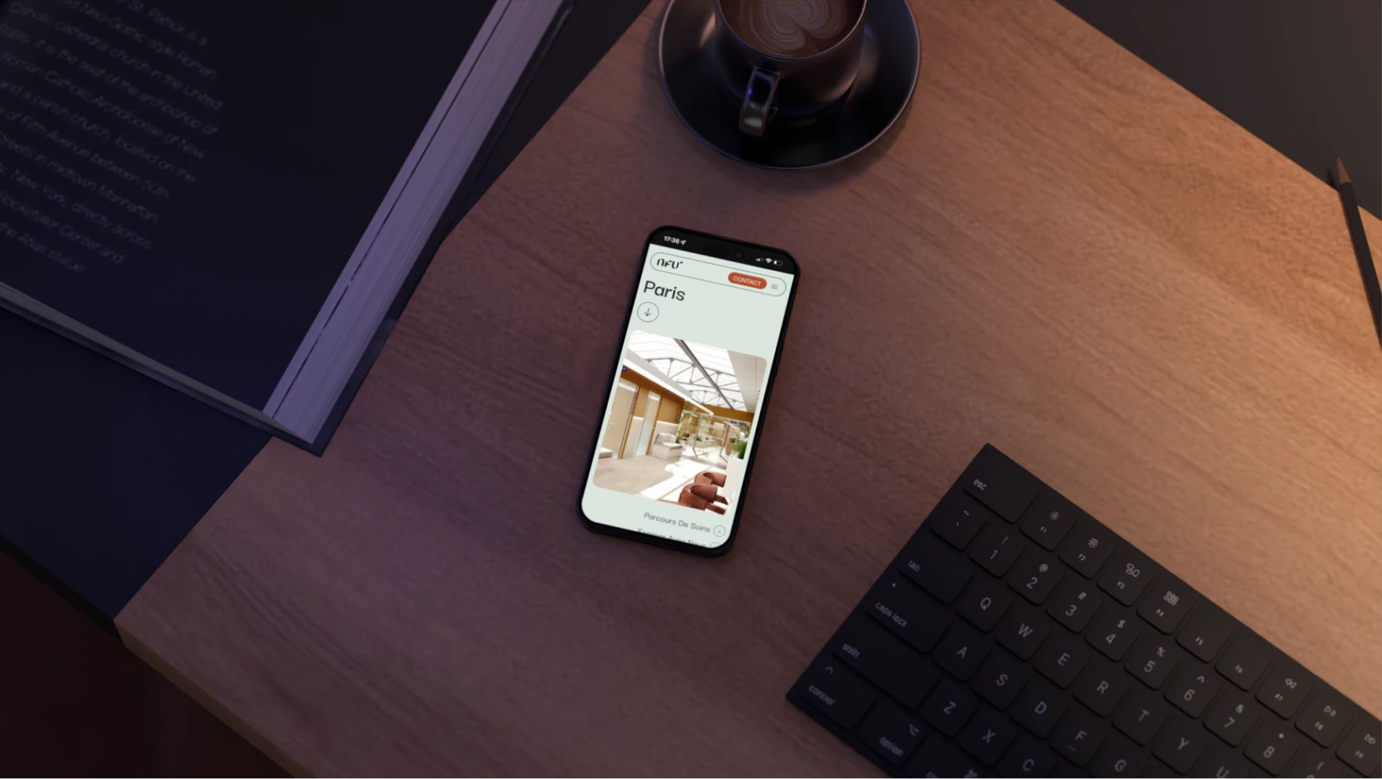
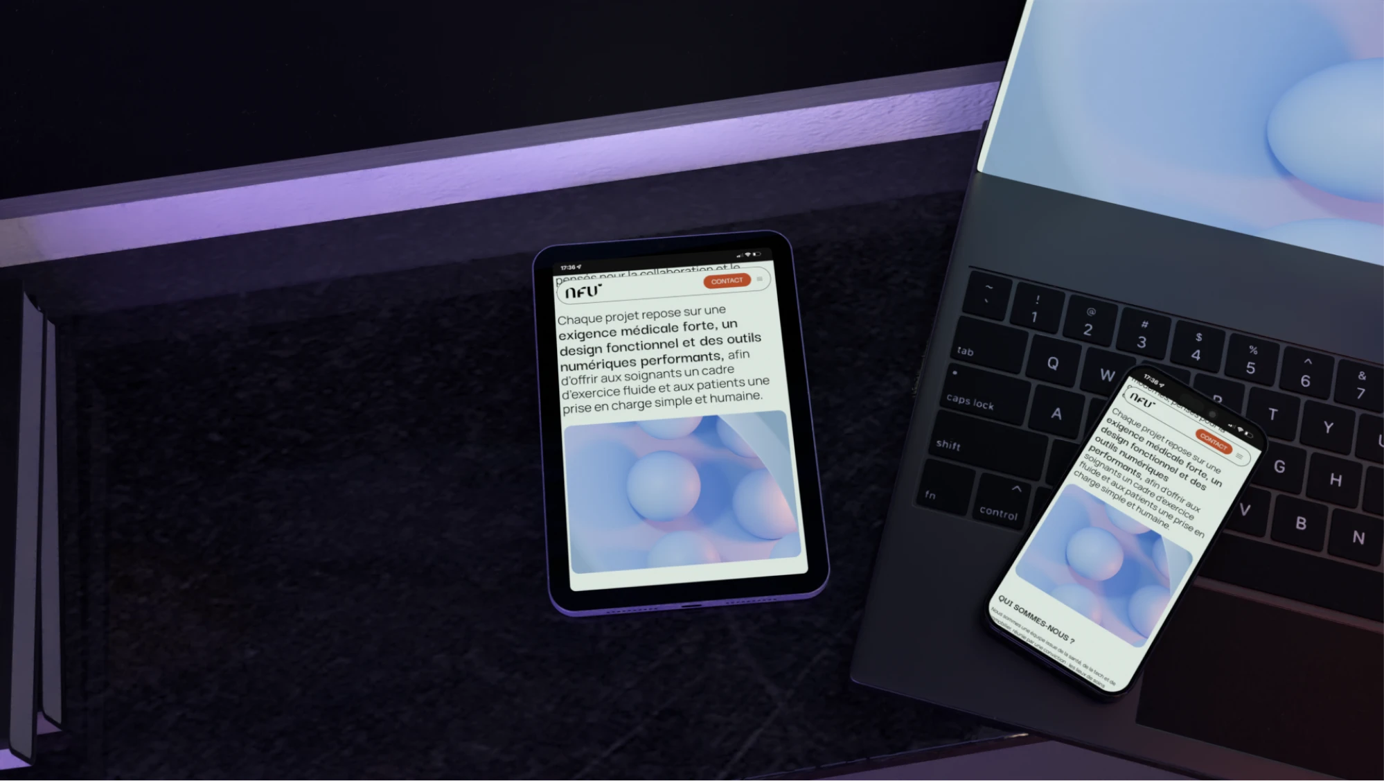
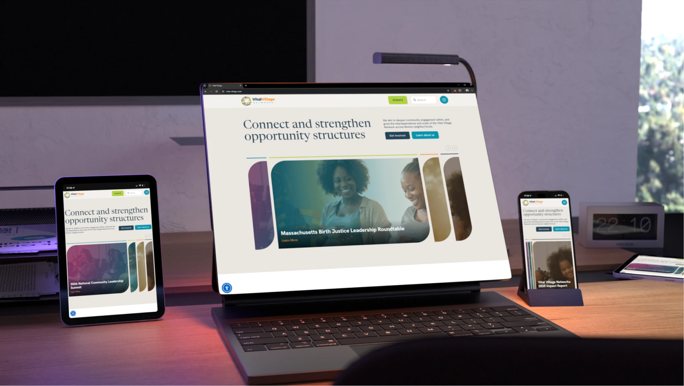
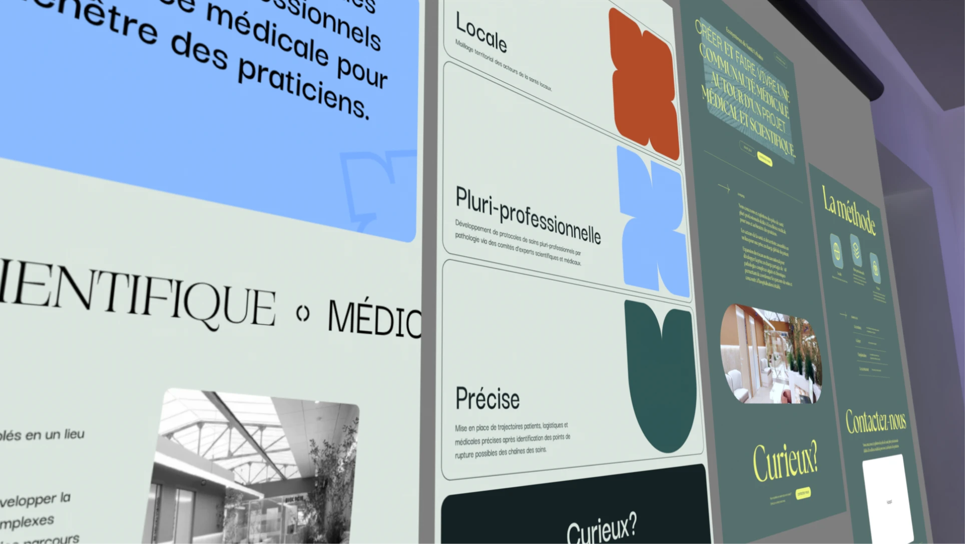
The website needed to feel friendly, human, and approachable, yet high-end and luxurious, the same balance struck in the branding, now tested across an interactive, animated web environment.
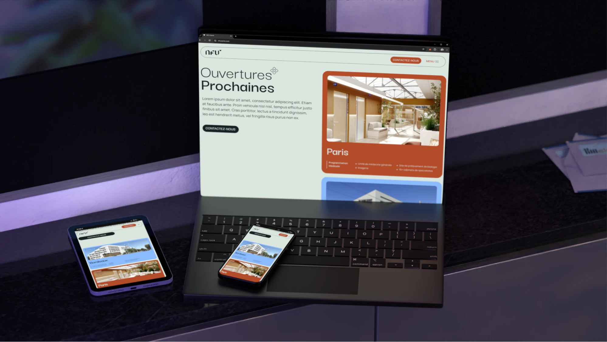

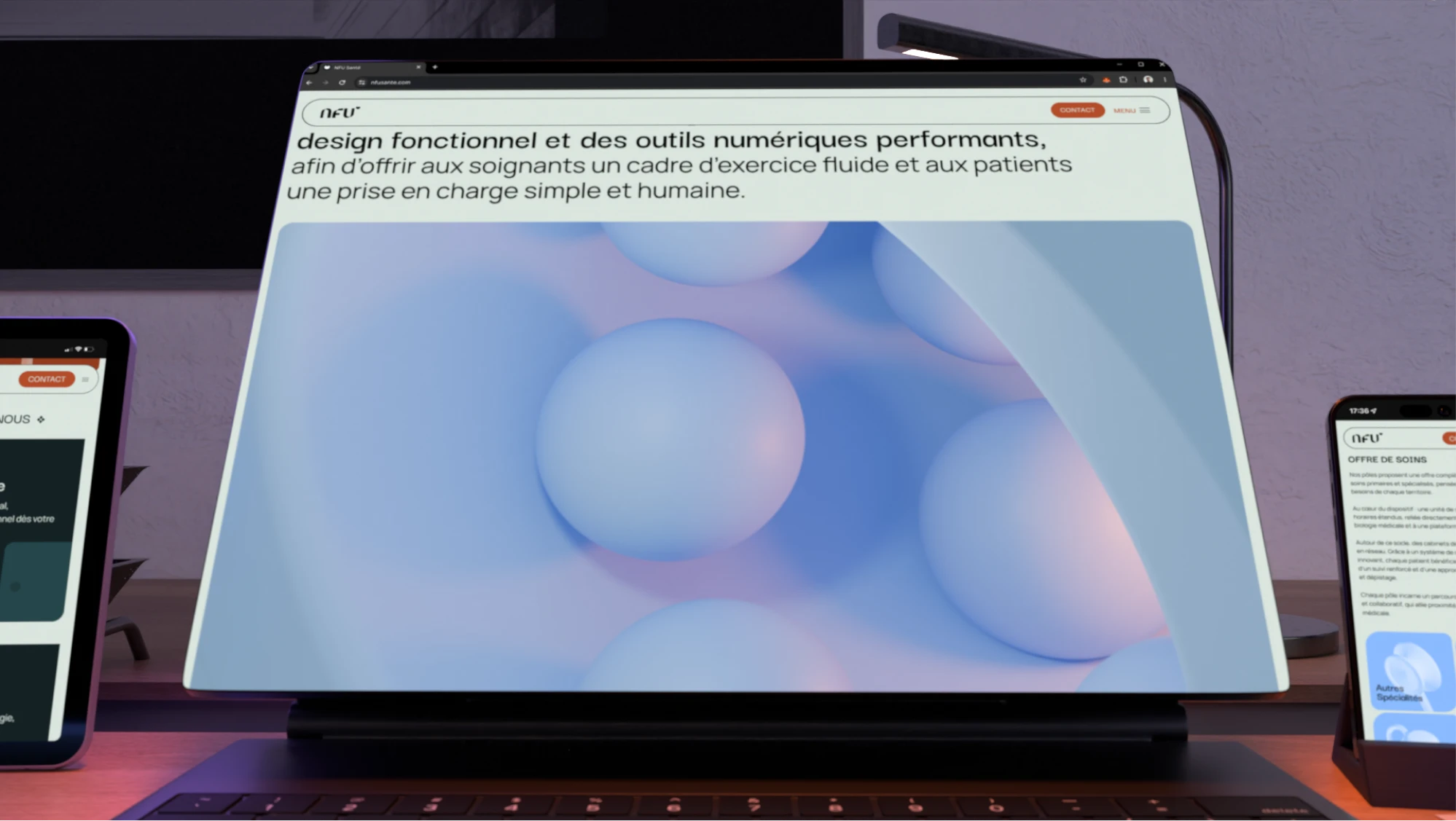
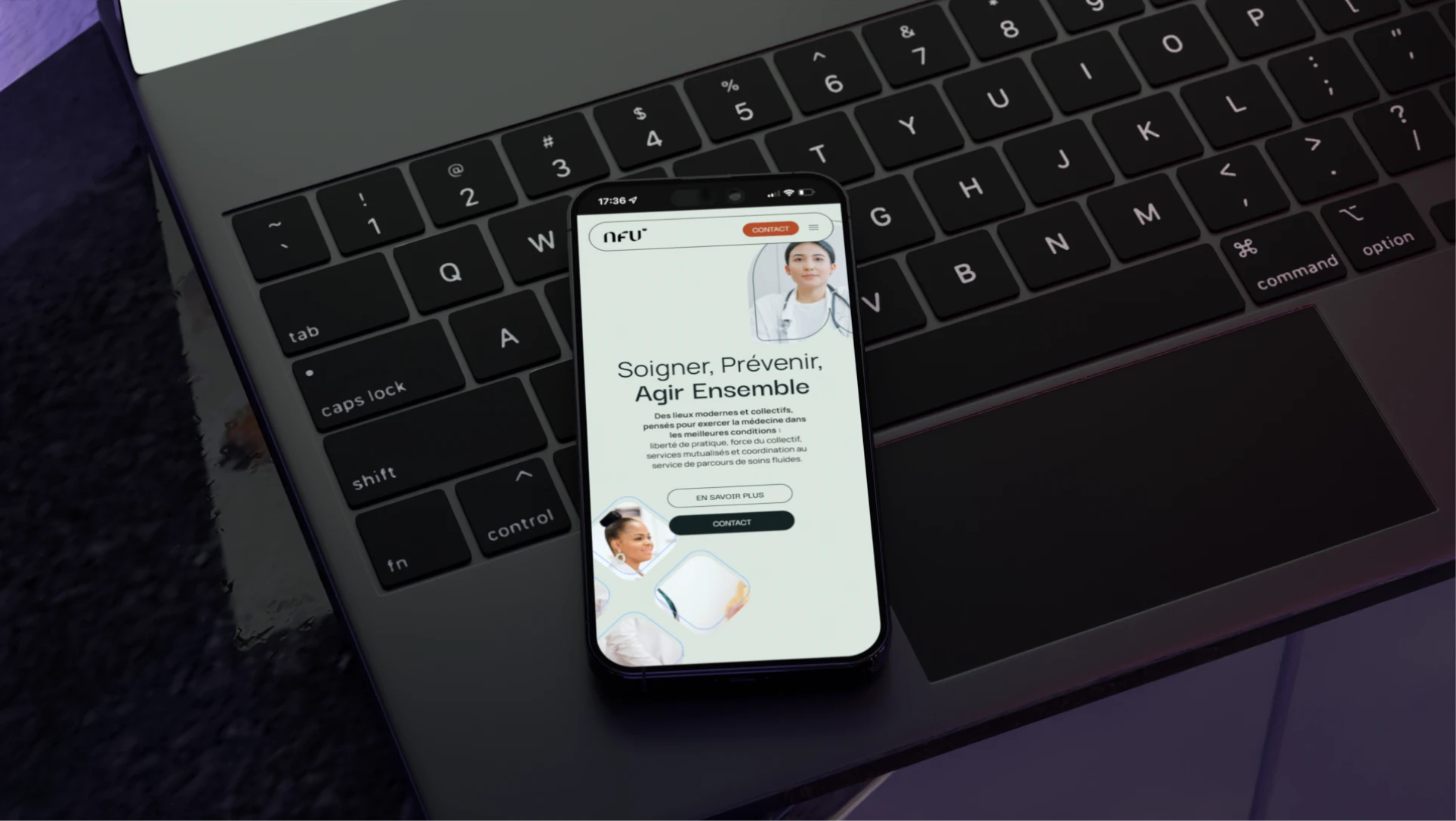
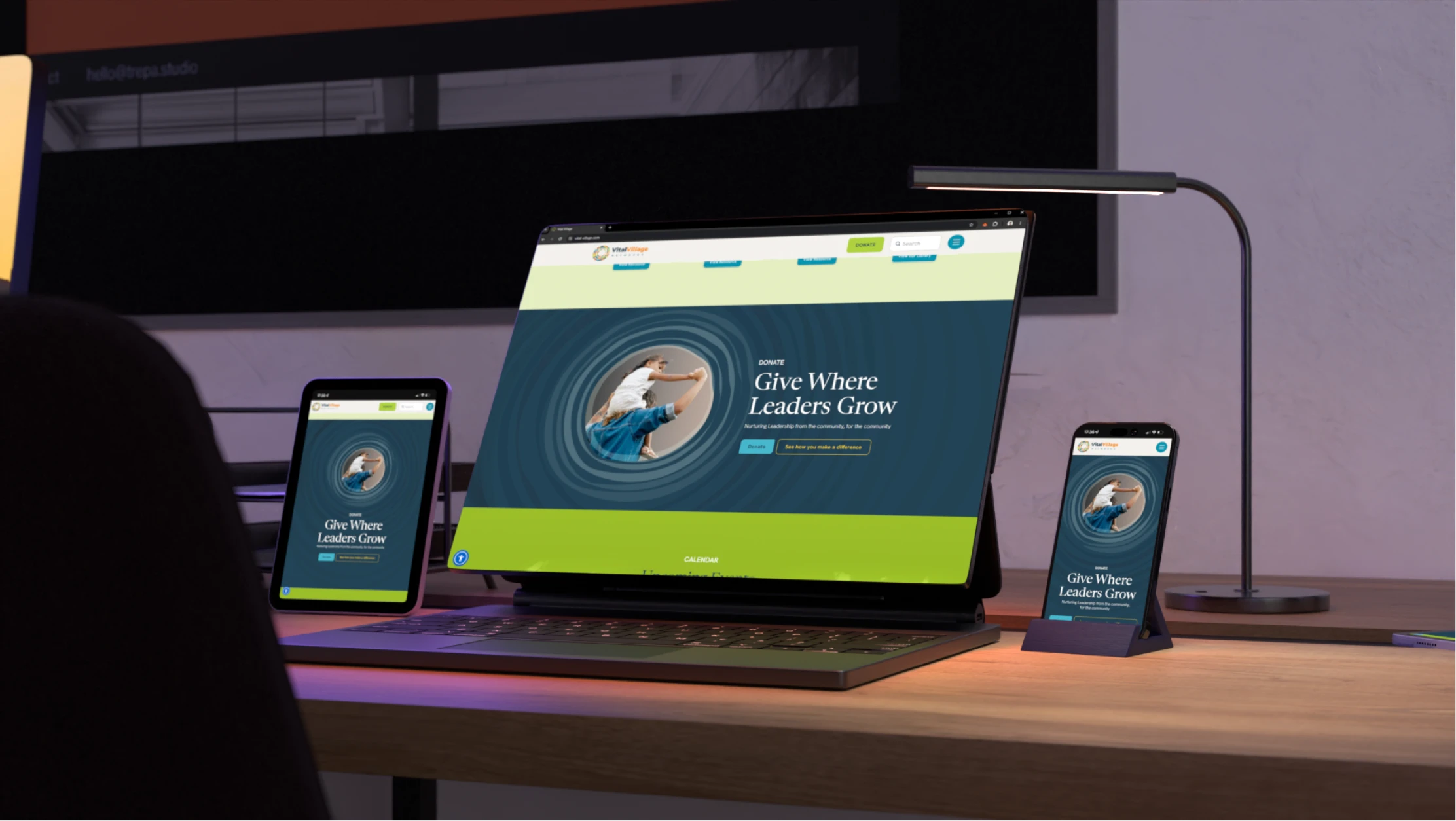
The hero section went through many iterations, swinging between too serious and dry to too playful and colorful, before landing on the right first impression for the brand.
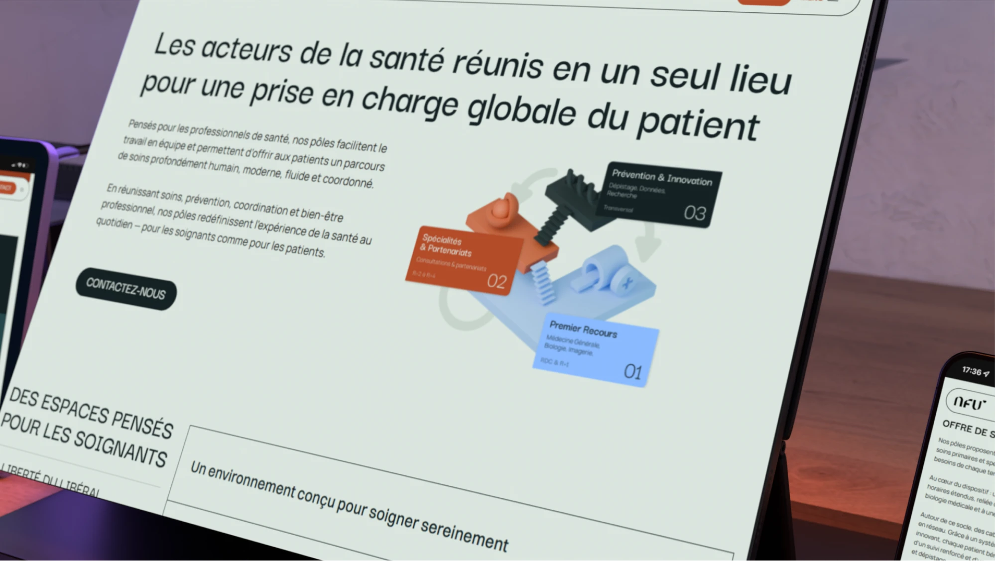
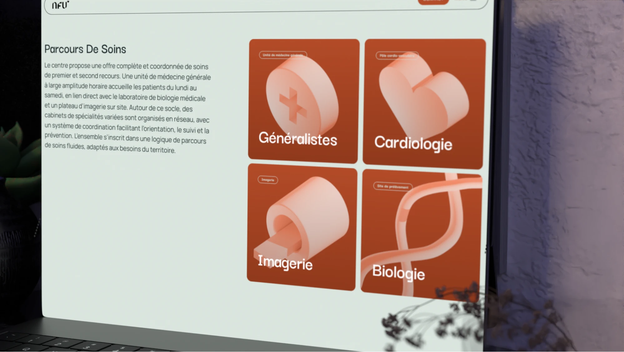
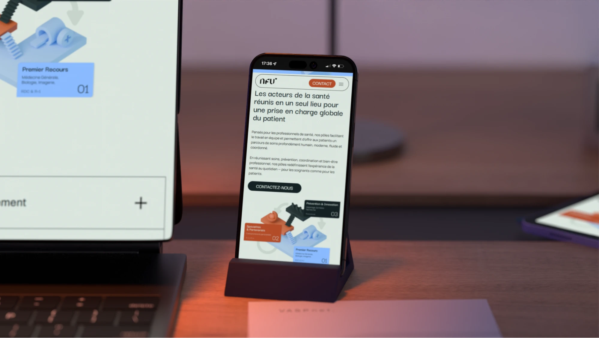
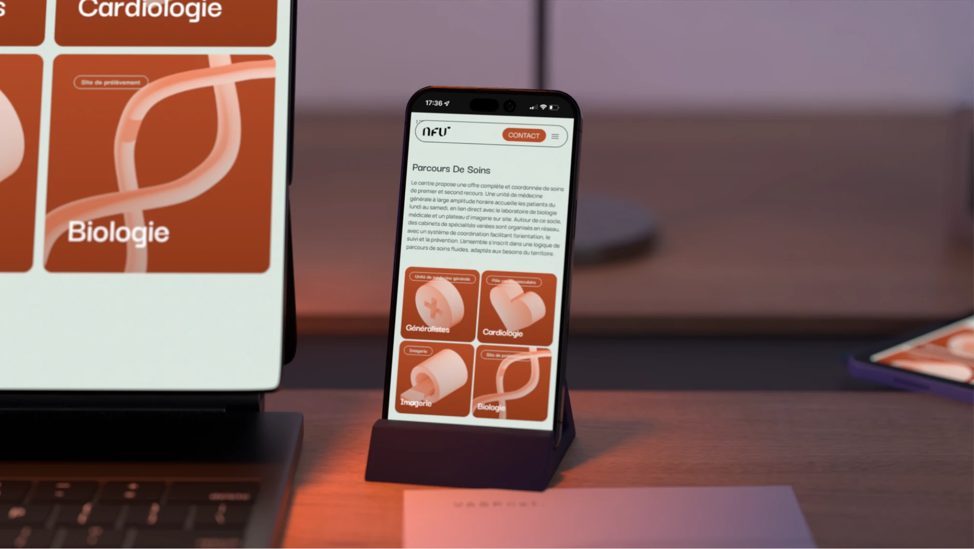
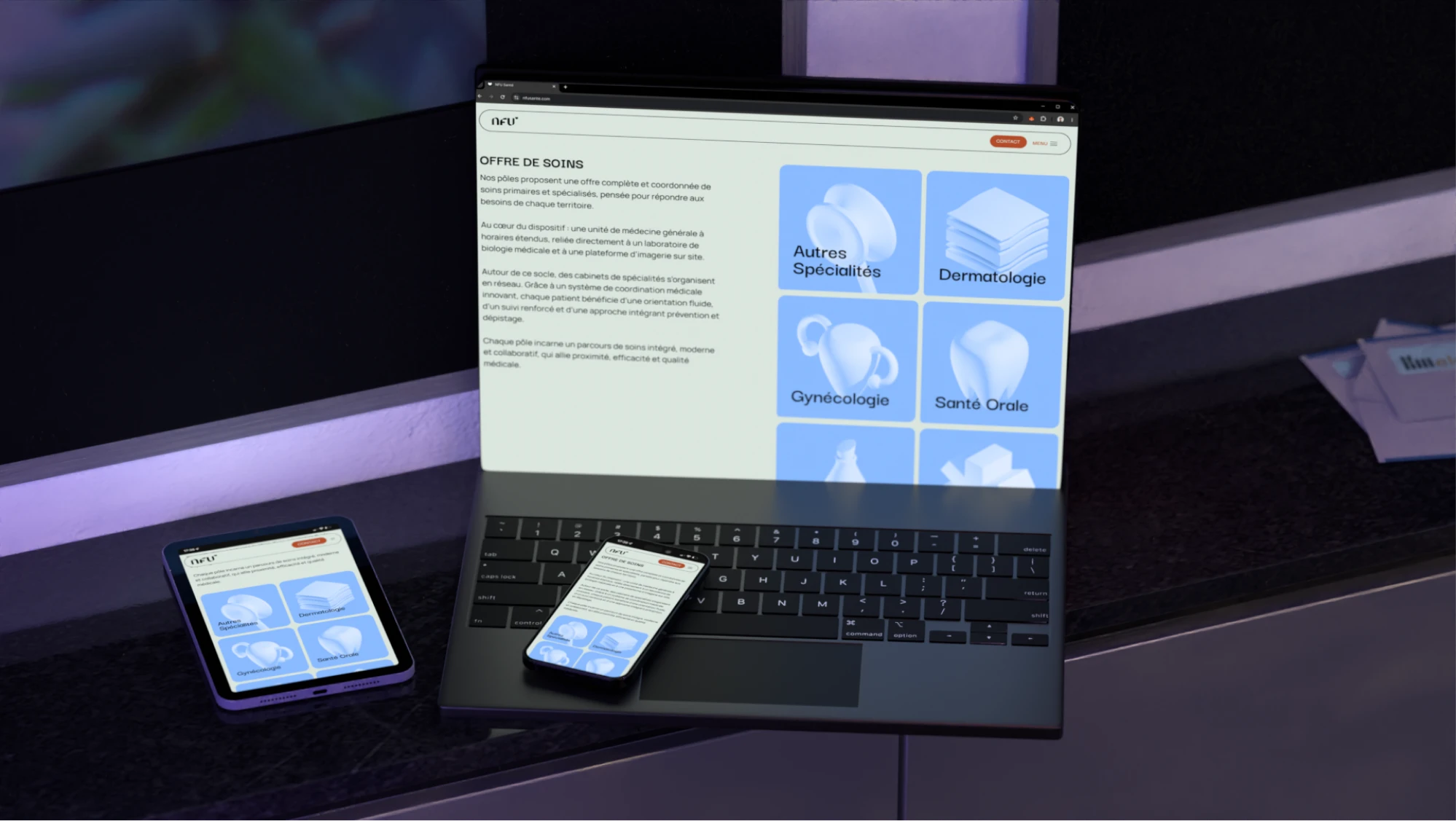
3D elements needed careful iteration on placement, location, and animation intensity, so they read as professional and appealing to health practitioners rather than overly 'tech' in feel.
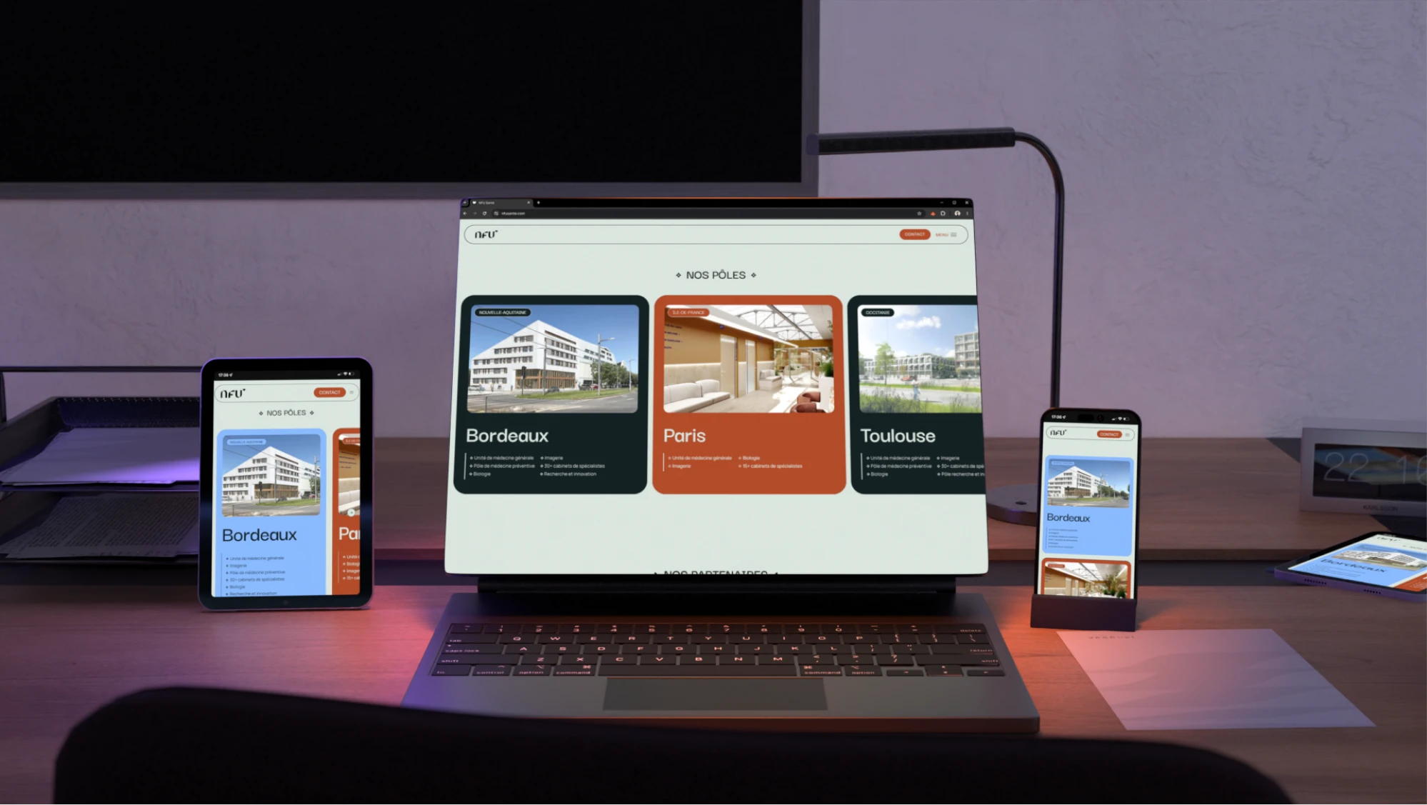
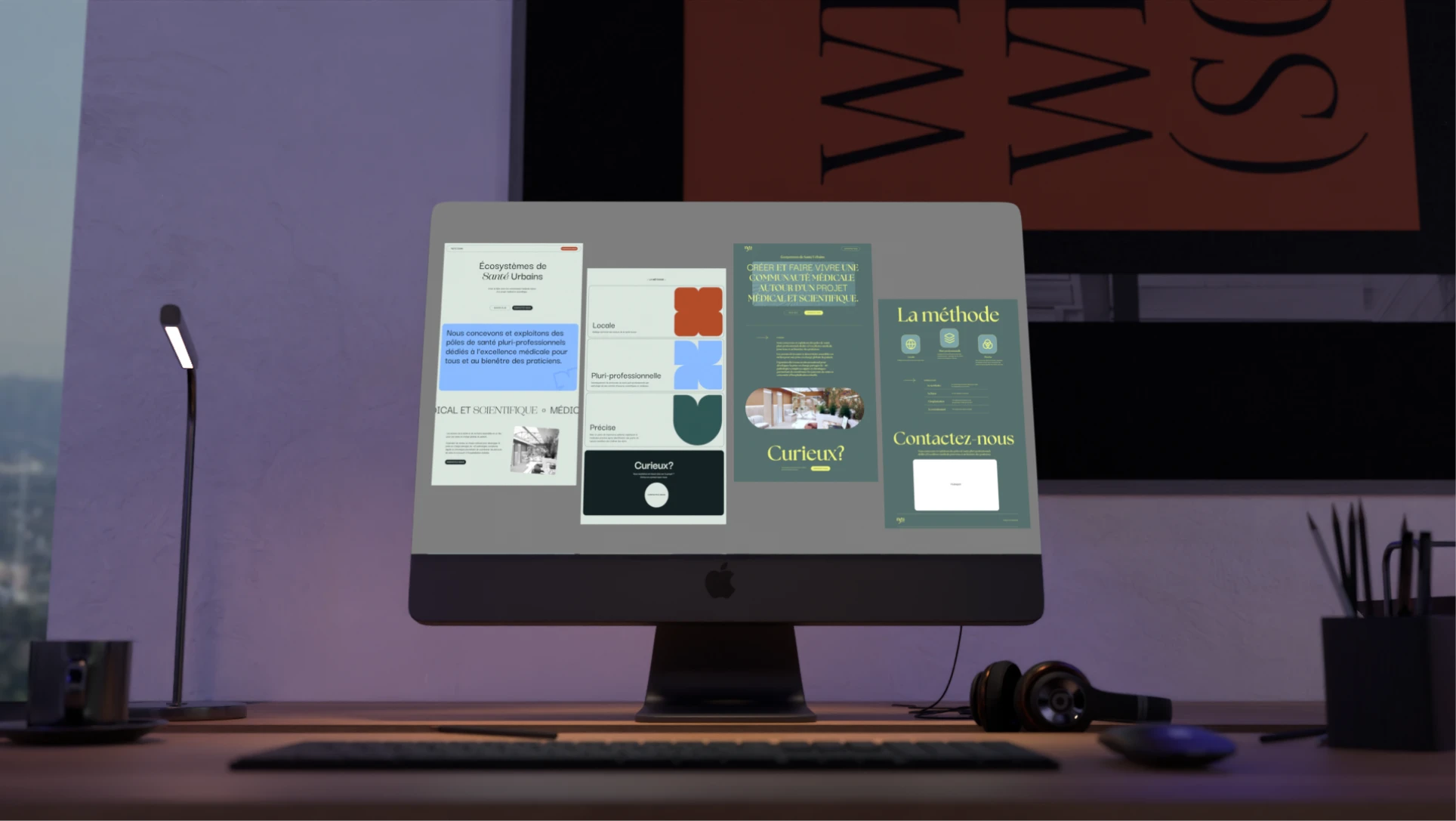
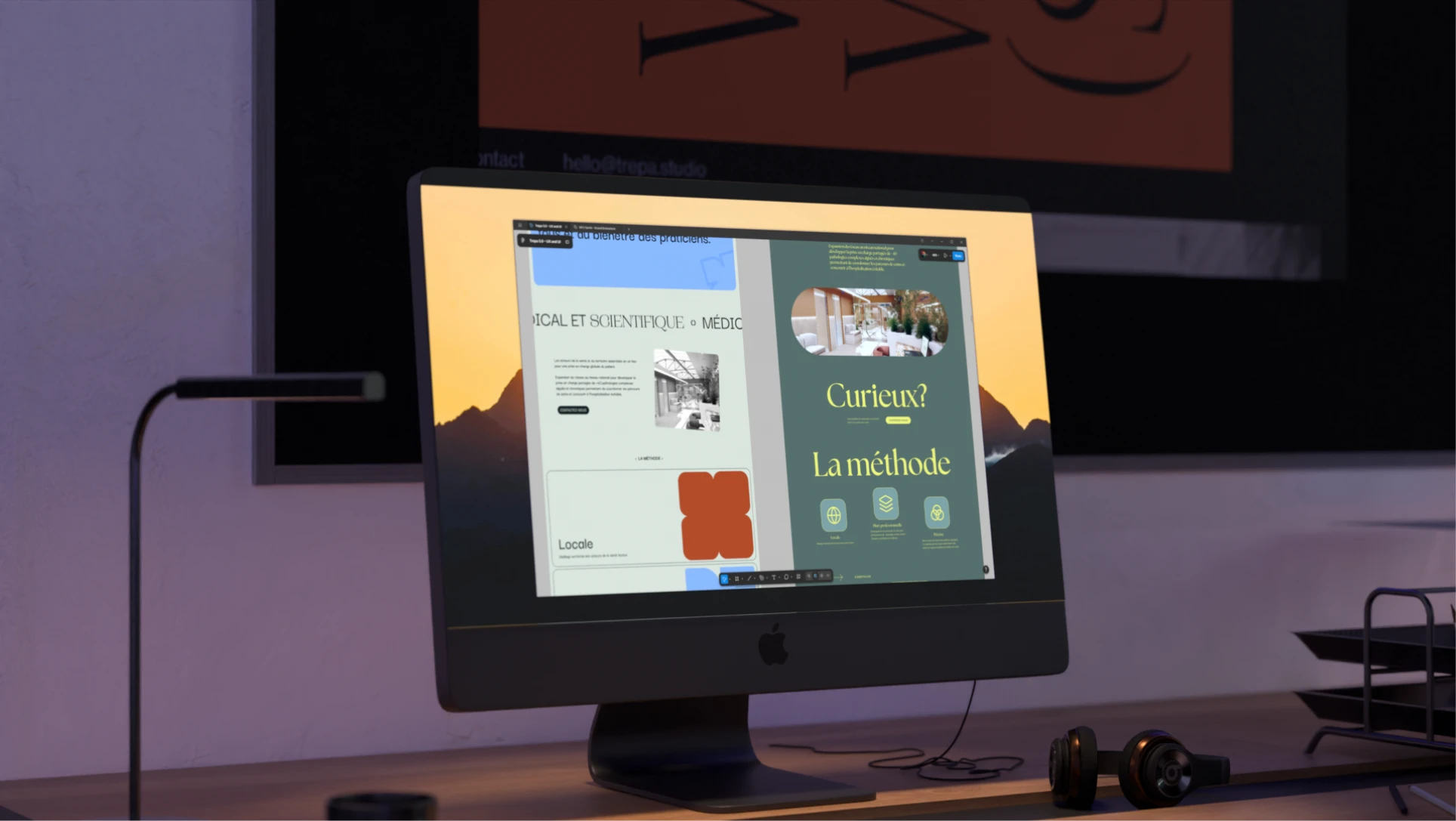
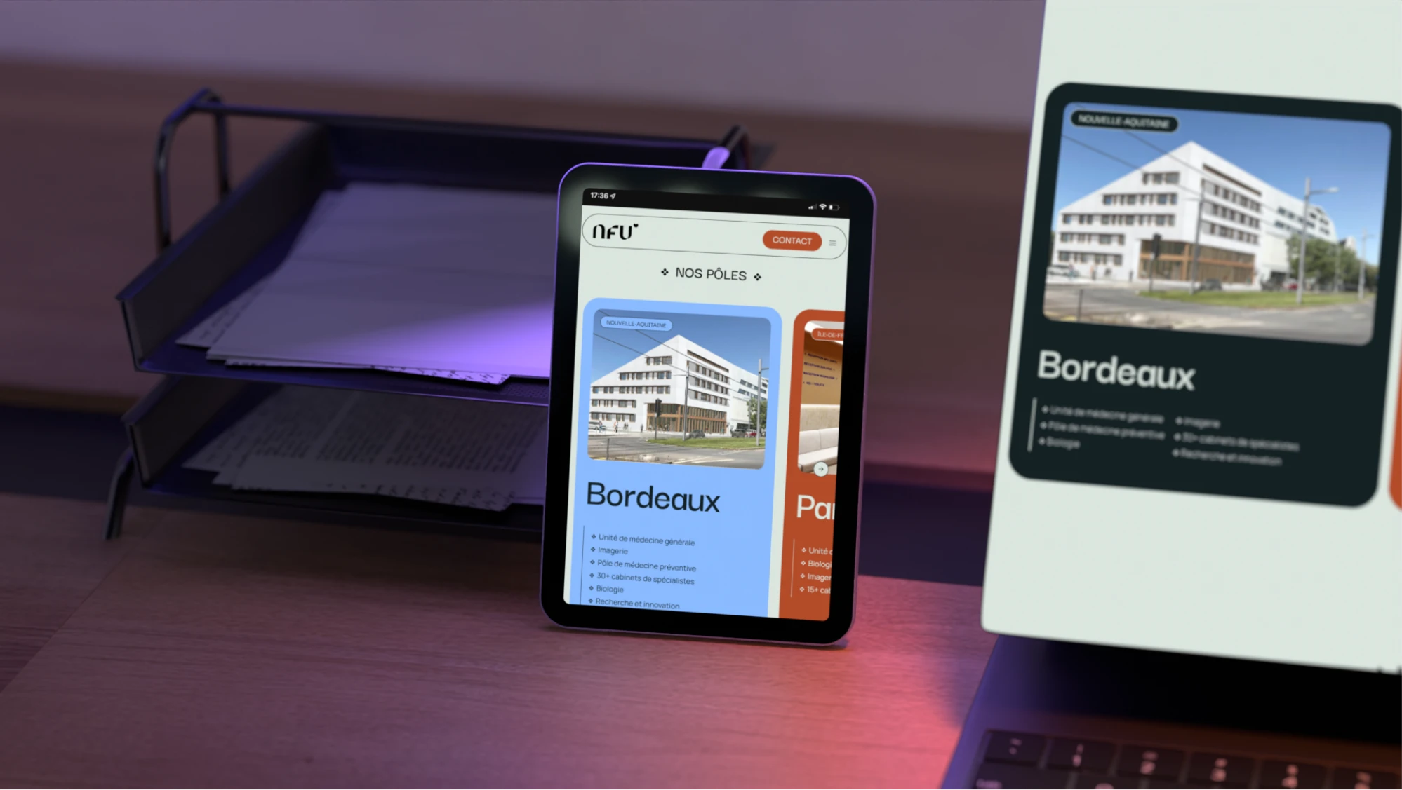
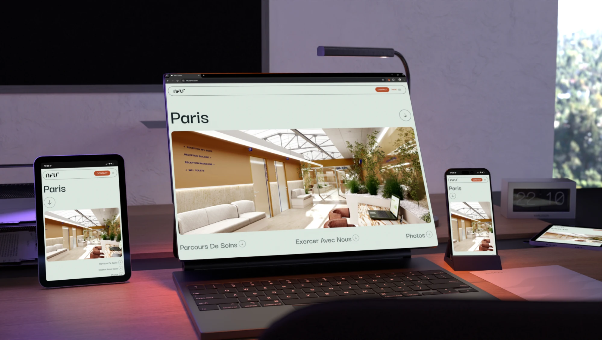
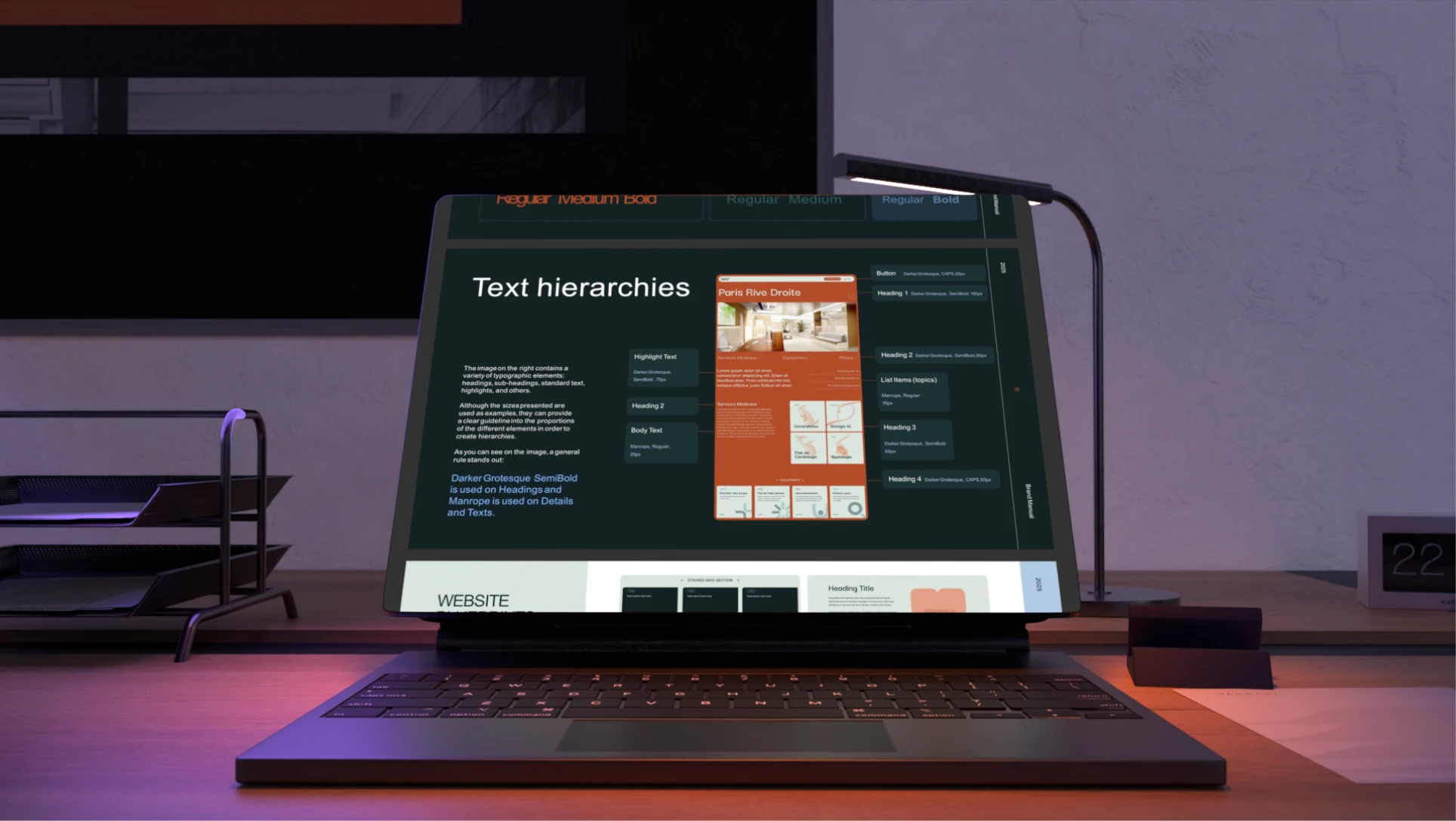
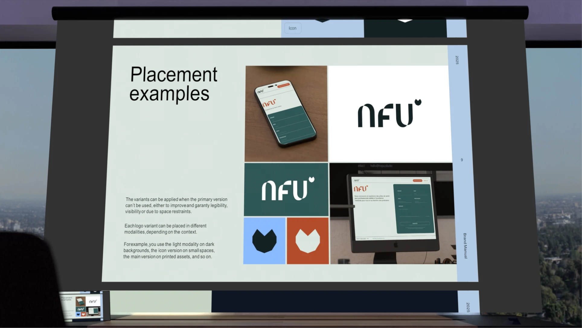
Every page needed to stay coherent with the brand identity already established, so the website felt like a natural extension of it rather than a separate, disconnected experience.