The ecosystem behind connected patient care

Client

NFU Santé

Services

Branding

The ecosystem behind connected patient care

Client

NFU Santé

Services

Branding

Overview
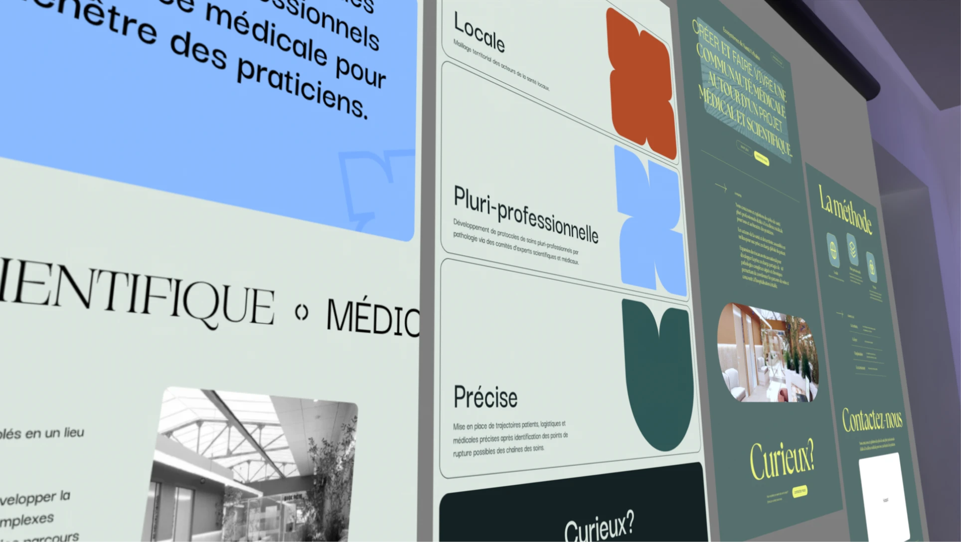
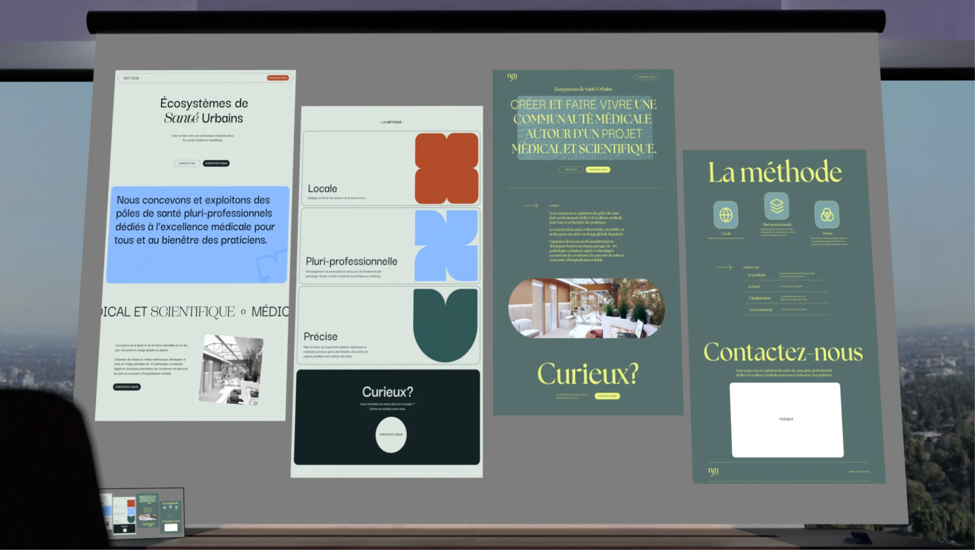
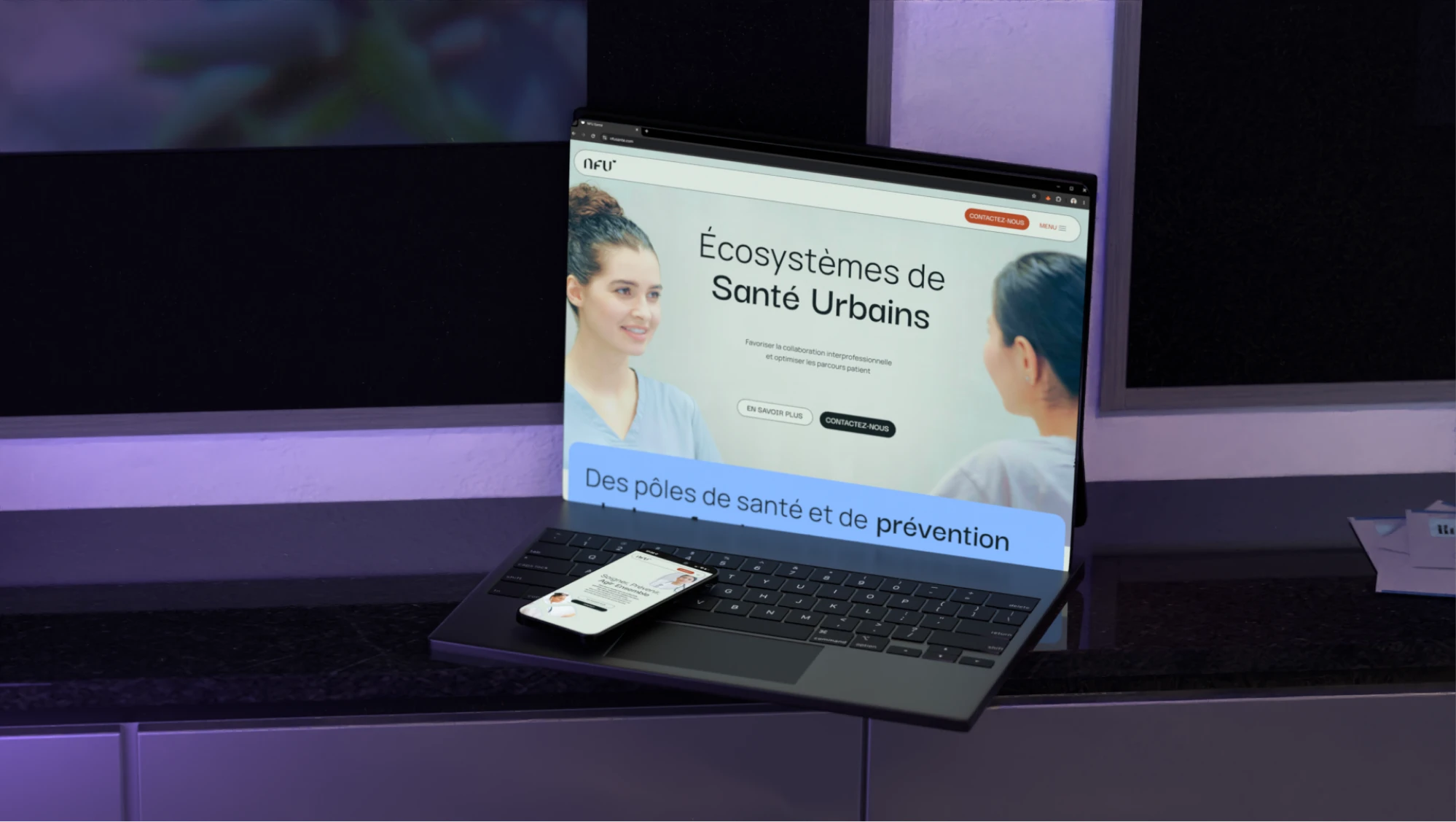
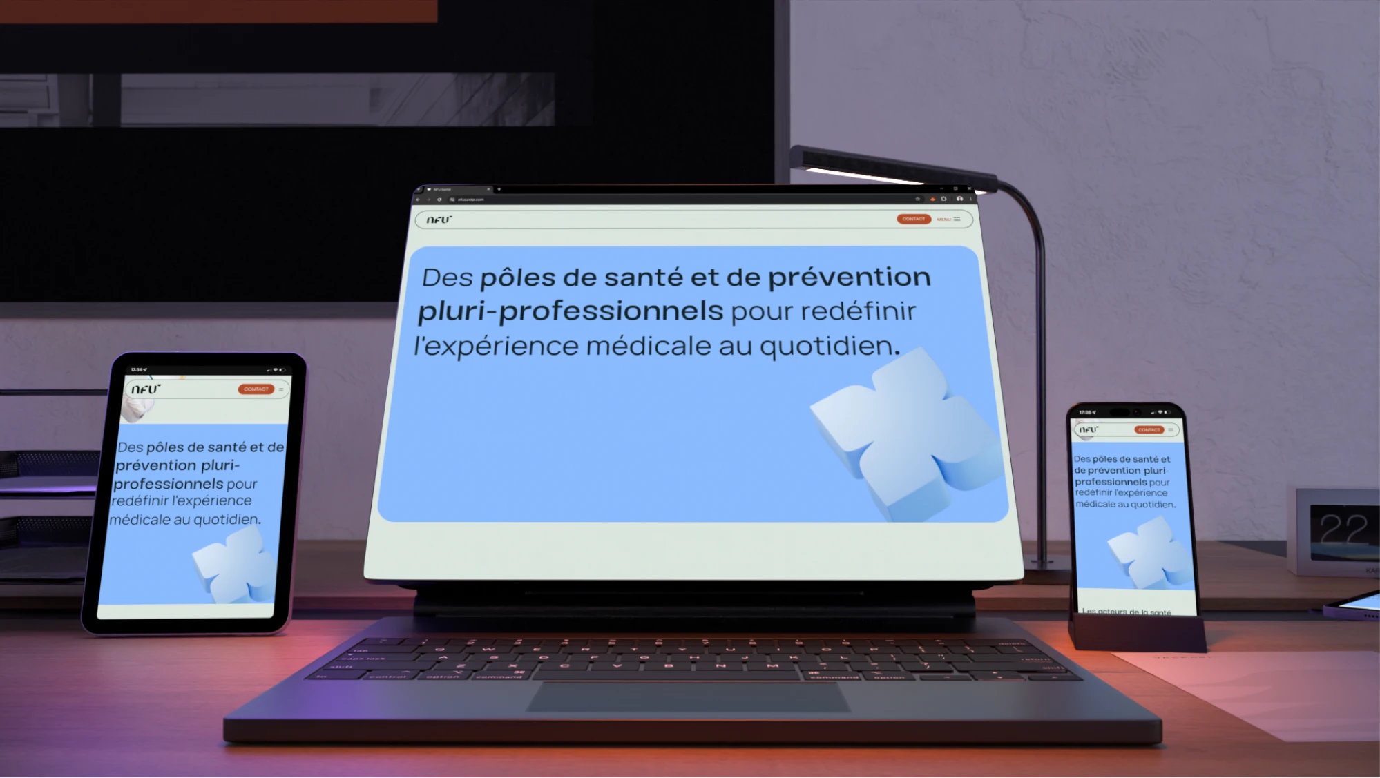
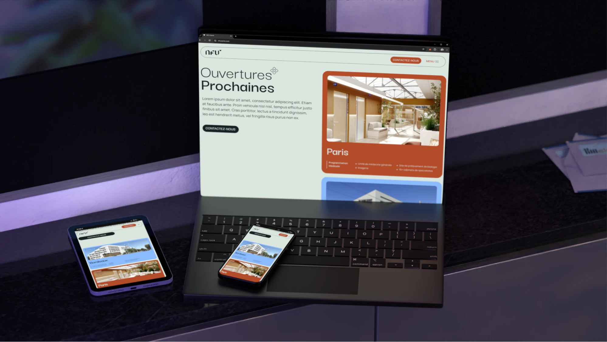
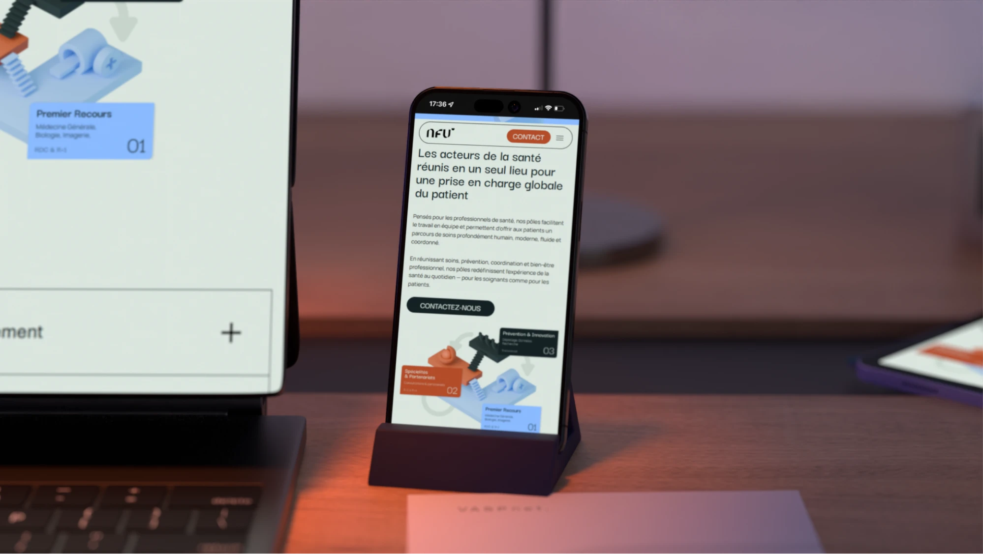
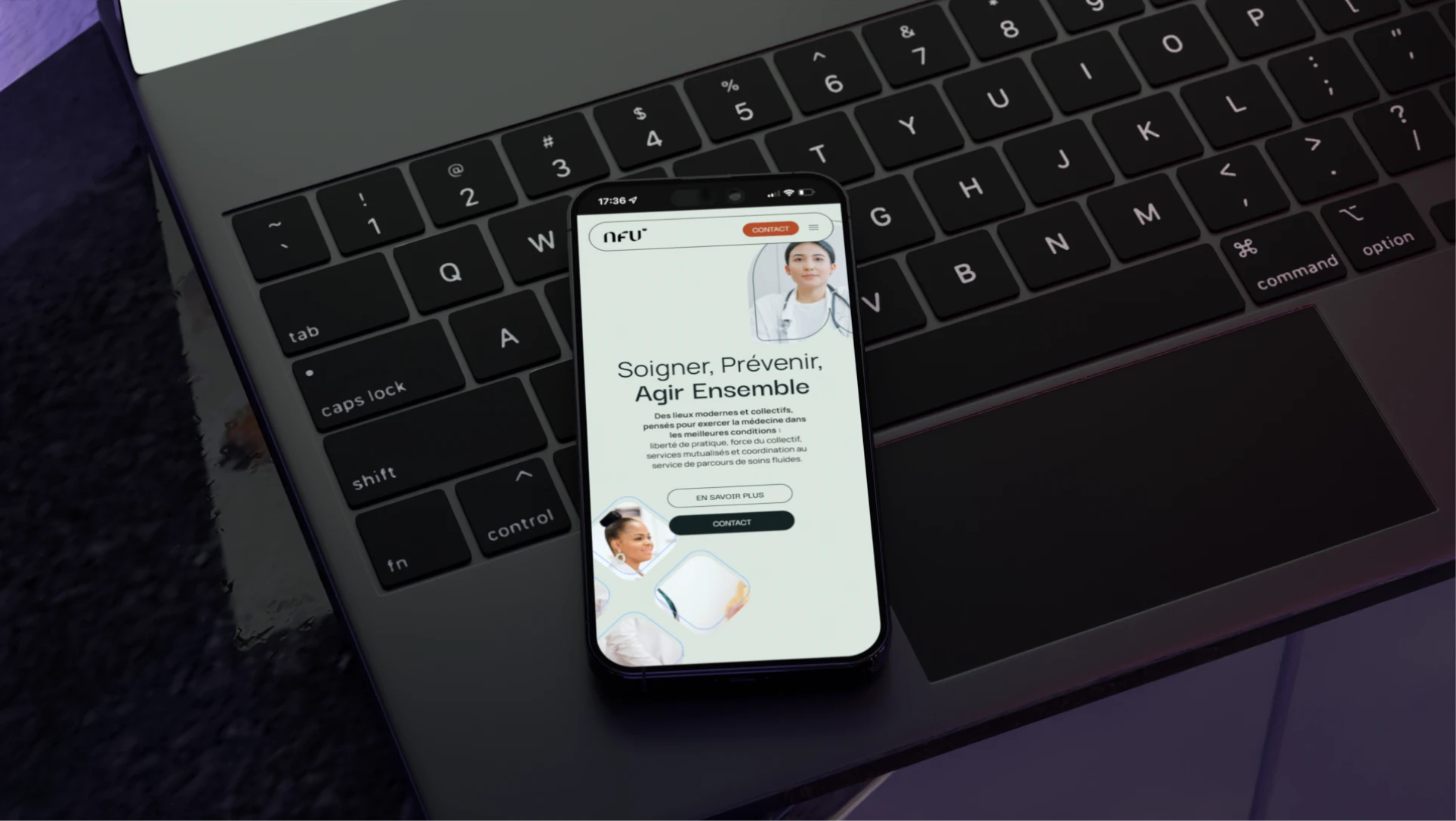
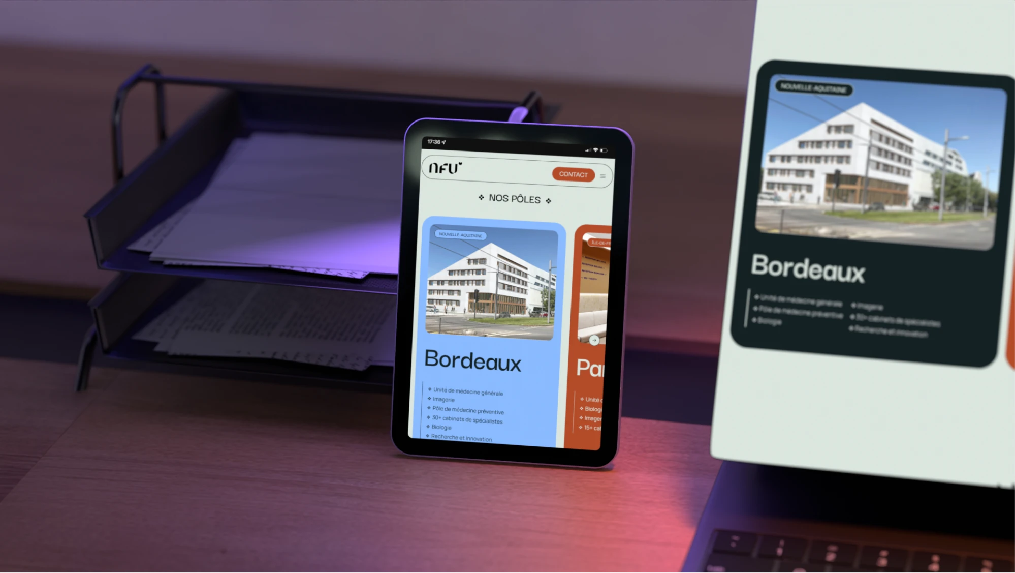
NFU Santé designs and operates multi-professional health hubs dedicated to medical excellence and practitioner well-being, with locations across France including Paris, Bordeaux, and Marseille. Trepa developed a complete brand identity that reflects the ecosystem's dual focus: interprofessional collaboration and coordinated patient care.

Date
Jan 2025
Duration
1 to 3 months
Pricing range
3k to 5k

The plan

Timeline

Strategy

Uncovered NFU's shared-space model for healtcare services

Drafting & Reviews

Explored a refined-casual tone: exclusive yet approachable

Development

Designed the full visual system around the existing logo

Delivery & Support

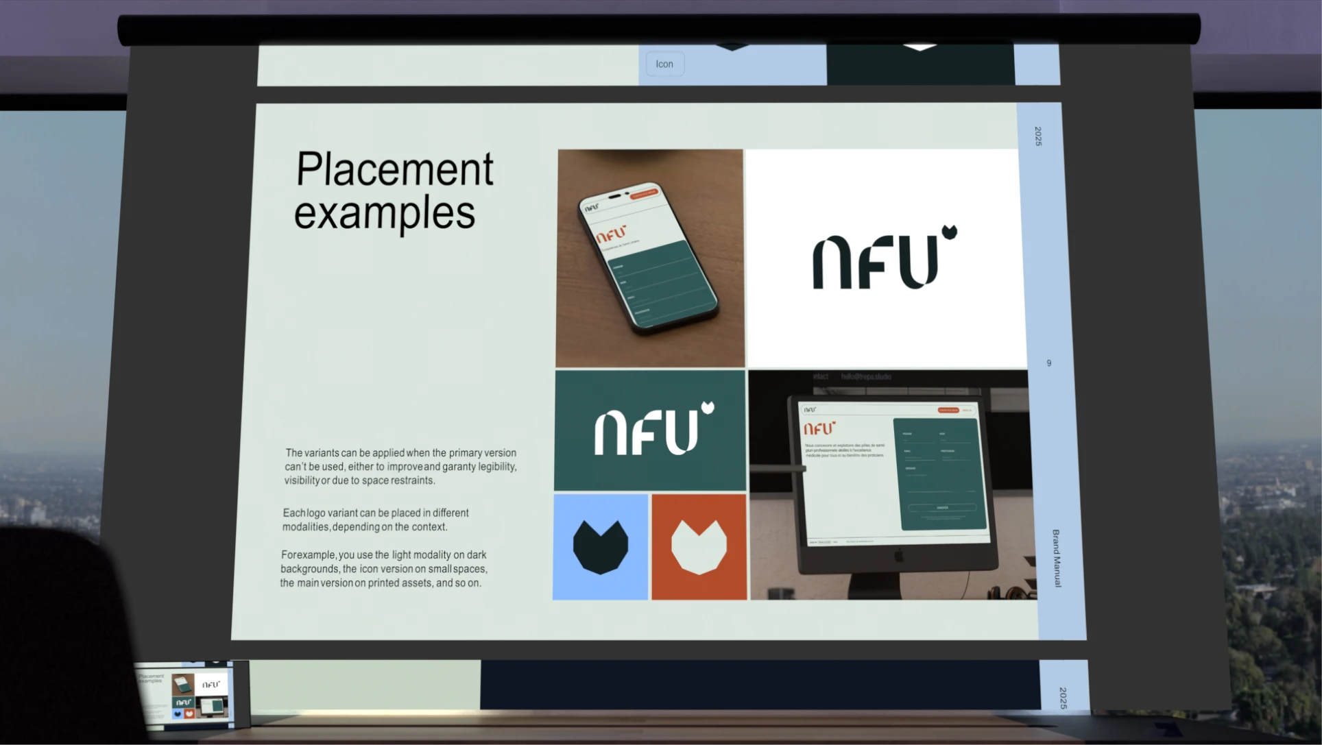
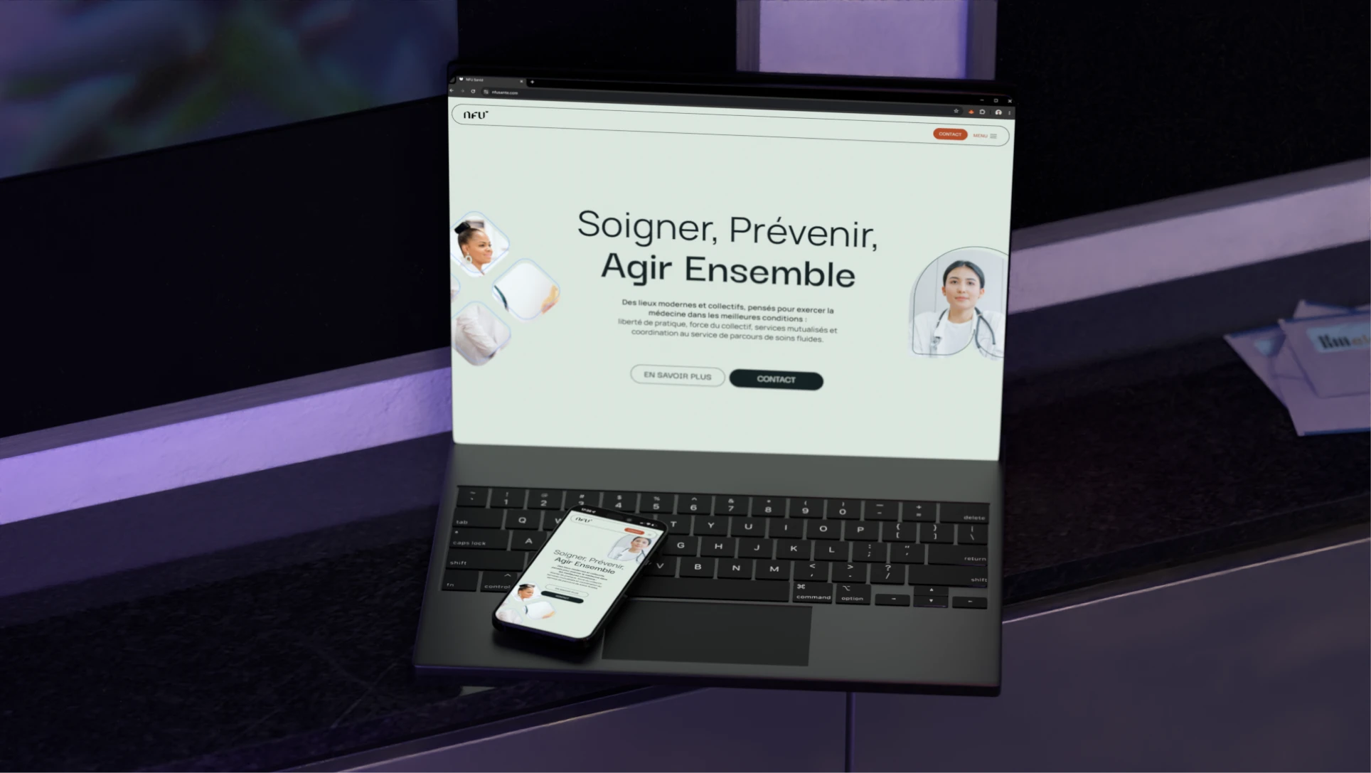
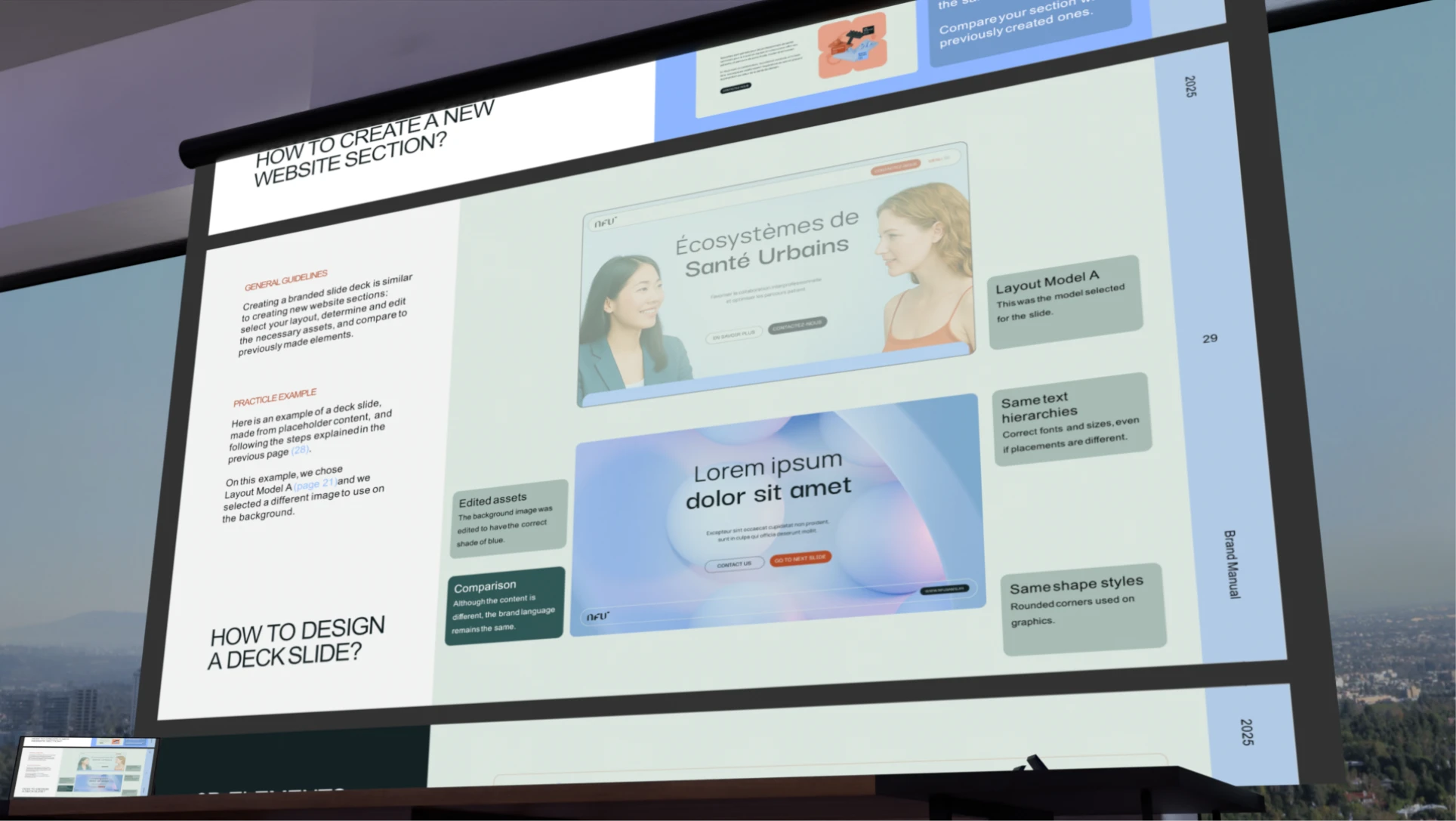
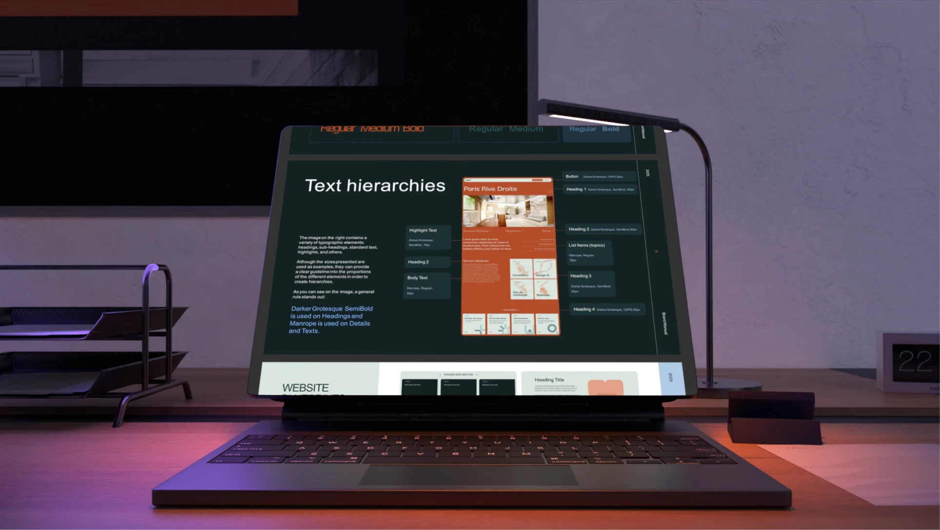
Compiled the brand manual, kicked off the website design

Pain points & solutions

Bringing NFU Santé's identity to life meant reconciling several tensions at once: exclusivity with friendliness, minimalism with playfulness, and medical precision with visual simplicity
Striking a tone that was both exclusive and friendly was difficult, since the two concepts easily undercut each other. Too luxurious and the brand loses warmth; too casual and it loses its high-end quality.
The client wanted health centers that felt better than standard healthcare, yet still accessible to the local populations they serve, requiring a visual language that balanced minimalism with a light, approachable aesthetic.
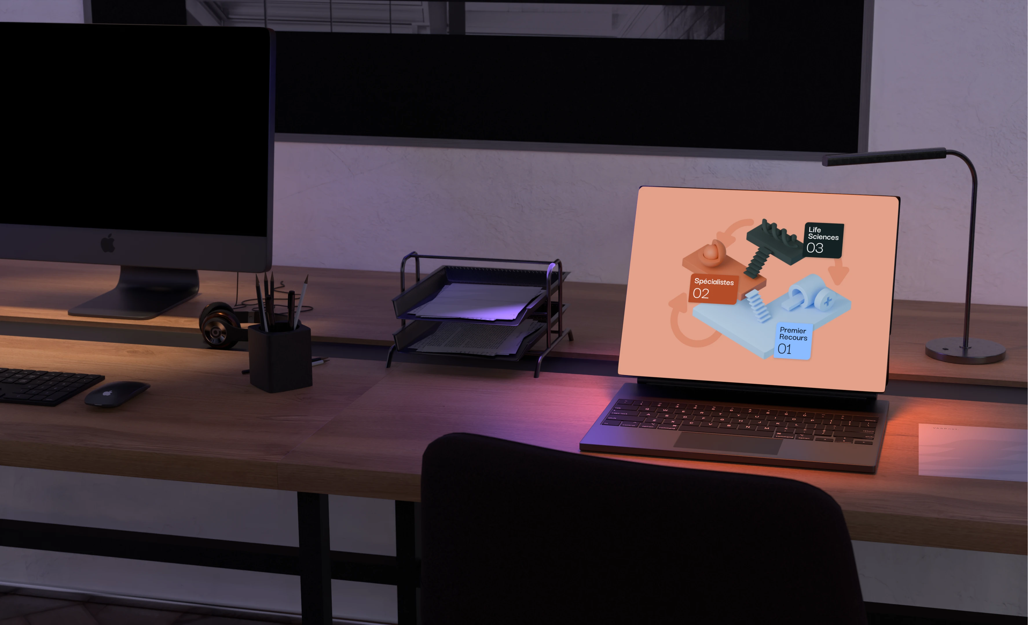
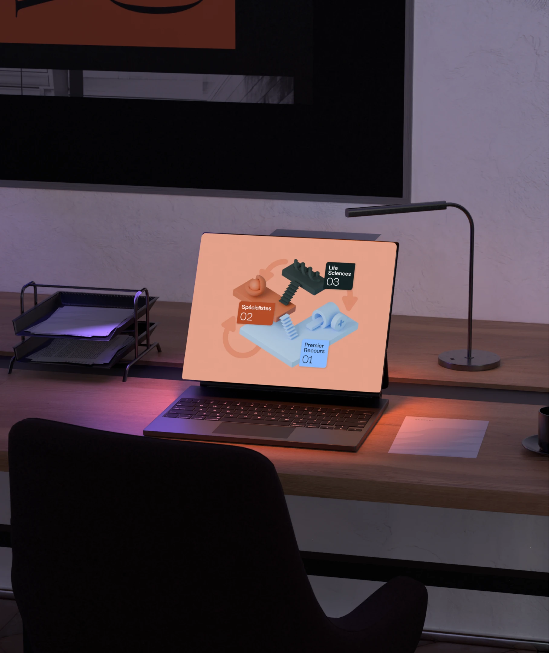
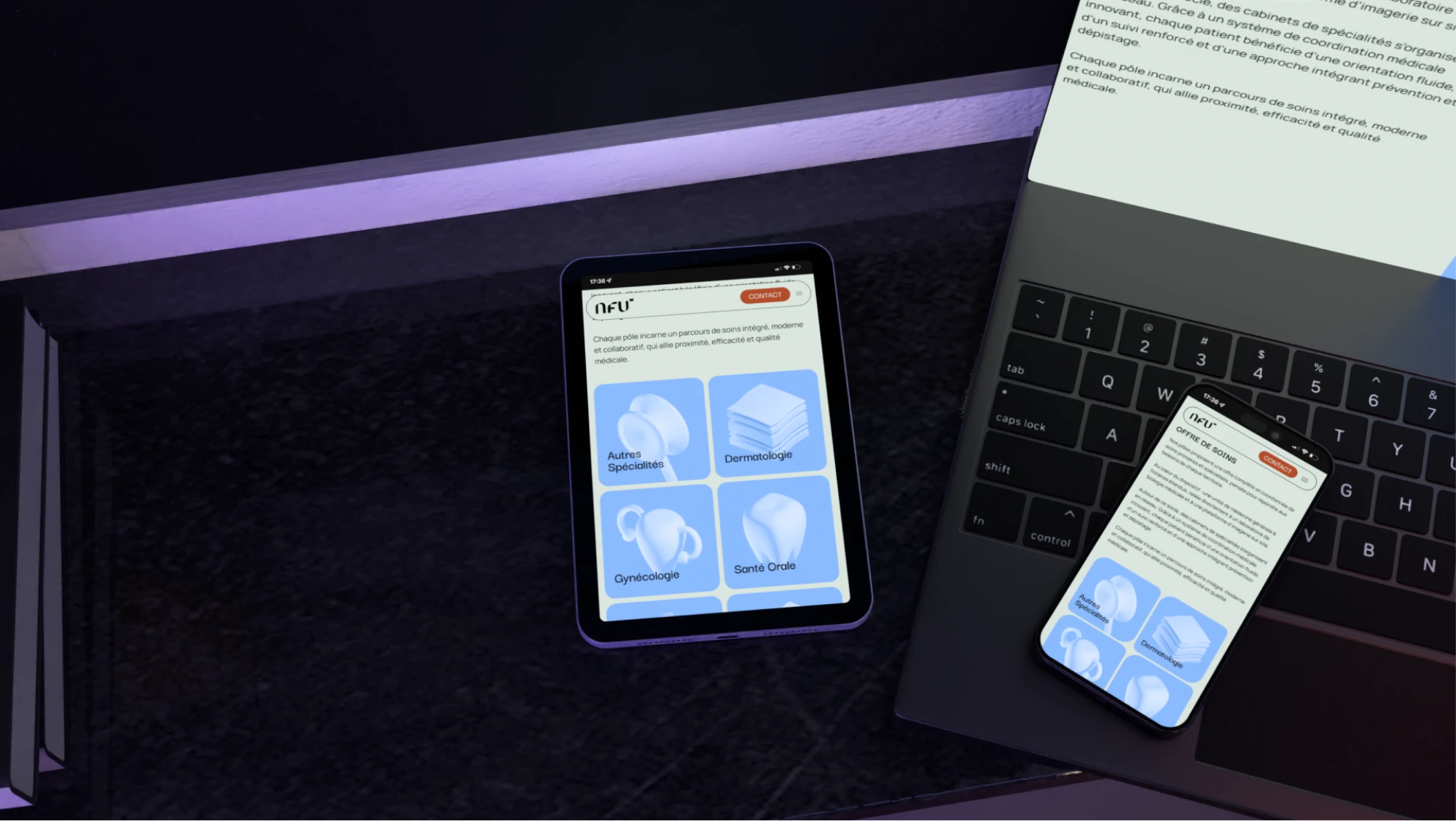
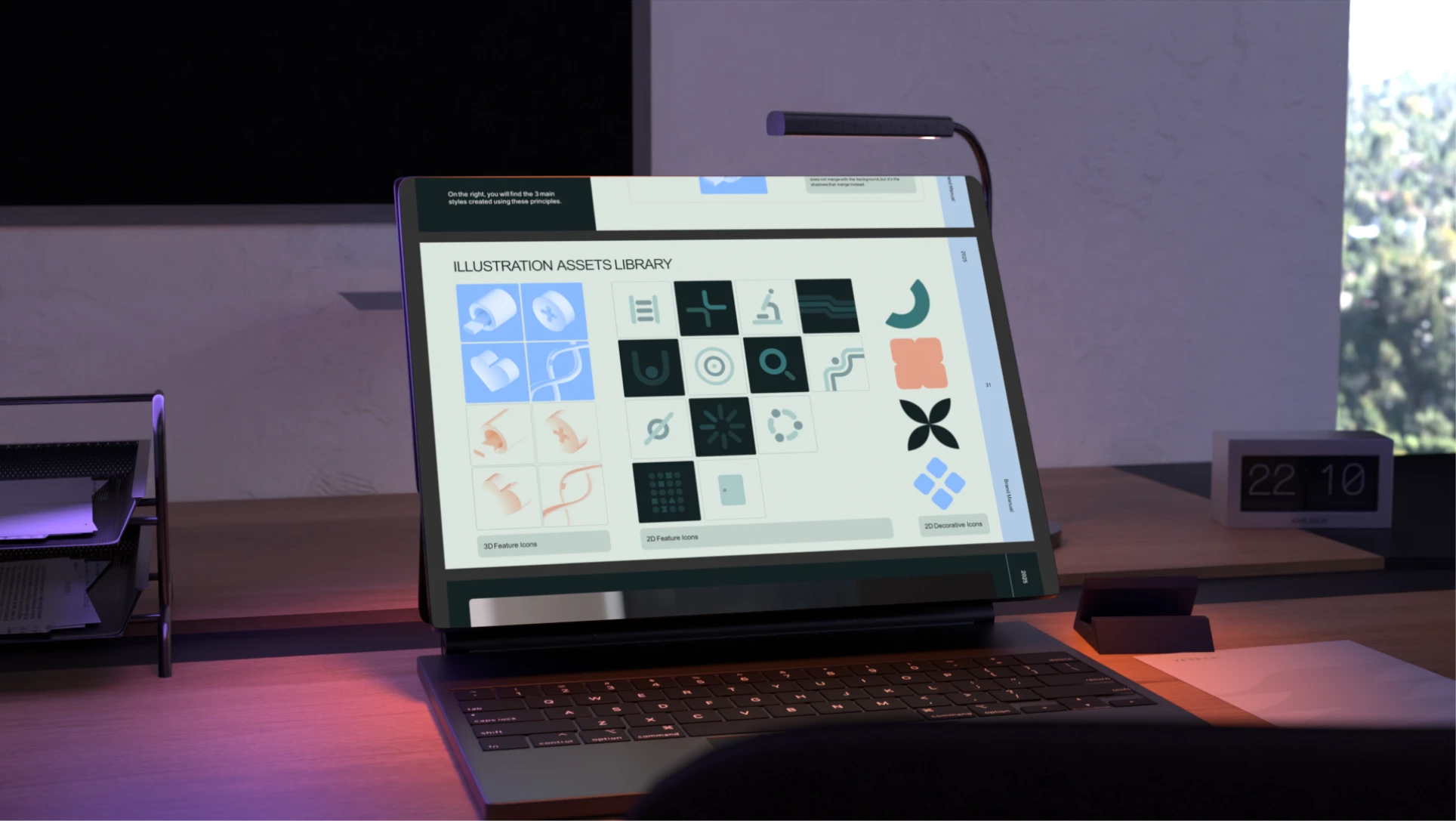
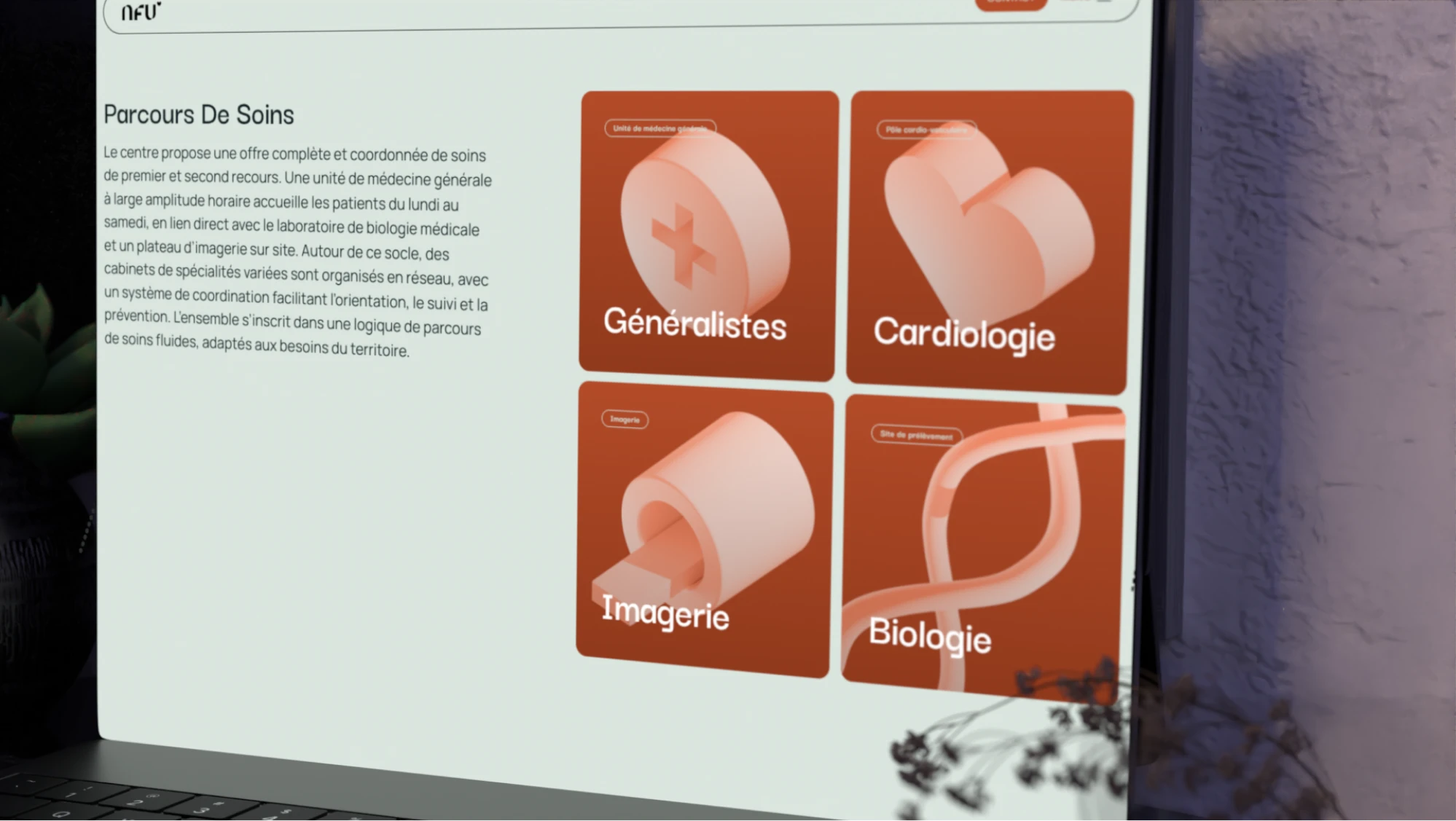
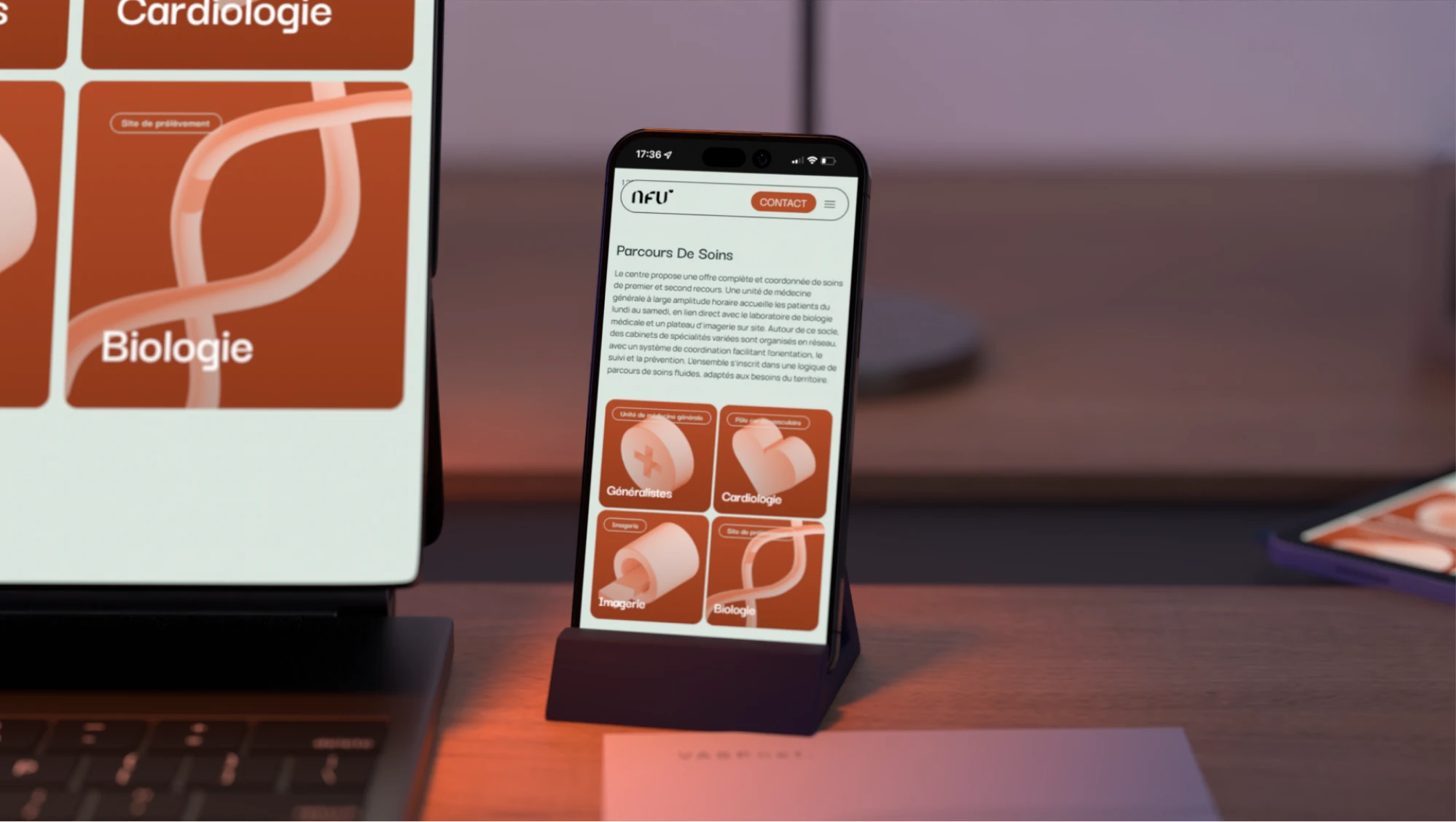
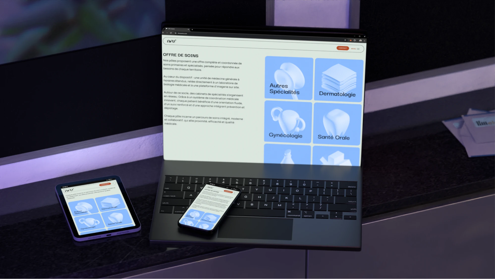
The 3D icons representing medical specialties (cardiology, gynecology, dermatology, research, and others) went through many redesigns to stay easily recognizable without excessive detail or realism that could potentially become too graphic.
Solutions tested

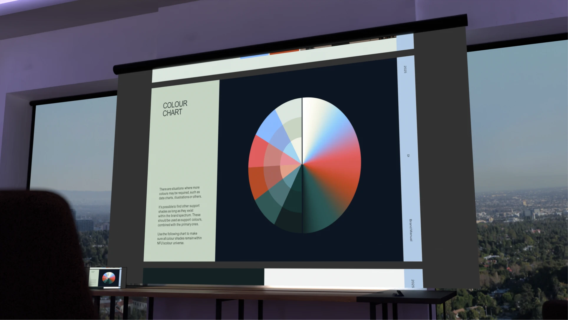
Earthy tones over pastel backgrounds

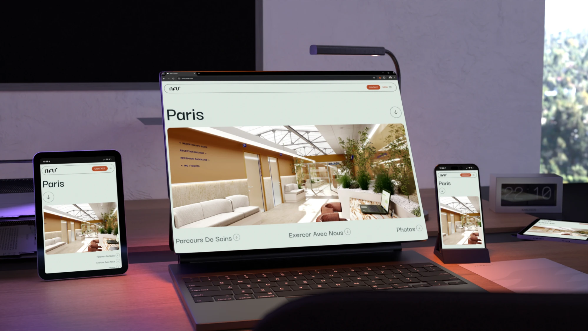
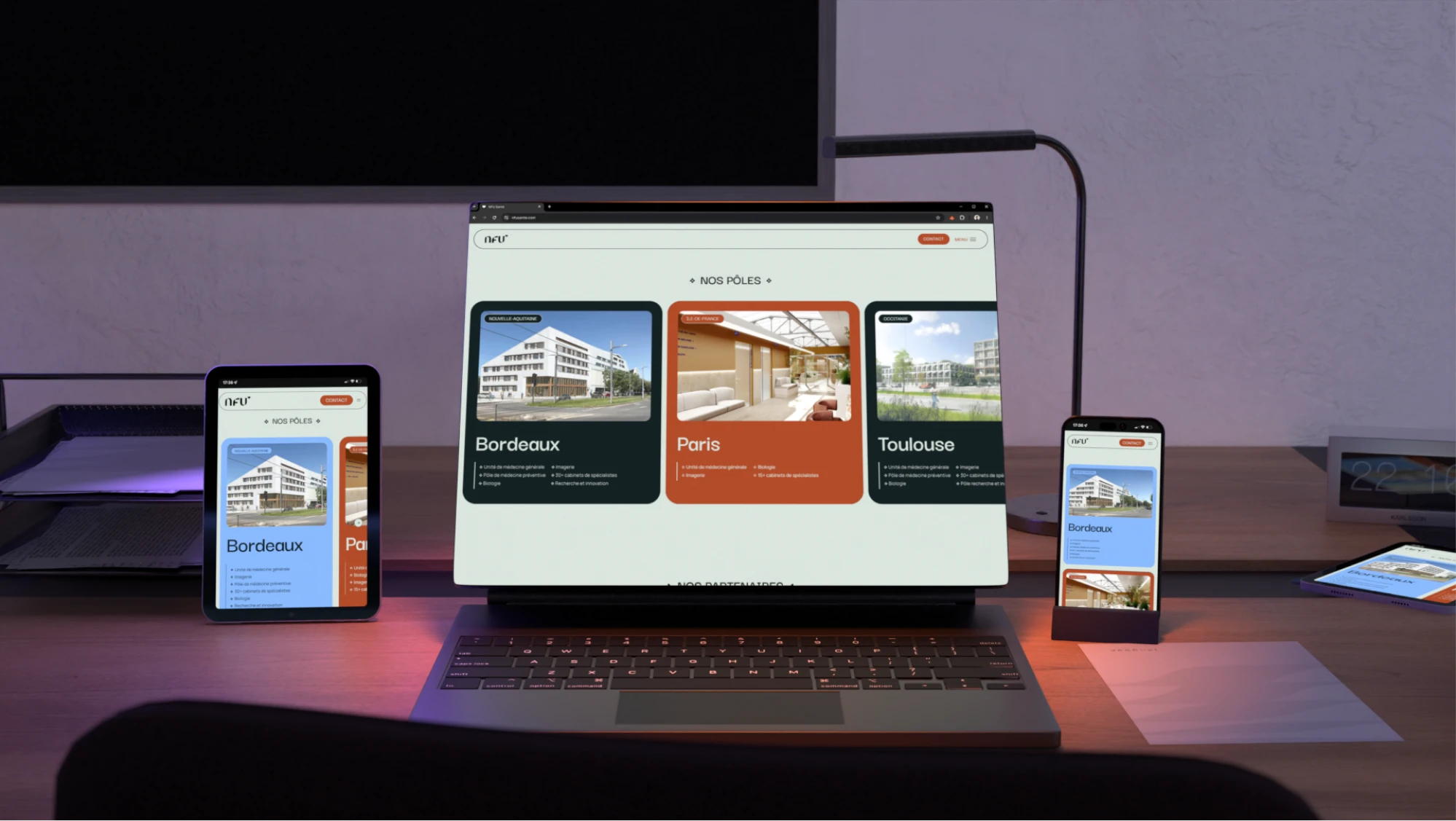
Strategic color contrast paired earthy tones with pastel backgrounds, creating strength without losing gentleness, and keeping the overall brand environment light across decks and the website.

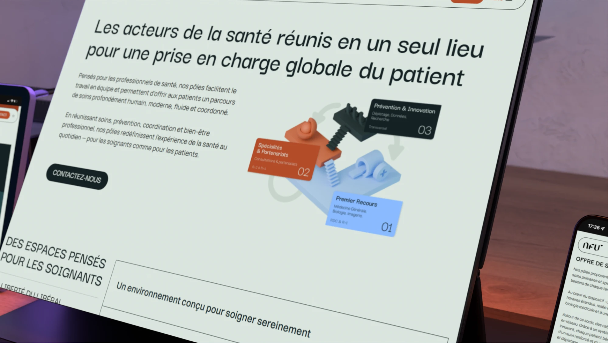
Satisfying Smooth 3D illustrations

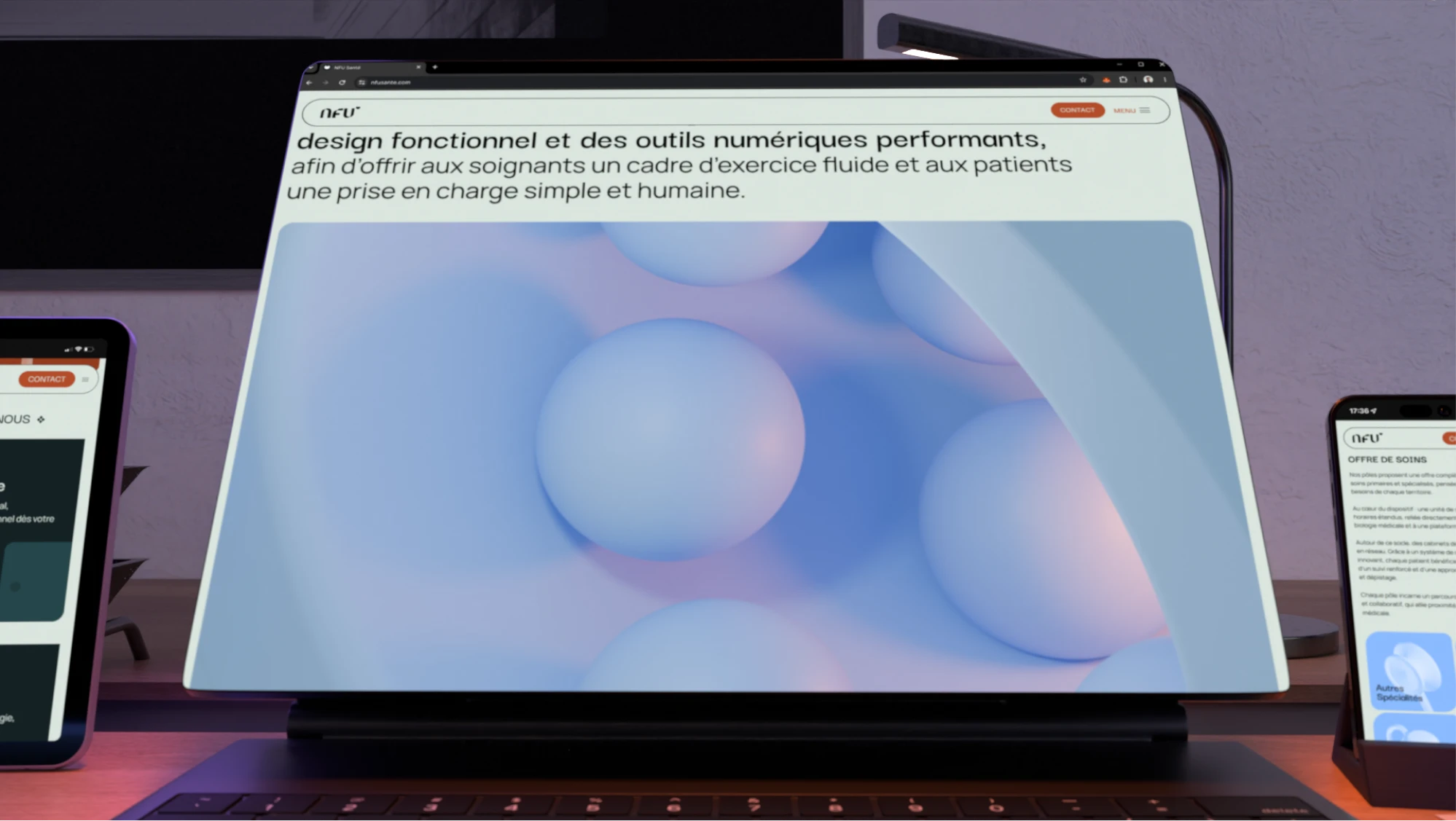
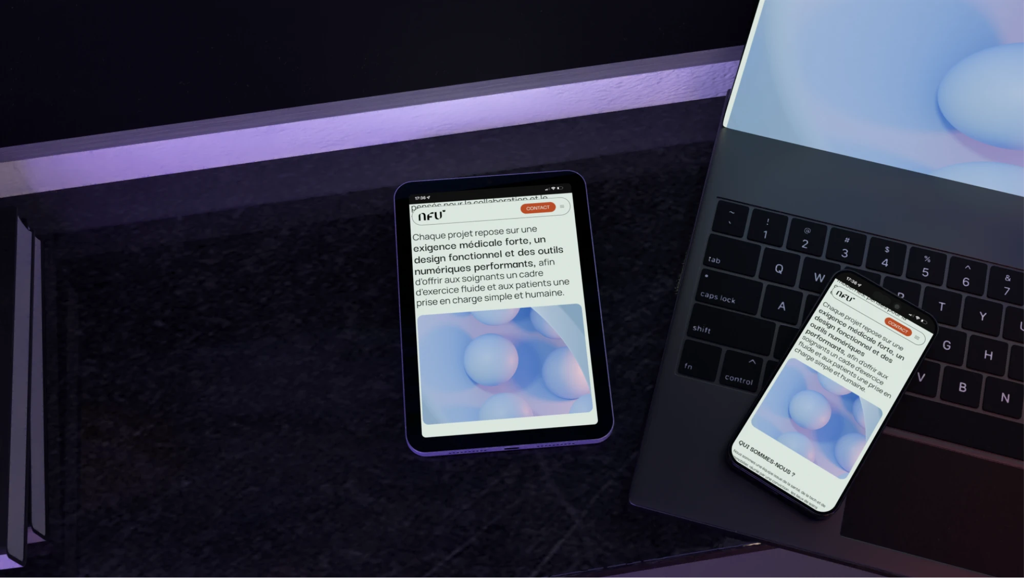
3D illustrations were kept smooth and free of disruptive textures, supporting the overall sense of harmony the team aimed for throughout the project.

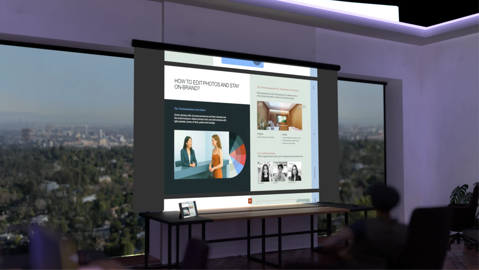
Bright human-centered photography

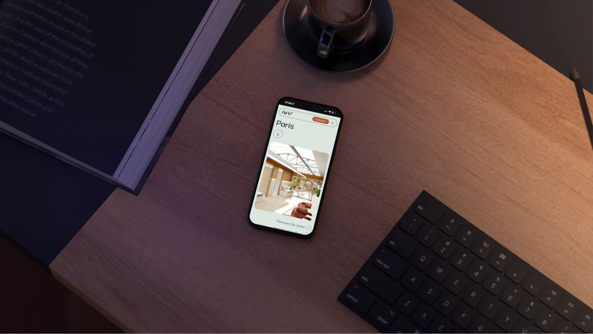
Photography was curated in a light, bright style featuring people, adding a human, approachable dimension that was essential to the brand.

Geometric shapes for clarity and harmony

Geometric shapes were used to support illustrations and text throughout the system, since geometry naturally reads as clear, objective, and balanced. Combined with the color contrast, smooth 3D, and photography, it tied the entire identity into one harmonious whole.

Designing for harmony

The final identity resolves NFU Santé's core tensions through one consistent principle: harmony. Earthy tones set against pastel backgrounds bring strength without losing gentleness, while smooth 3D illustrations and light, human photography keep the system calm, cohesive, and approachable.

Geometric shapes tie the supporting illustrations and text together, reinforcing clarity and objectivity. Together, these choices give NFU Santé a visual language that feels exclusive yet welcoming, minimal yet playful, and precise without losing its human side, perfectly representing their health centers.
‍
Related Work
Contact us

Are you looking for something similar?

Get in touch to discuss a solution for your project.
Let’s talk