Building trust into crypto compliance

Client

VASPnet

Services

Branding

Building trust into crypto compliance

Client

VASPnet

Services

Branding

Overview
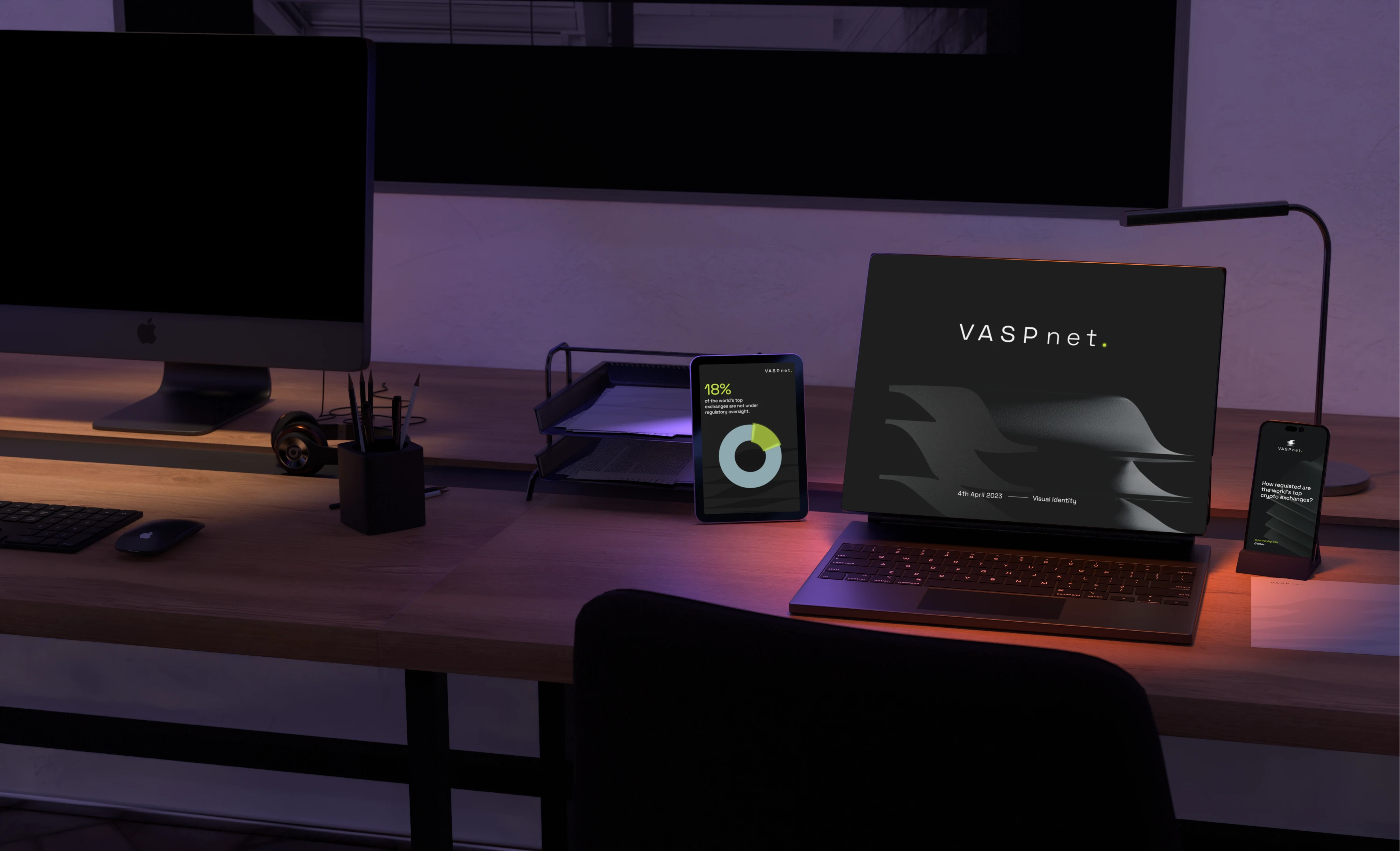
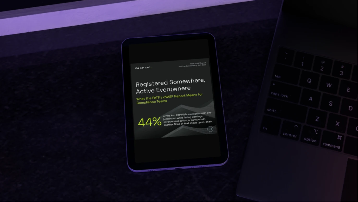
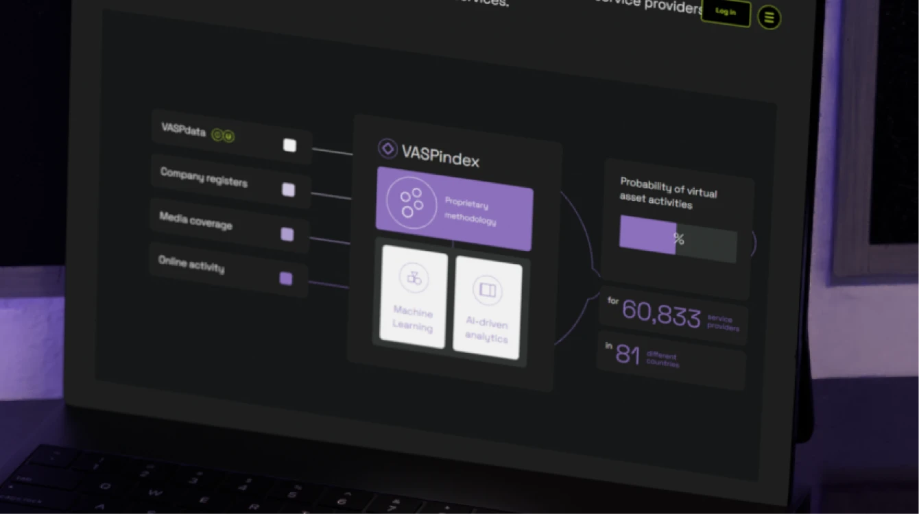
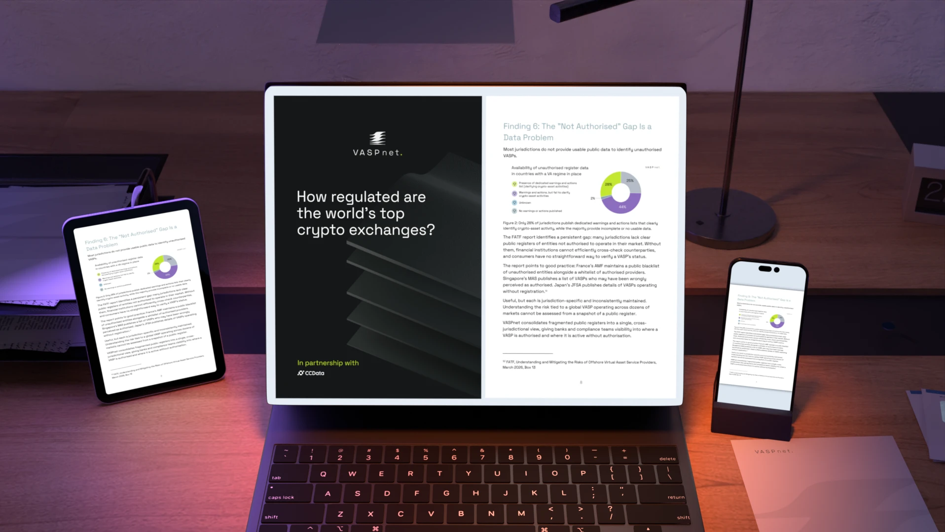
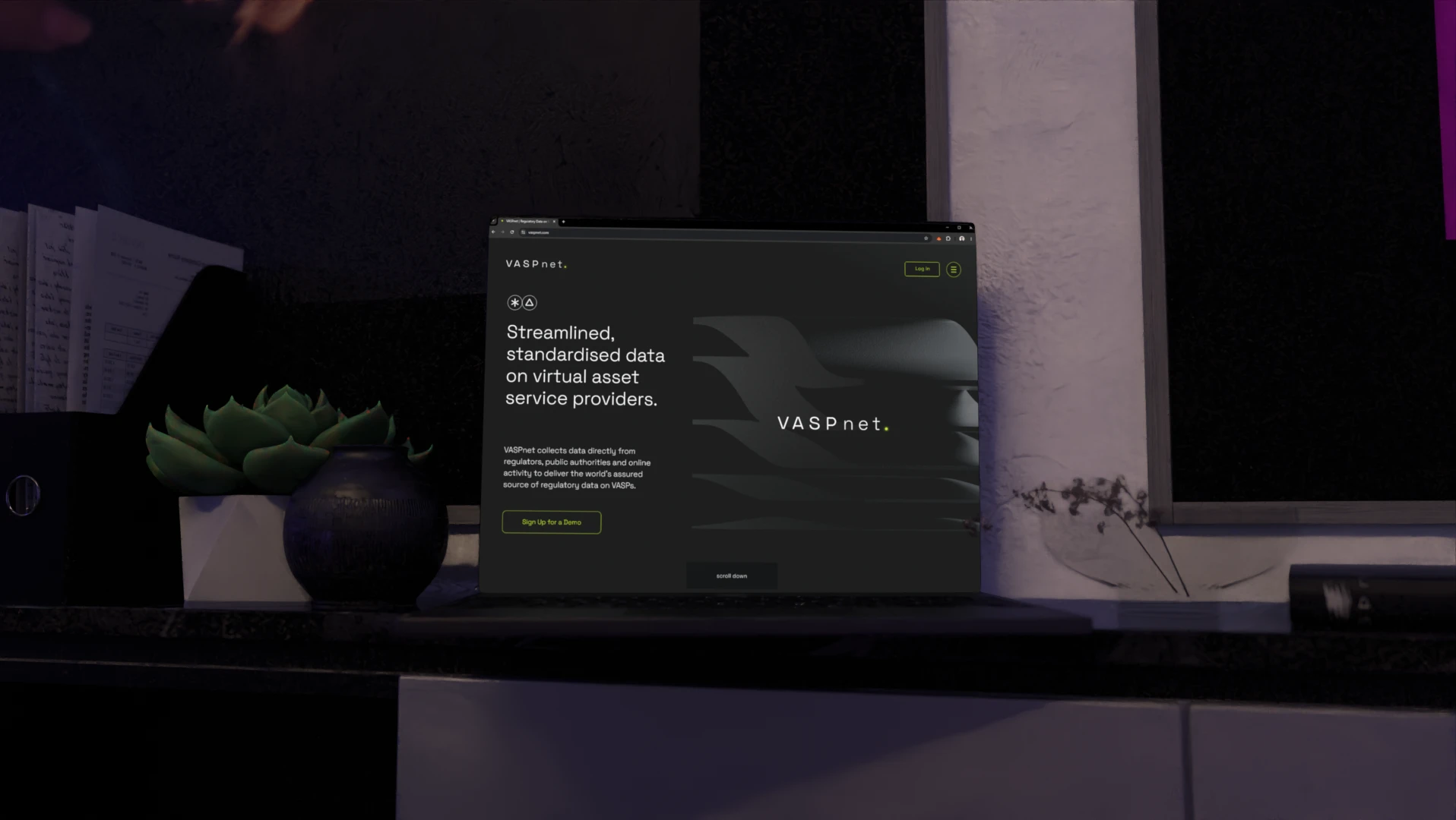
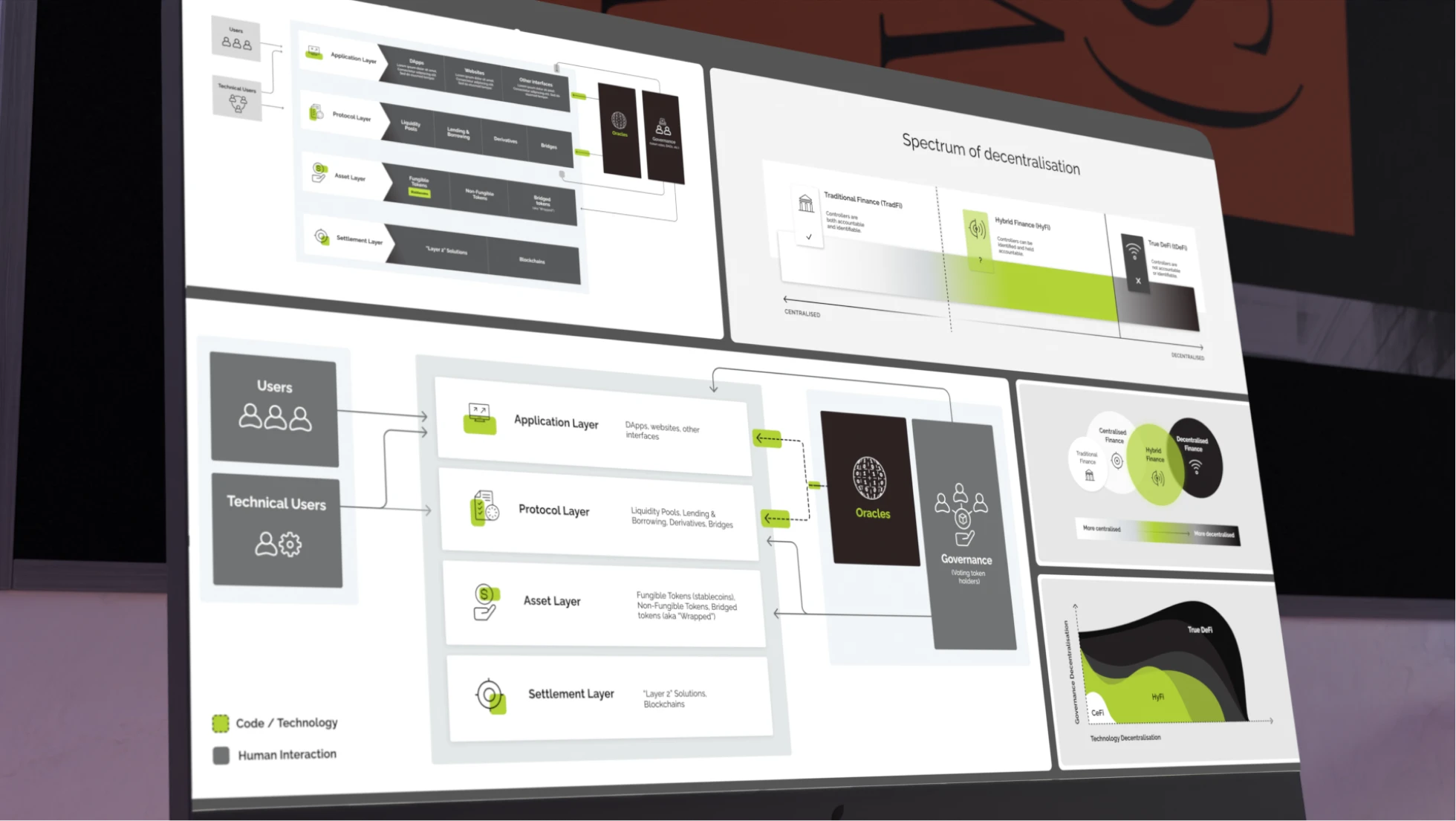
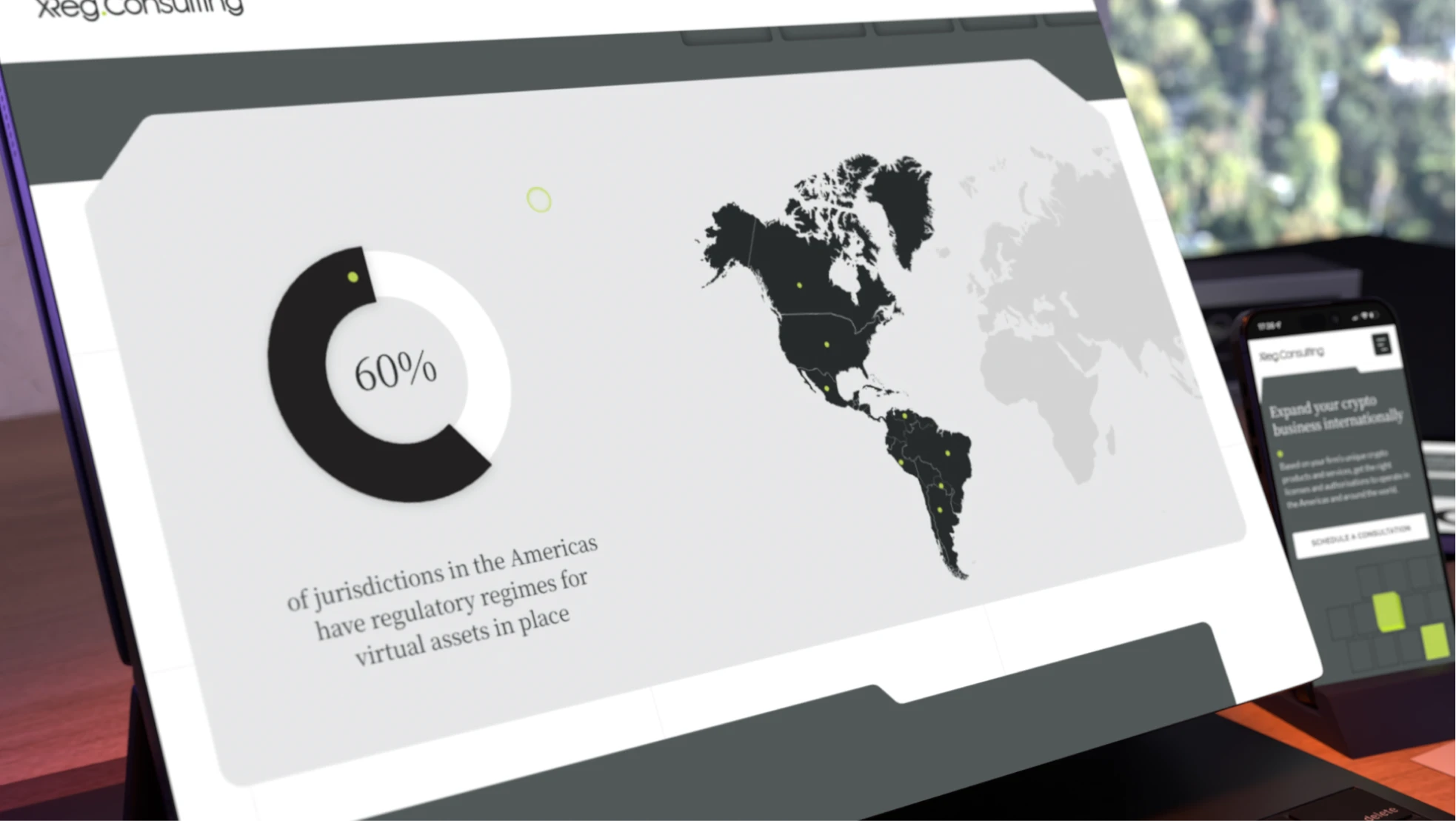
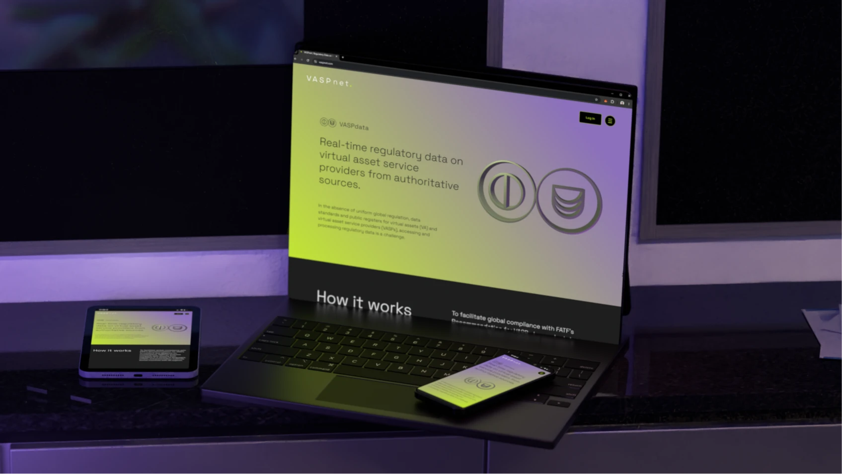
VASPnet provides businesses with access to regulatory data collected from multiple sources and regulators, enabling them to vet counterparties and meet compliance obligations. Our team developed a complete brand identity and custom website that translates VASPnet's mission into a visual language rooted in trust, reliability, and clarity.

Date
May 2023
Duration
3 to 5 months
Pricing range
3k to 5k

The plan

Timeline

Strategy

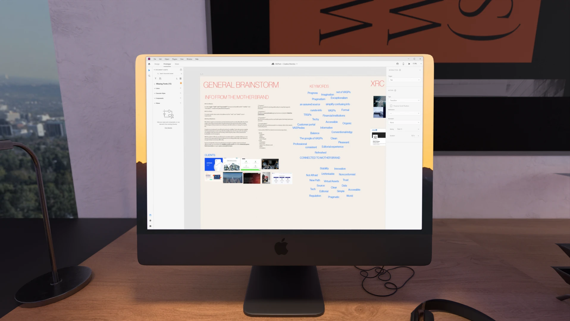
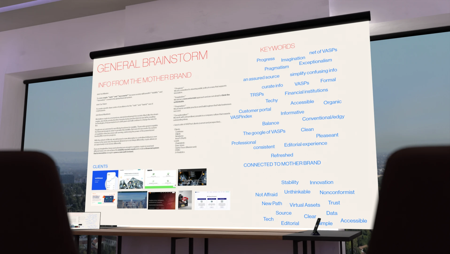
Explored VASPnet's products, mission, and industry language

Drafting & Reviews

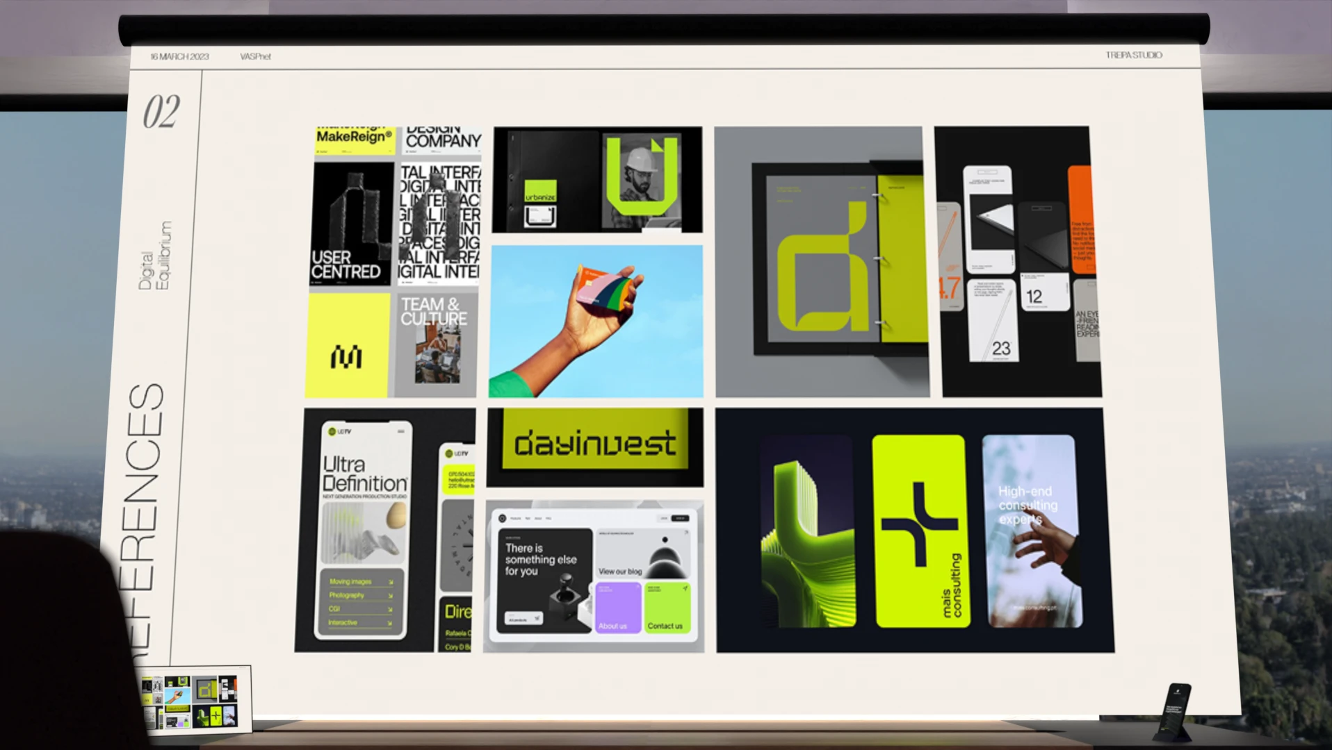
Drafted, presented, and refined logo and moodboard options

Development

Built the full brand system: colors, type, icons, guidelines

Delivery & Support

Delivery of source files. Team and developer handover

Pain points & solutions

The challenge was communicating trust and regulatory compliance without the dark, suspicious visual tropes common in crypto branding, while finding a symbol abstract enough to stay flexible yet still feel recognizable.
Like many companies in the crypto sector, VASPnet risked being perceived as 'dark' or secretive, the opposite of the compliance, transparency, and regulatory trust it needed to project to regulators and clients alike.
Technical terms paired with the crypto industry's typically dark visual language, made it unclear how to communicate VASPnet's compliance-first mission clearly to a broader, non-technical audience from the Traditional Finance sectors.
The brand needed a visual symbol abstract enough to stay flexible across VASPnet's two products, yet recognizable enough that it wouldn't feel unfamiliar or strange to a reader or potential client encountering it.
Solutions tested

Dark branding with a balance

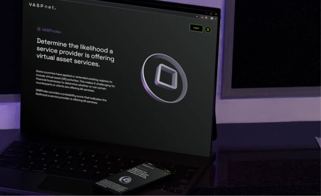
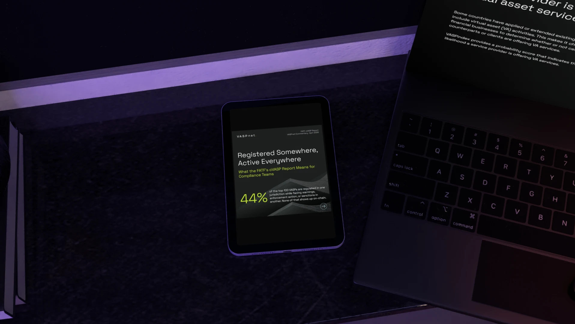
The team opted for dark branding to remain familiar within the crypto space, balanced by a strong sans-serif typeface (Space Grotesk) and a deliberate avoidance of complex illustrations typically associated with the sector.

Smooth 3D & lighter gradients

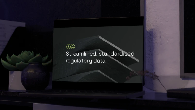
Smooth 3D elements were introduced to bring realism into the system, paired with lighter gradients and unconventional color combinations, such as green and purple, to create a more approachable feel for audiences from Traditional Finance.

Clear, objective iconography

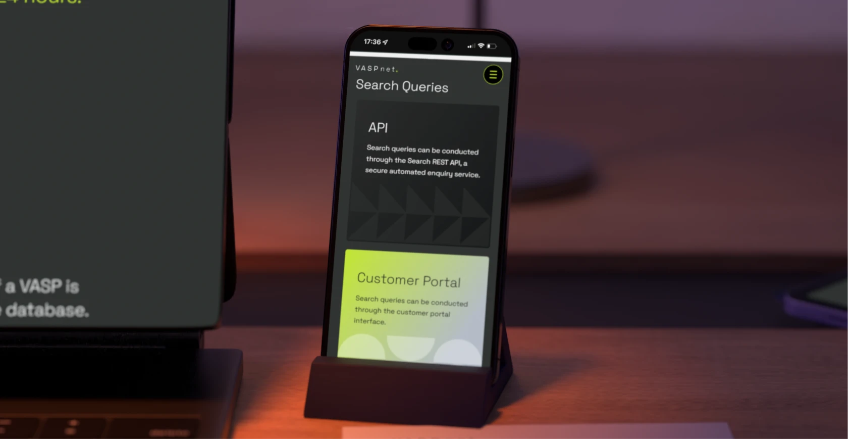
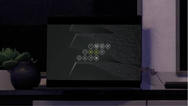
Icons were designed to be clear and immediately understandable. The only abstract icons represent VASPnet's two products, and are always paired with the product name and a custom 3D element to reinforce the connection.

A stabilizing wave logomark

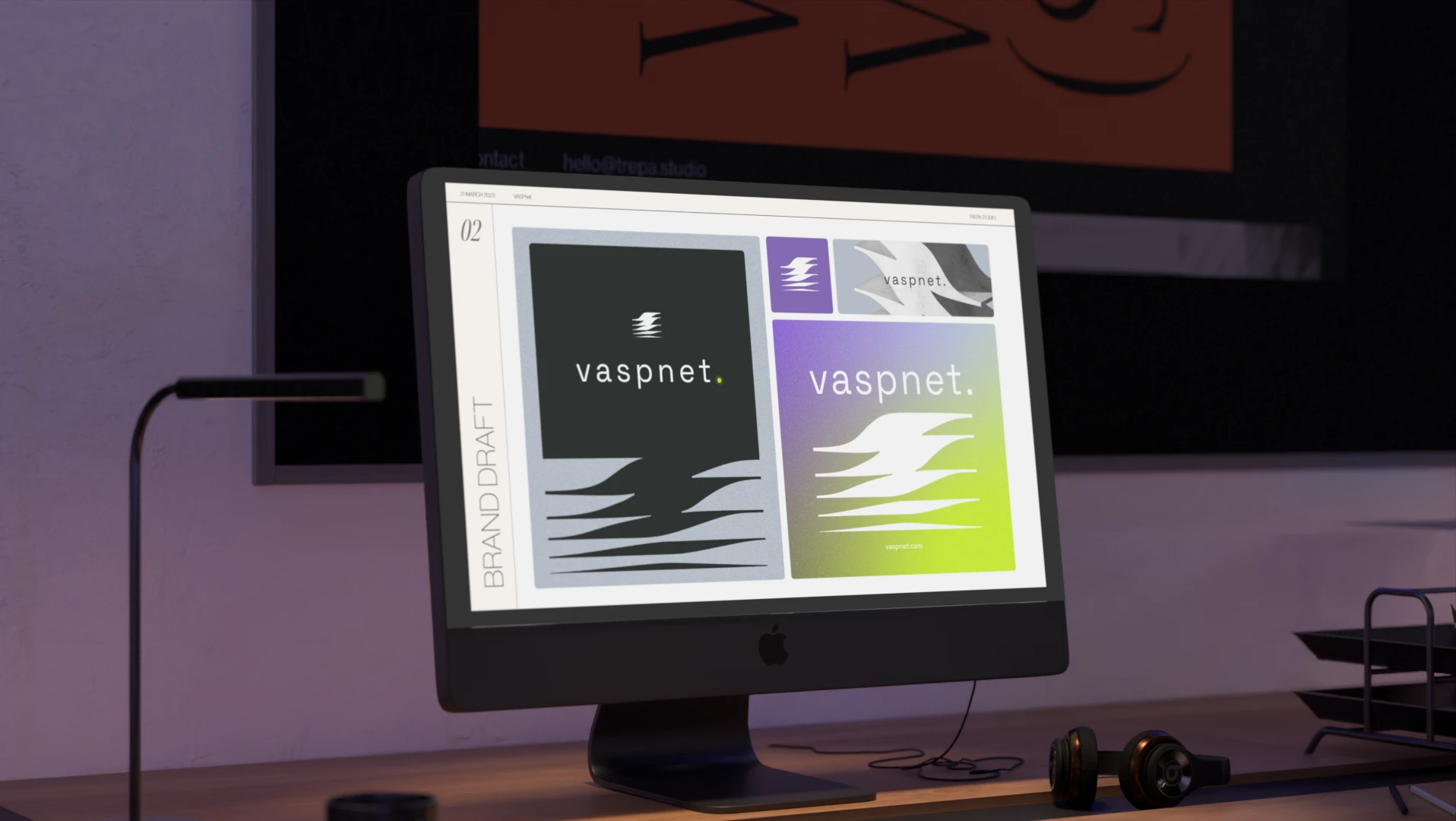
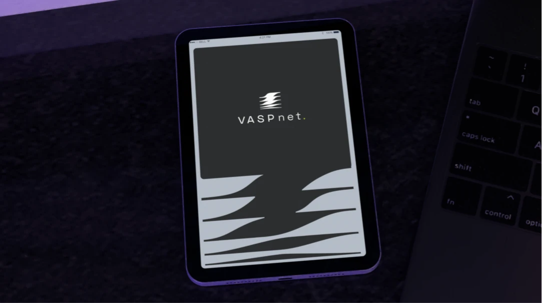
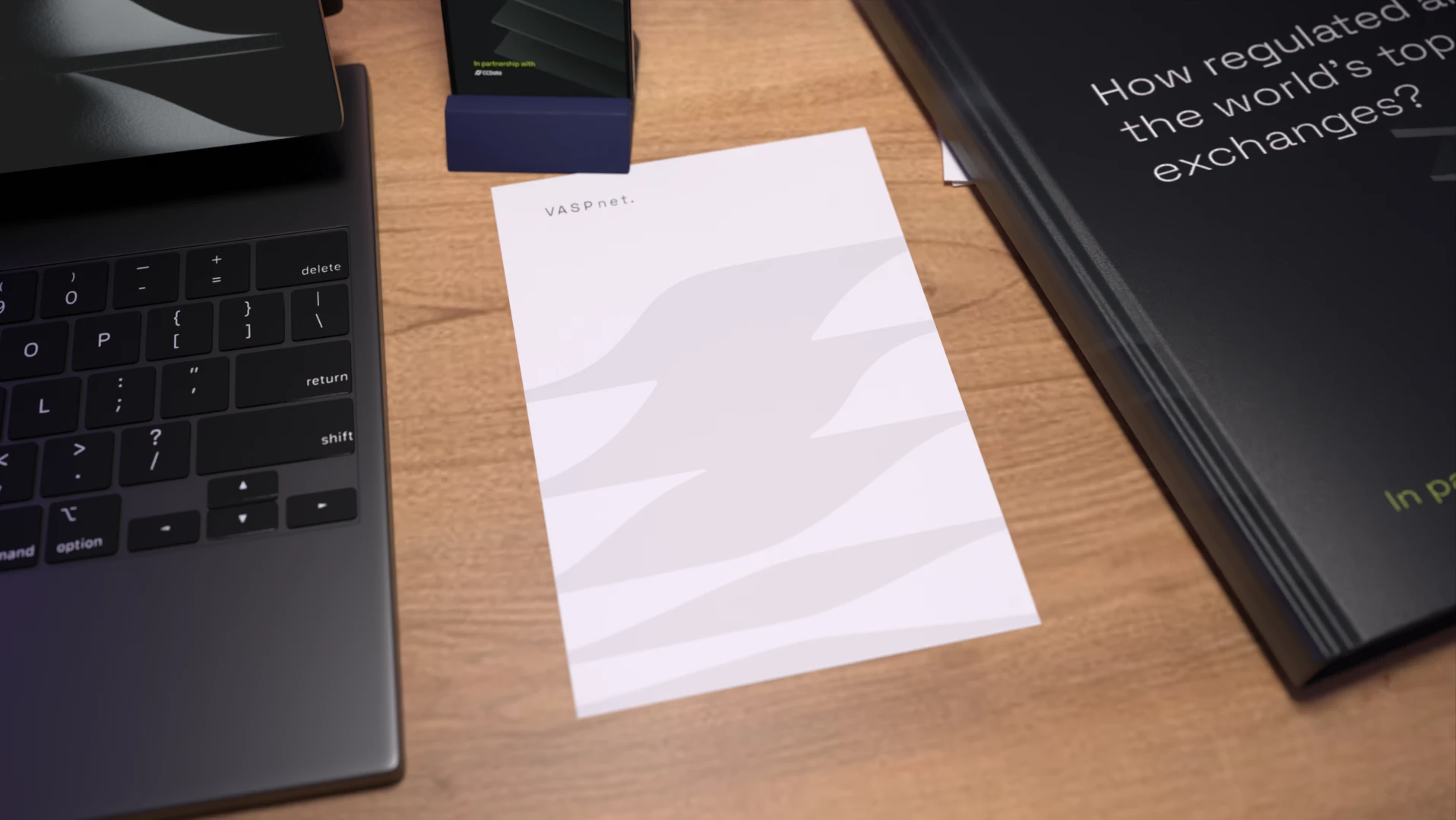
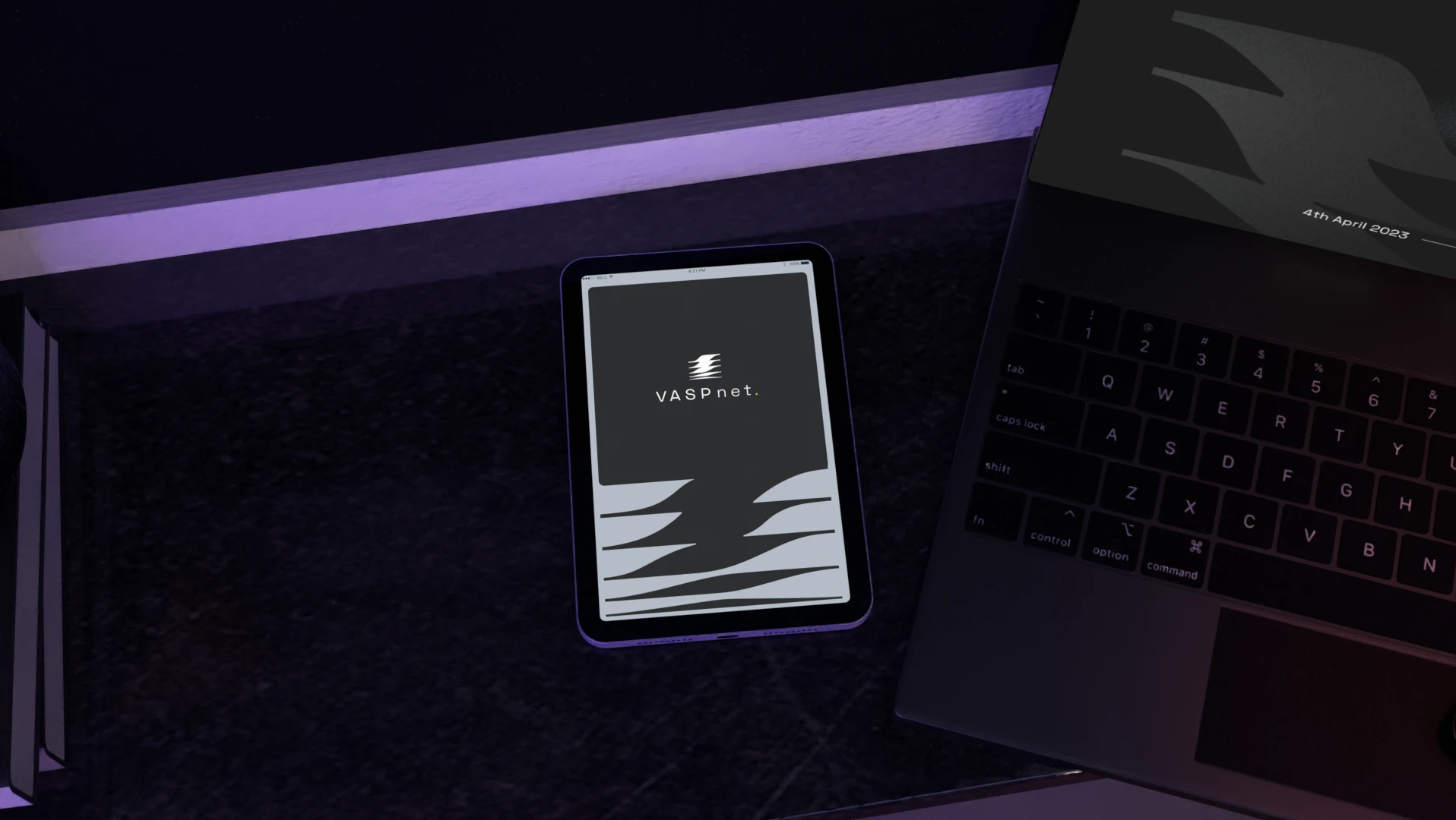
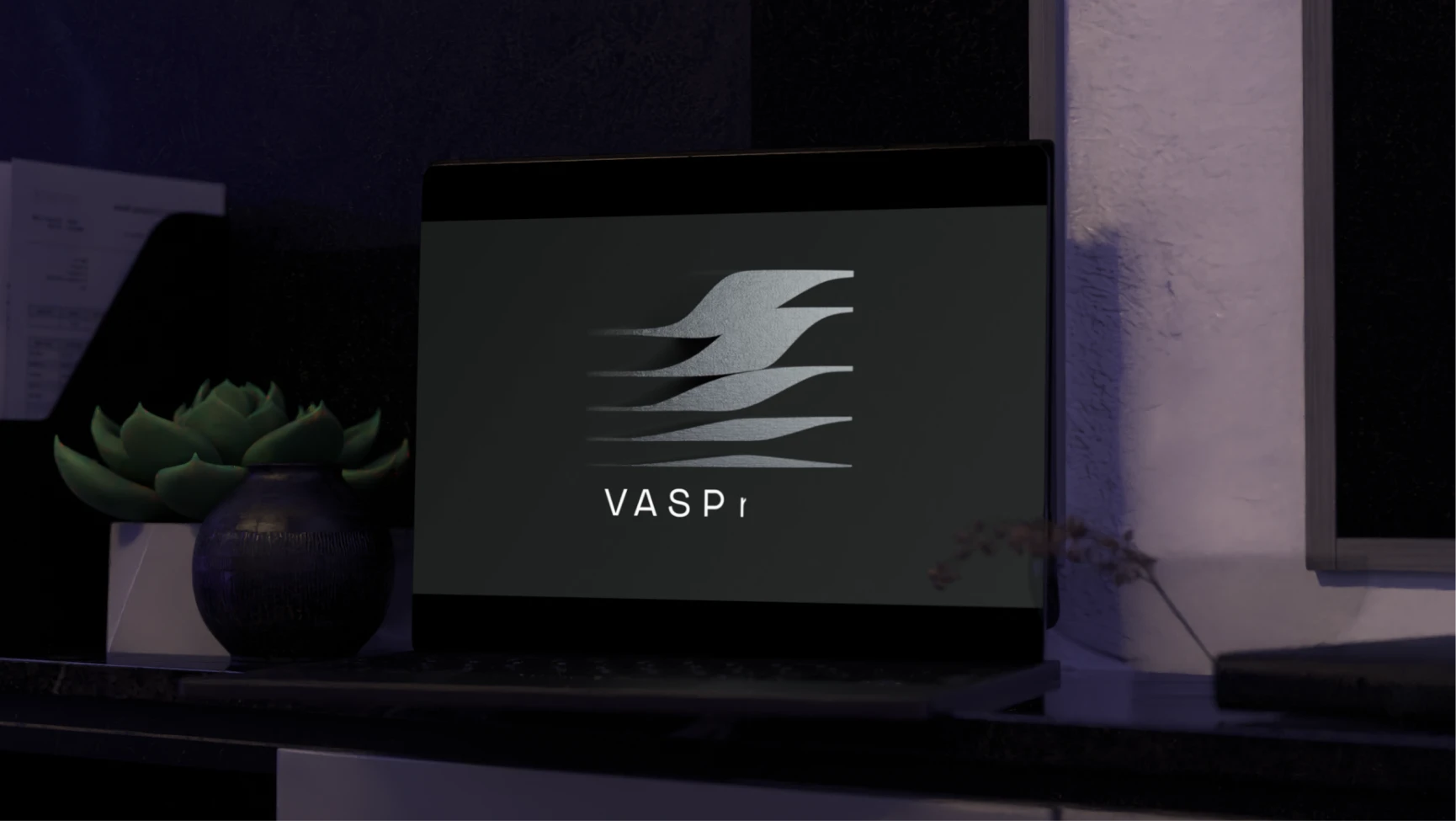
The logo takes a familiar shape, the wave, and reinterprets it with a stabilizing perspective, as it's founded on a solid ground, reflecting VASPnet's position as a regulatory consultant bridging stable regulation with the disruption of the crypto industries.

Expertise & innovation

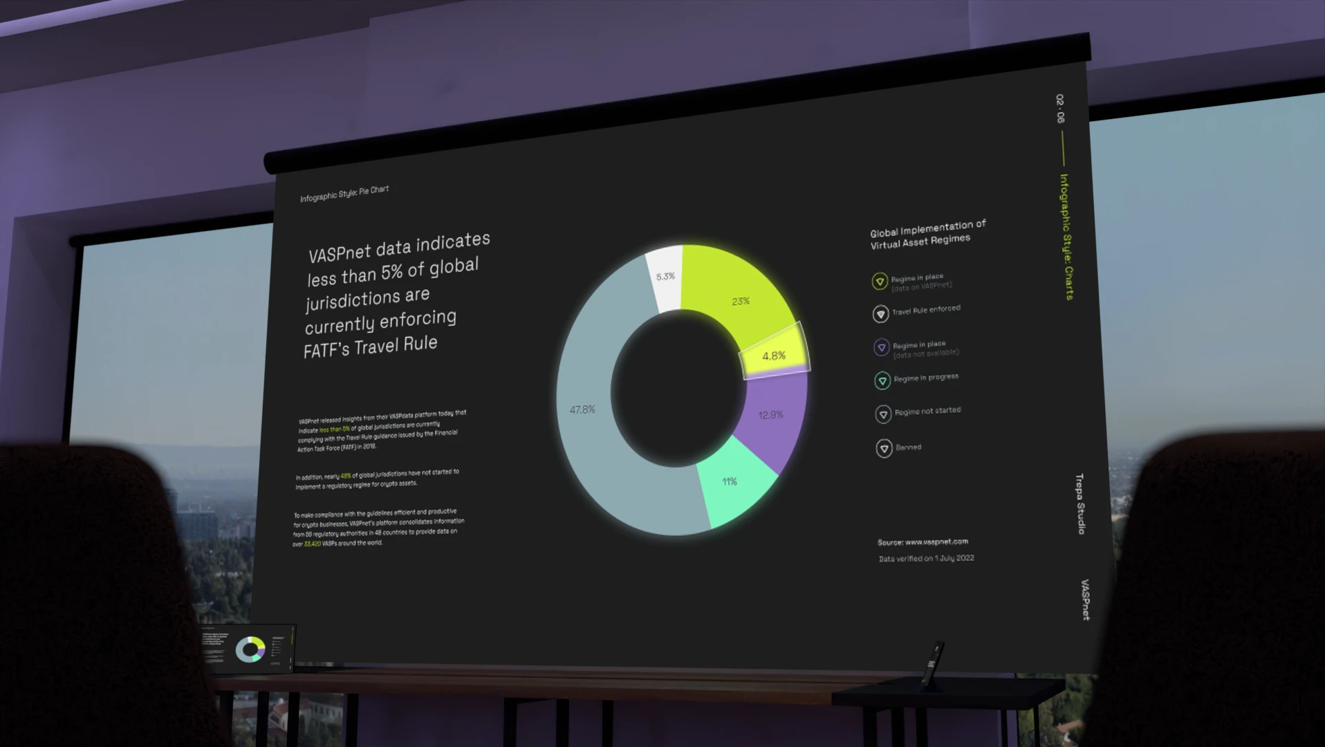
The final identity balances a dark, crypto-native base with a clean sans-serif typeface and smooth 3D elements, softening the sector's typical visual tone for audiences coming from Traditional Finance.
‍
Clear, objective iconography and a stable wave logomark reflect VASPnet's role bridging regulatory expertise with crypto innovation, by reframing the overall perspectives of both of these sectors, representing VASPnet's unique position within these markets.
‍
Together, these solutions translated the mission into a visual universe built on streamlining, trust, and reliability.
‍
Related Work
Contact us

Are you looking for something similar?

Get in touch to discuss a solution for your project.
Let’s talk