What does the future of payroll look like?

Client

Rise Works

Services

Branding

What does the future of payroll look like?

Client

Rise Works

Services

Branding

Overview
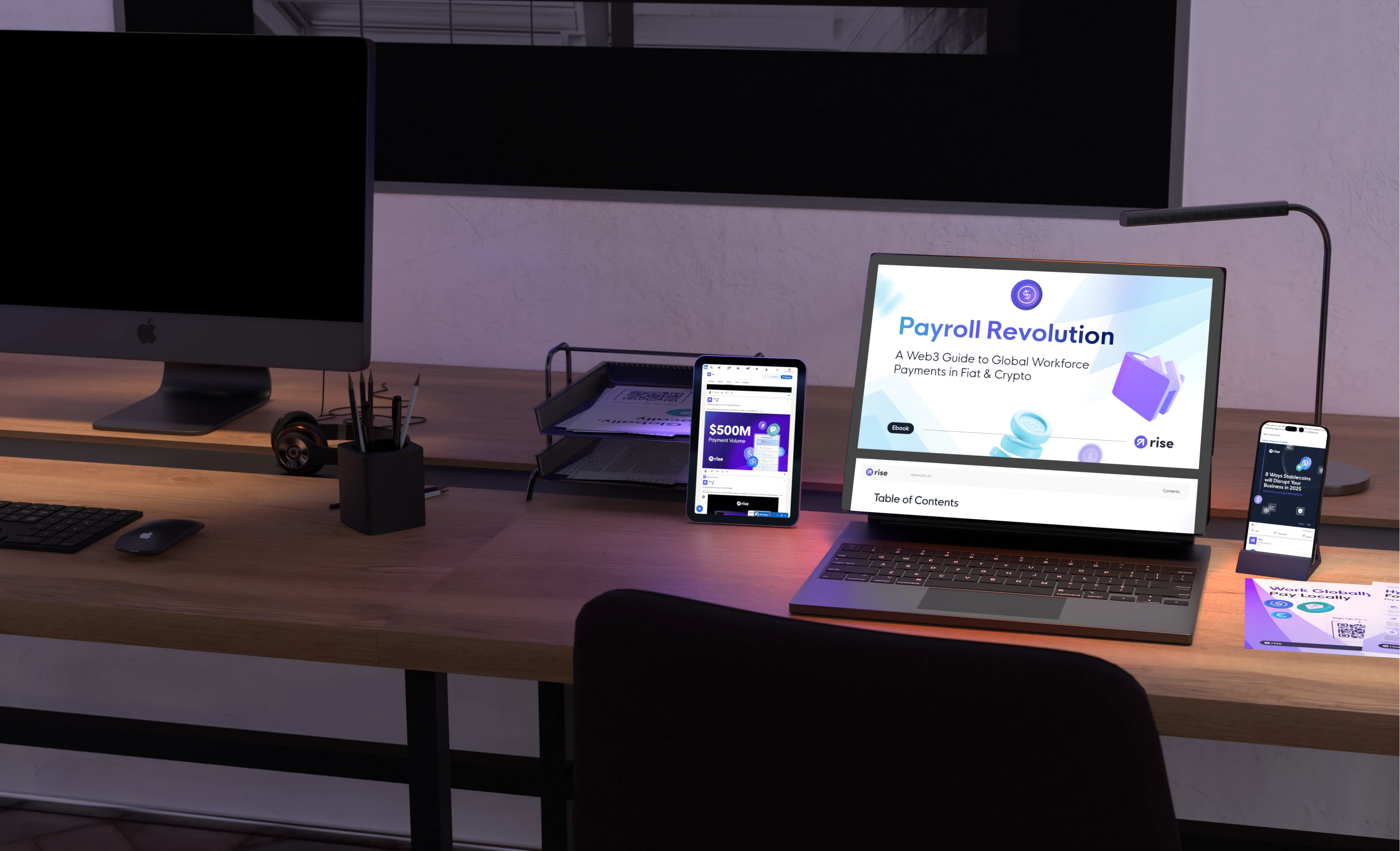
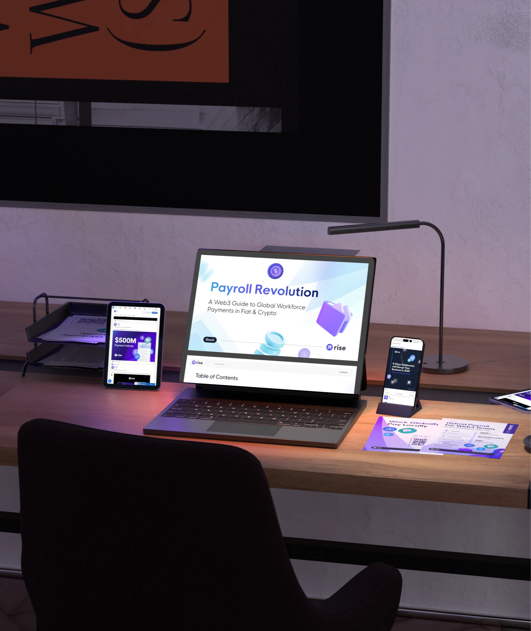
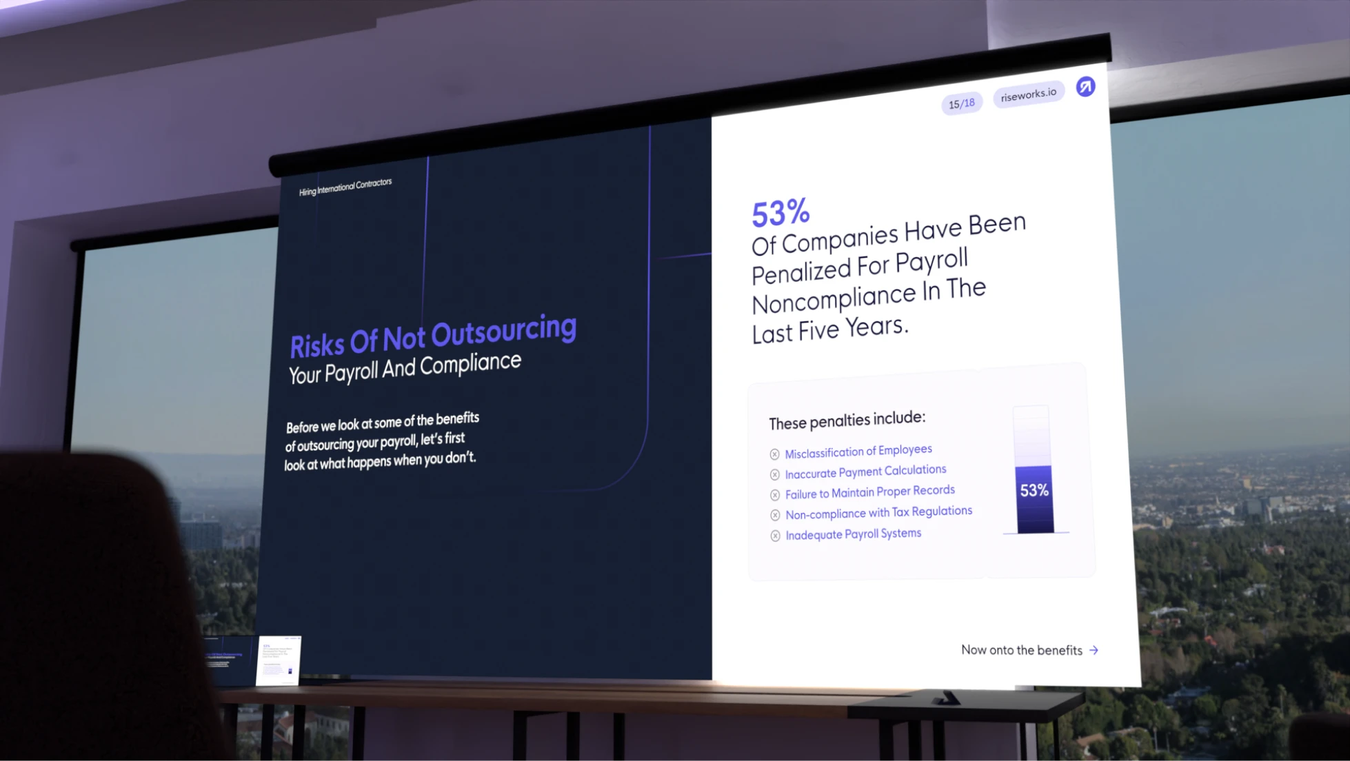
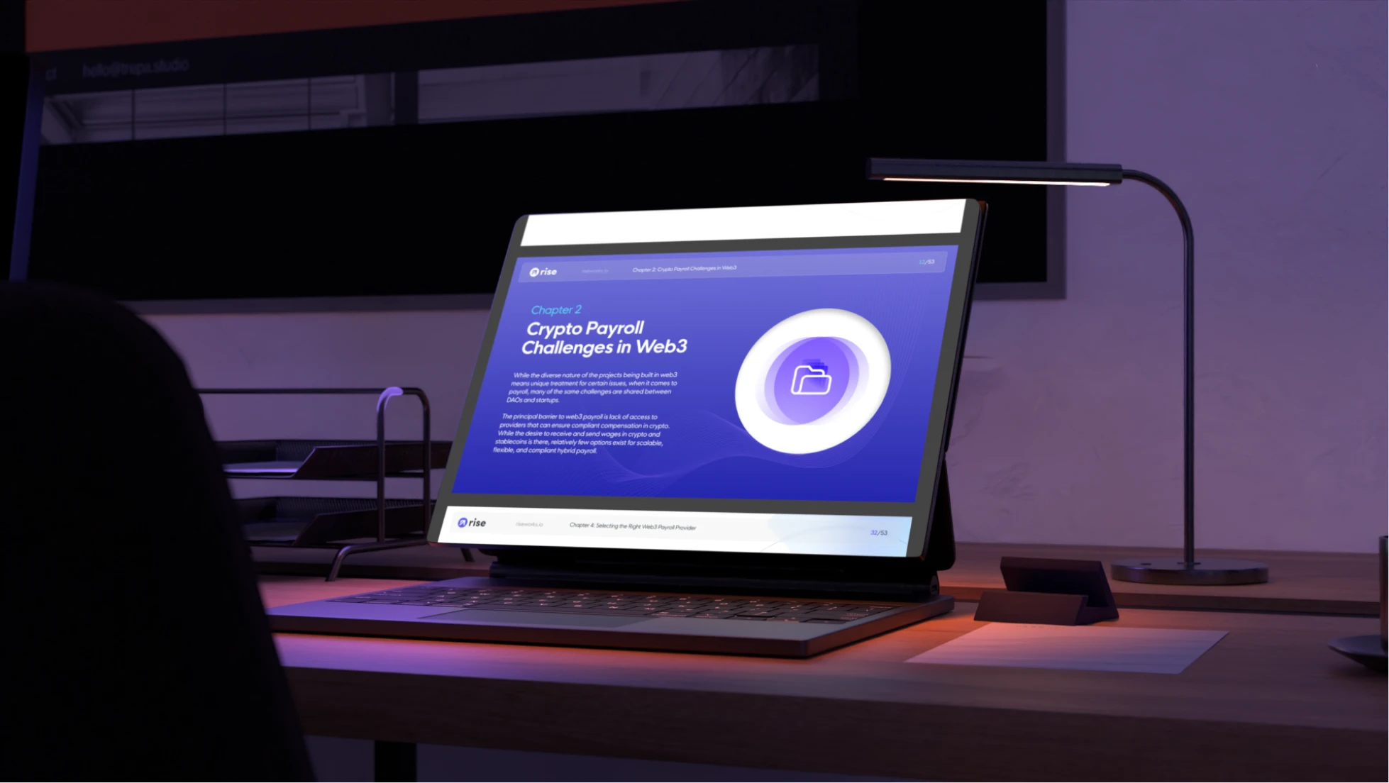
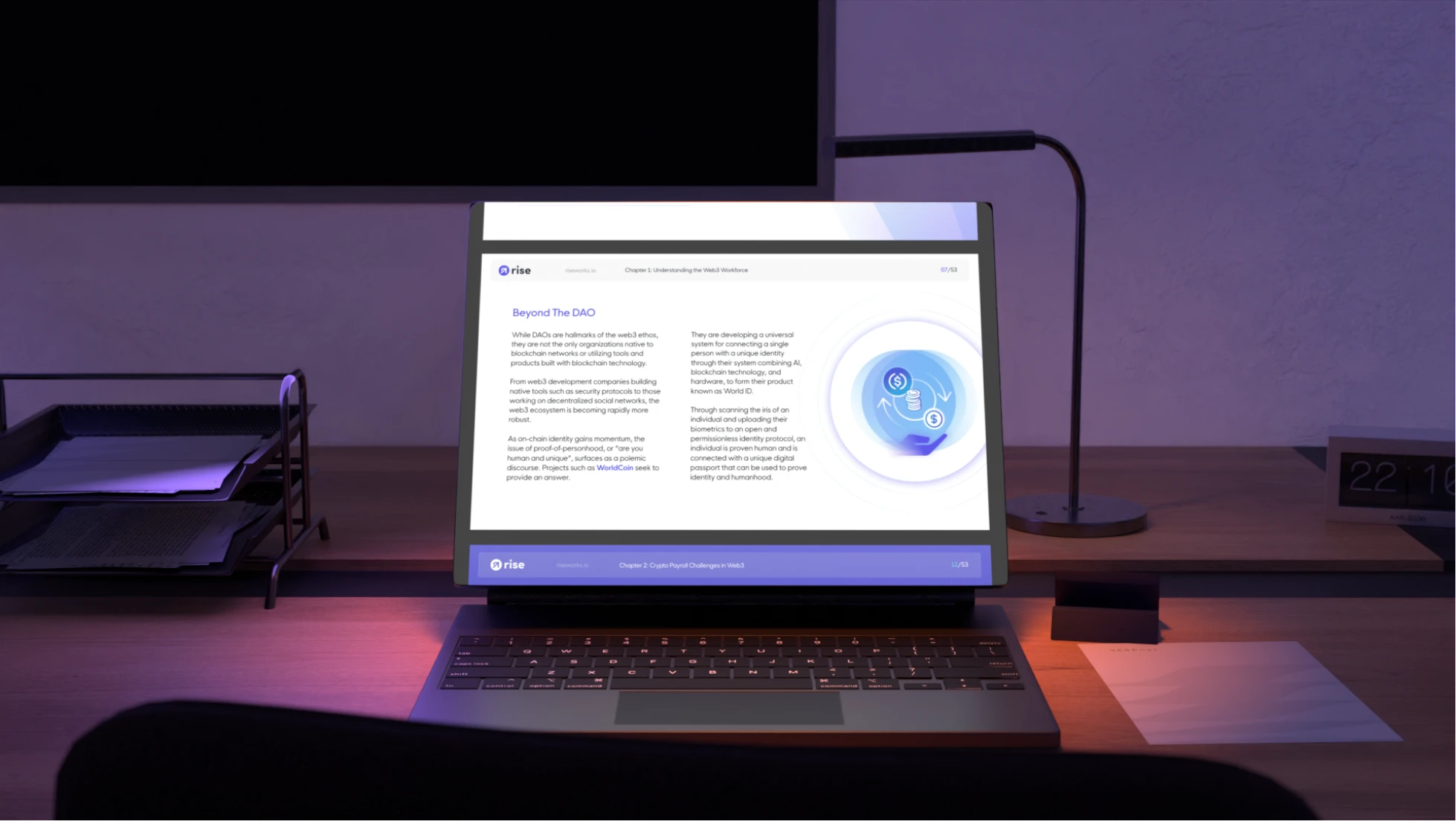
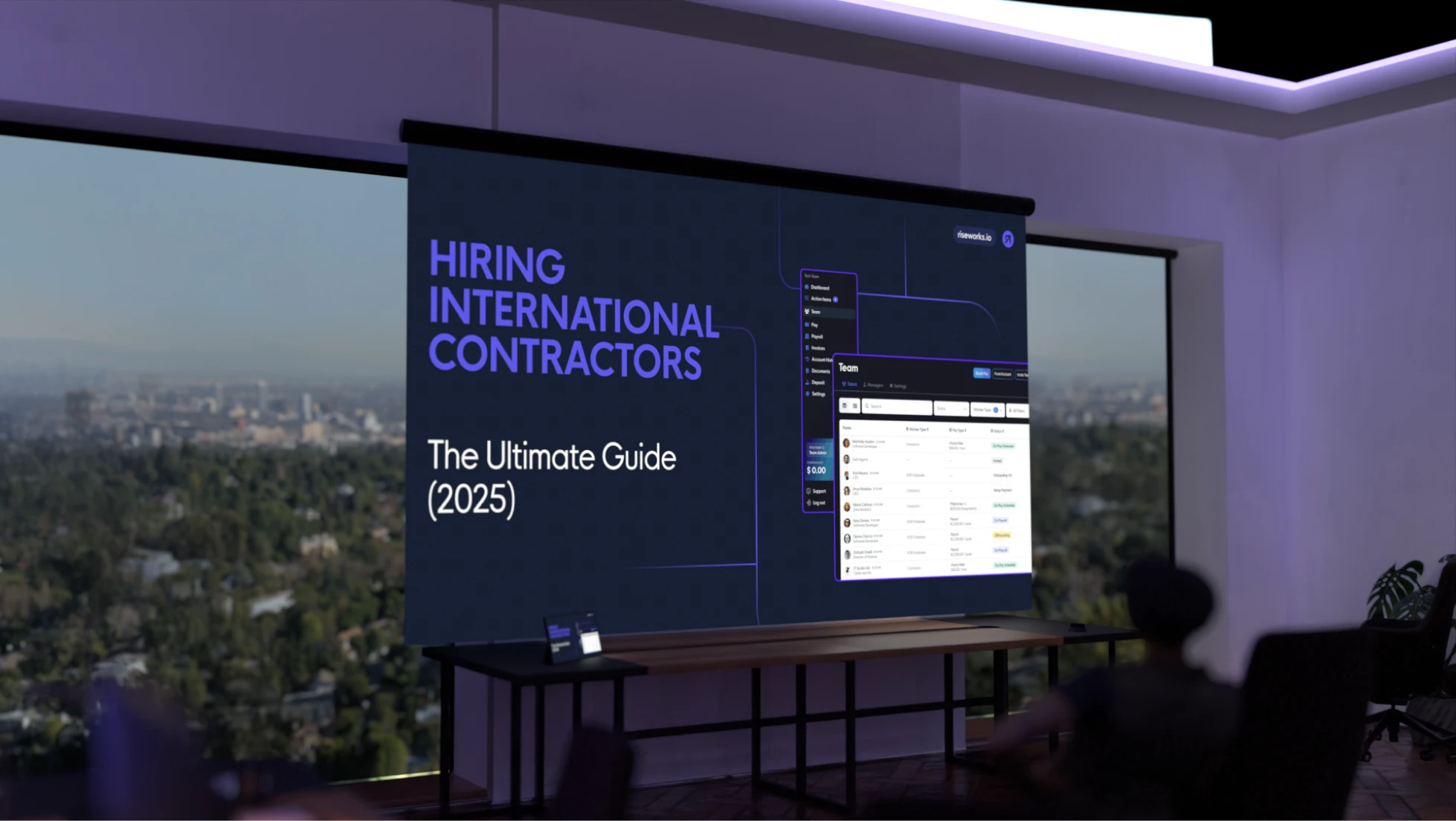
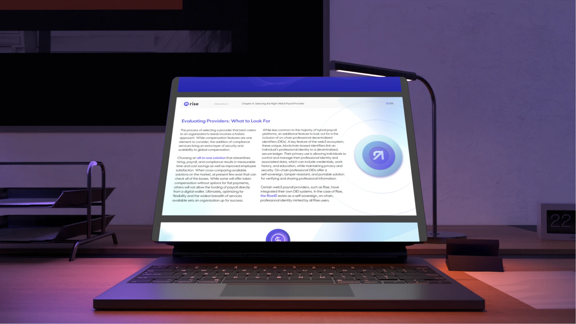
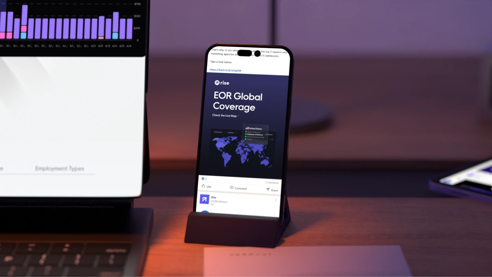
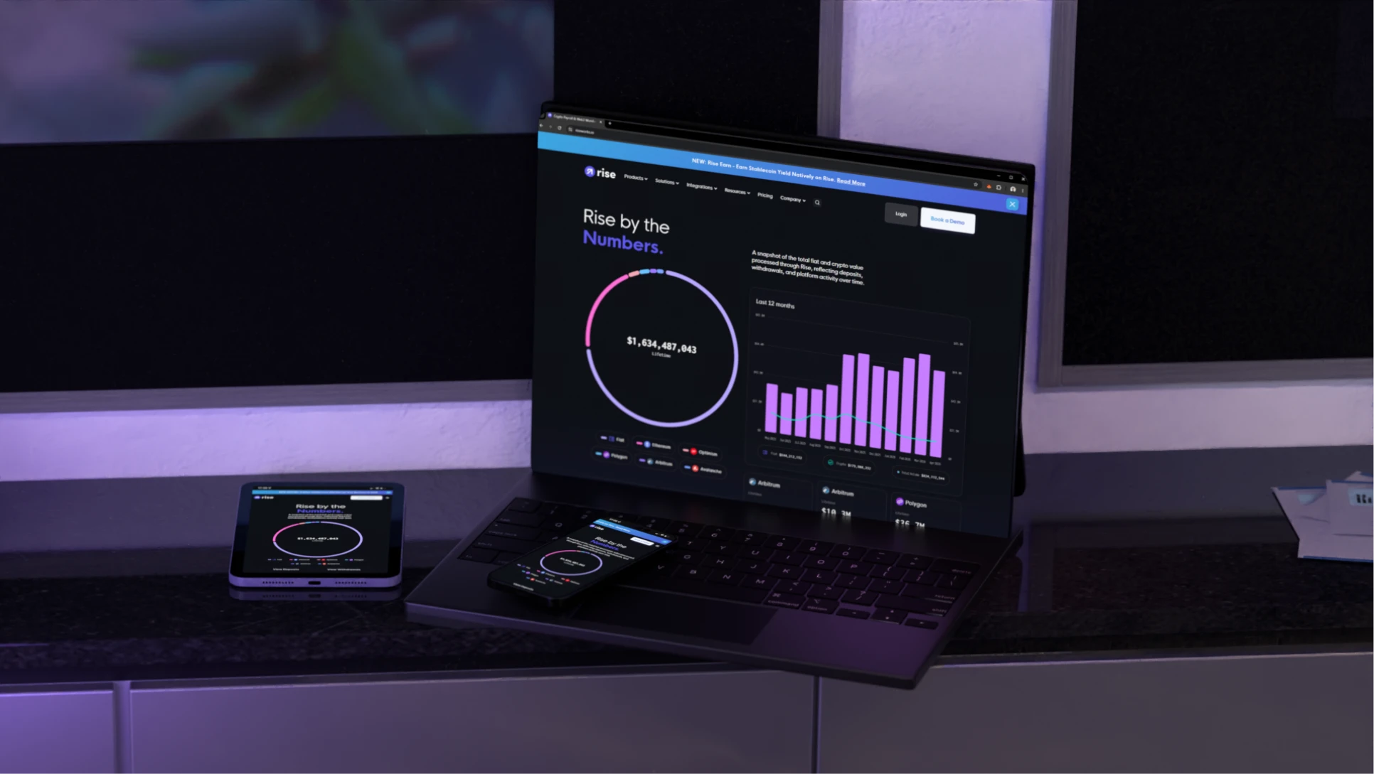
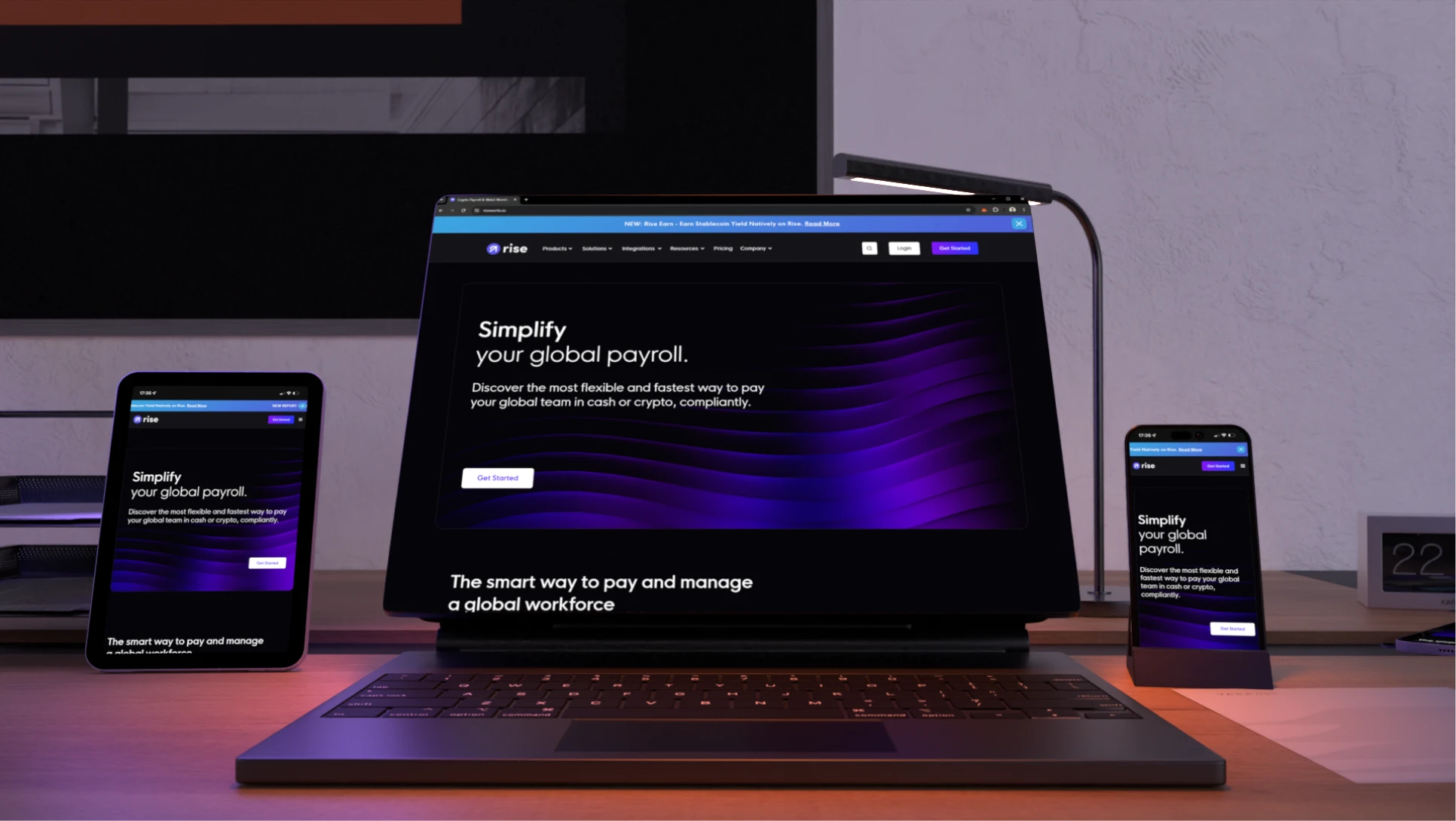
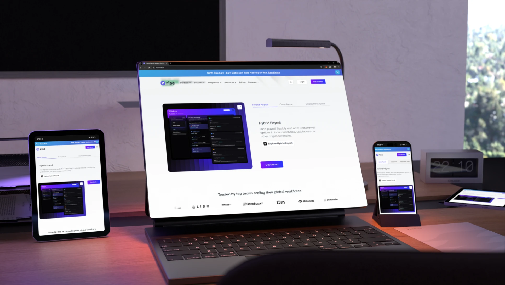
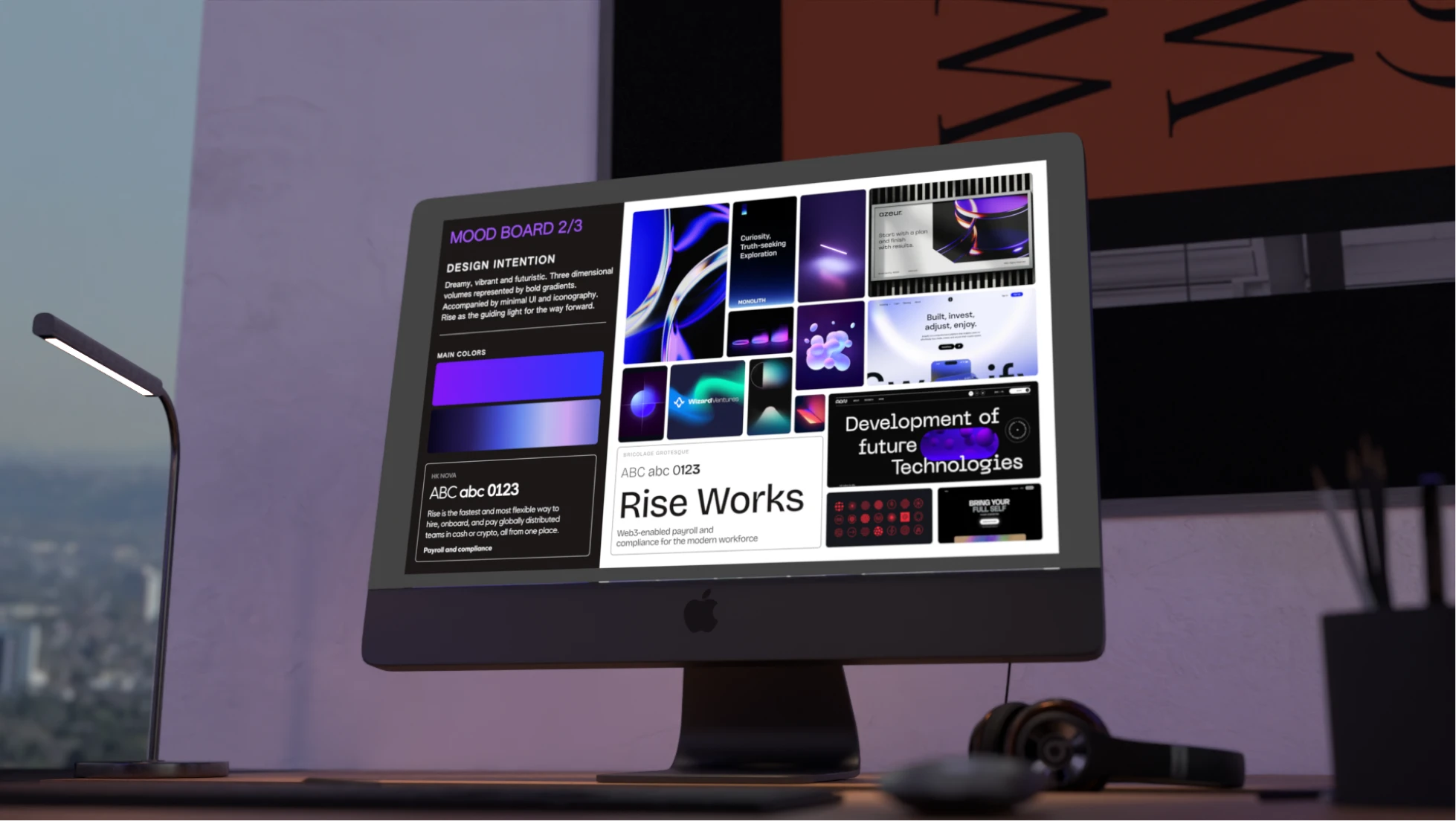
Rise provides global payroll infrastructure connecting traditional finance operations with modern digital asset workflows. As the company prepared to launch Rise 2.0, Trepa refreshed the brand identity while keeping its existing logo, creating a more innovative, future-facing visual language reflecting the evolution of the product and the company.
Date
Oct 2025
Duration
1 to 3 months
Pricing range
5k to 10k

The plan

Timeline

Strategy

Defined how Rise's future vision could live beyond the logo

Drafting & Reviews

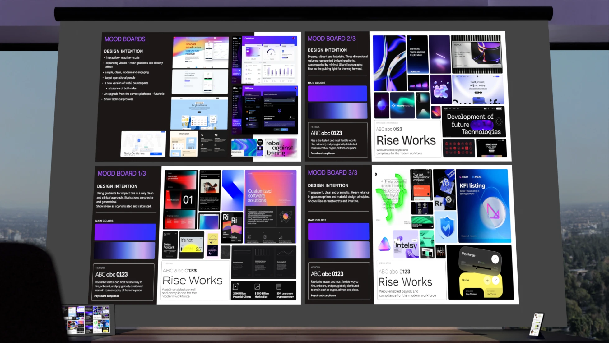
Explored multiple moodboards to align on the right direction

Development

Built new assets, systems, textures, and brand applications

Delivery & Support

Organized, exported, and documented the full asset library

Pain points & solutions

Bringing Rise into its next chapter required balancing innovation with familiarity. The brand had to appeal to both web2 and web3 professionals, while supporting a rapidly evolving product ecosystem.
Finding the right creative direction required extensive iteration. Early concepts often leaned too heavily toward web3 aesthetics or became too conventional, making it difficult to create a visual language that resonated with thet target audiences
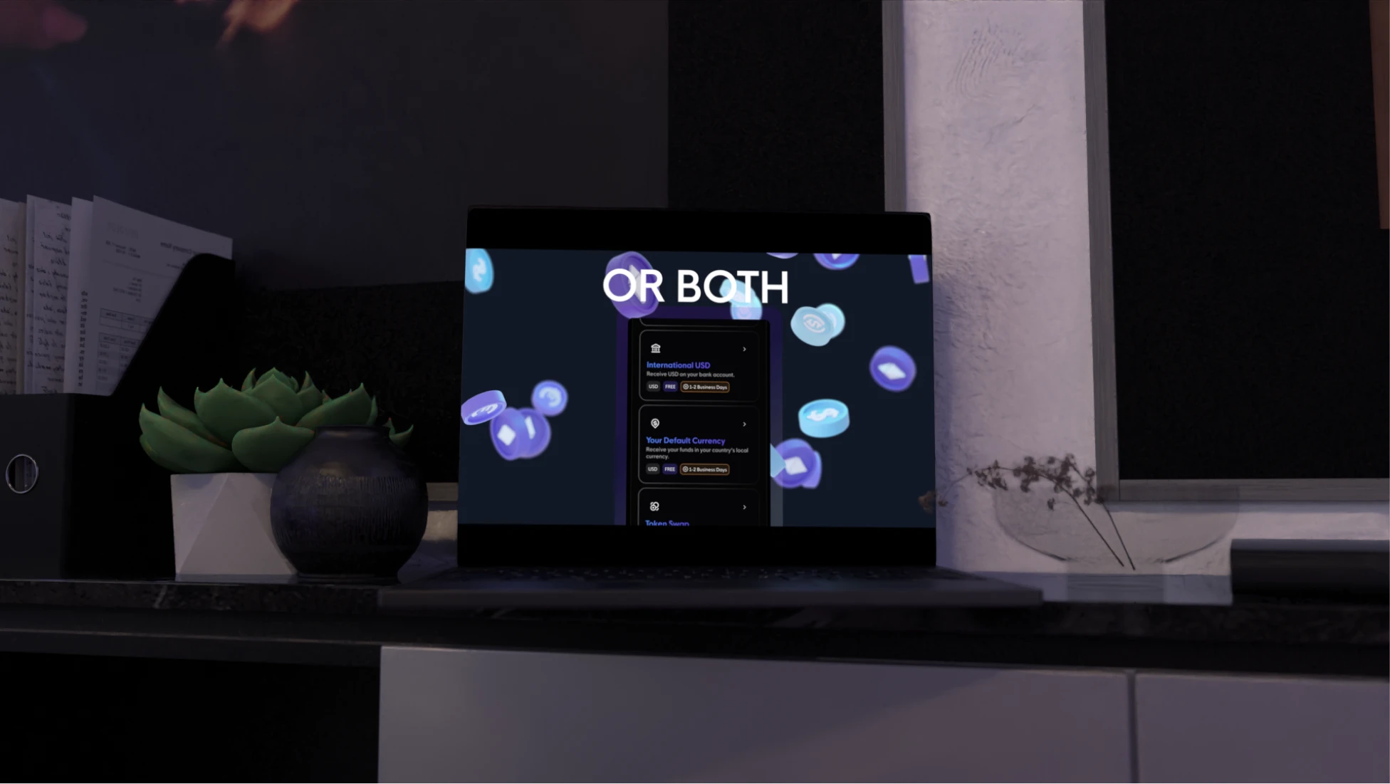
The development of glass effects, gradients, and 3D textures involved countless refinements. These elements needed to feel technologically advanced and visually rich while remaining subtle, lightweight, and unobtrusive across digital environments.
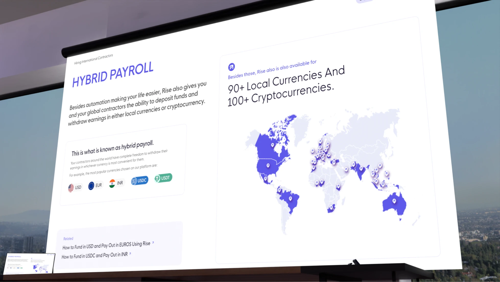
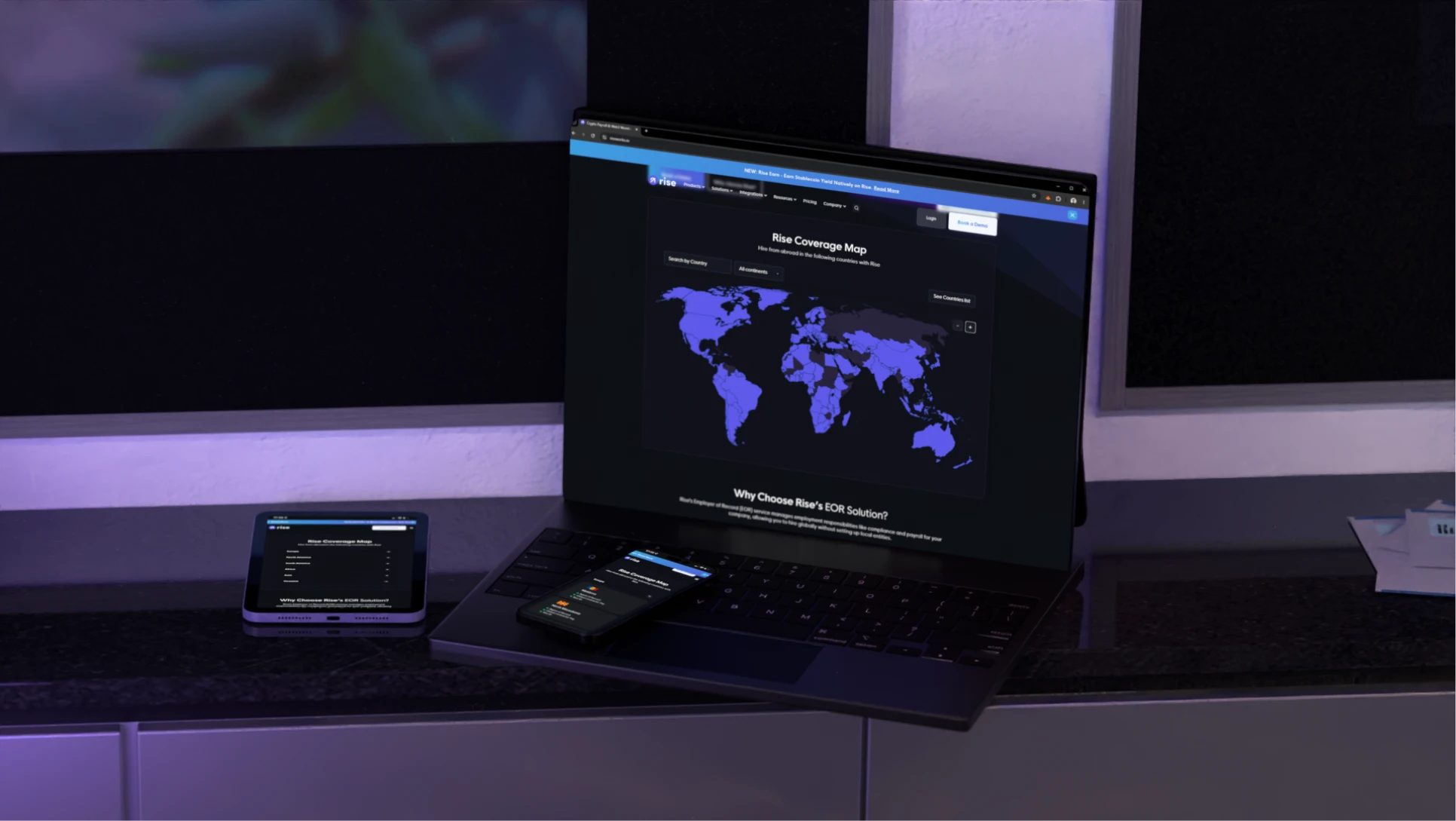
Representing the product for marketing posed a unique challenge. The team needed to balance functional app interfaces with more engaging marketing visuals, ensuring every screen, icon, and component felt both accurate and emotionally compelling.
Solutions tested

Glass morphism built around transparency

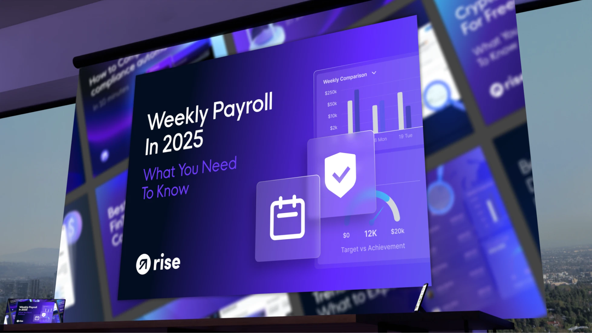
Glass-inspired surfaces introduced depth, layering, and sophistication throughout the identity, while also visually reinforcing one of Rise's core values: transparency. Extensive refinement helped the effect feel premium, subtle, and scalable across many applications.

Marketing icons connected to the product

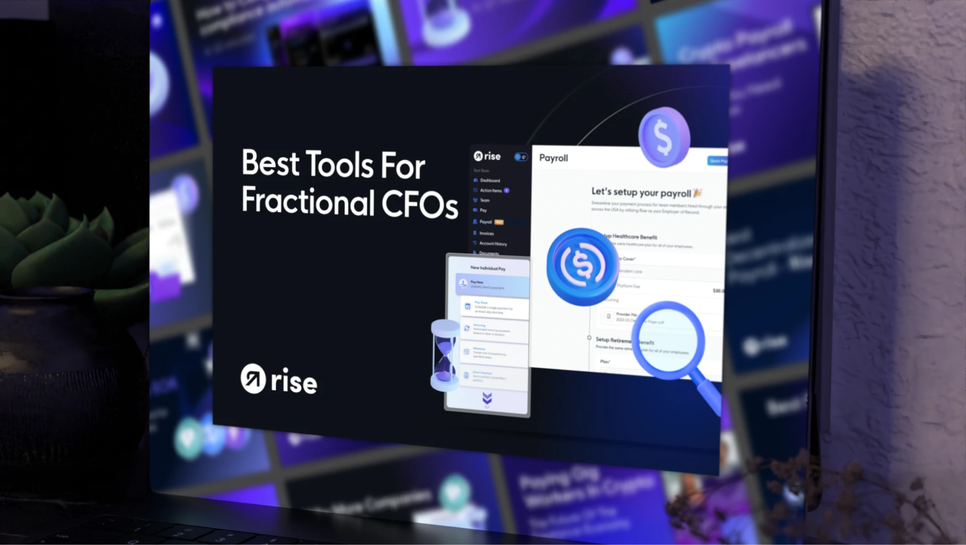
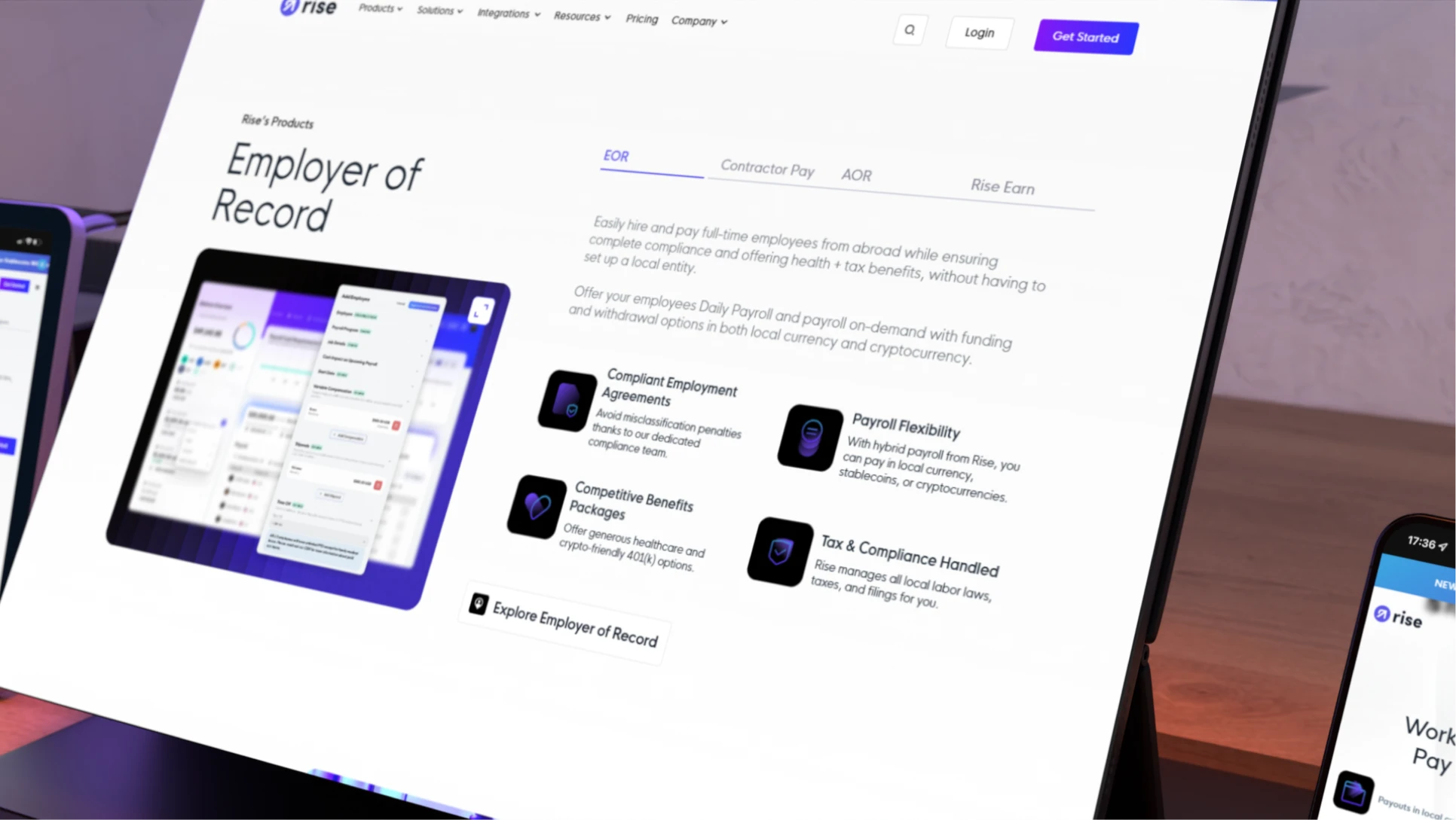
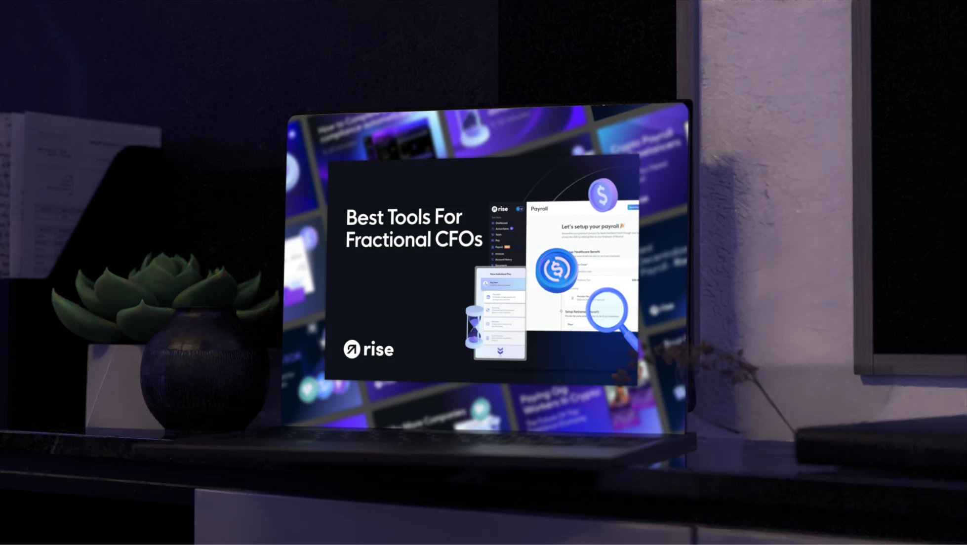
A dedicated icon system was developed using visual cues from the actual Rise product experience. These assets created a bridge between functional app interfaces and marketing communications, helping audiences immediately connect the brand story to the platform itself.

Organic gradients powered by the brand colors

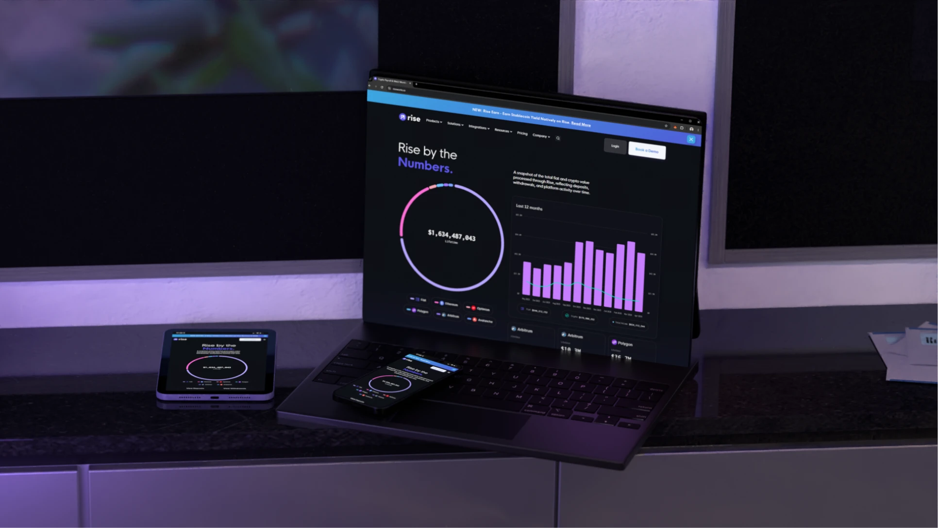
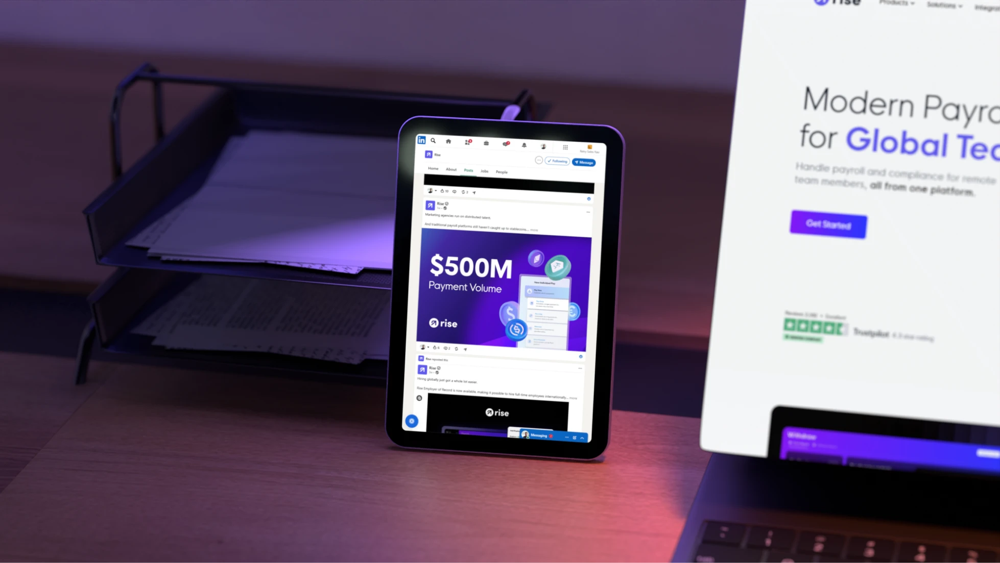
Rise's signature purple evolved into a broader gradient system capable of generating motion, energy, and visual depth. These abstract environments create a more future-facing atmosphere while preserving a strong connection to the company's established identity.

A complete system for the next chapter

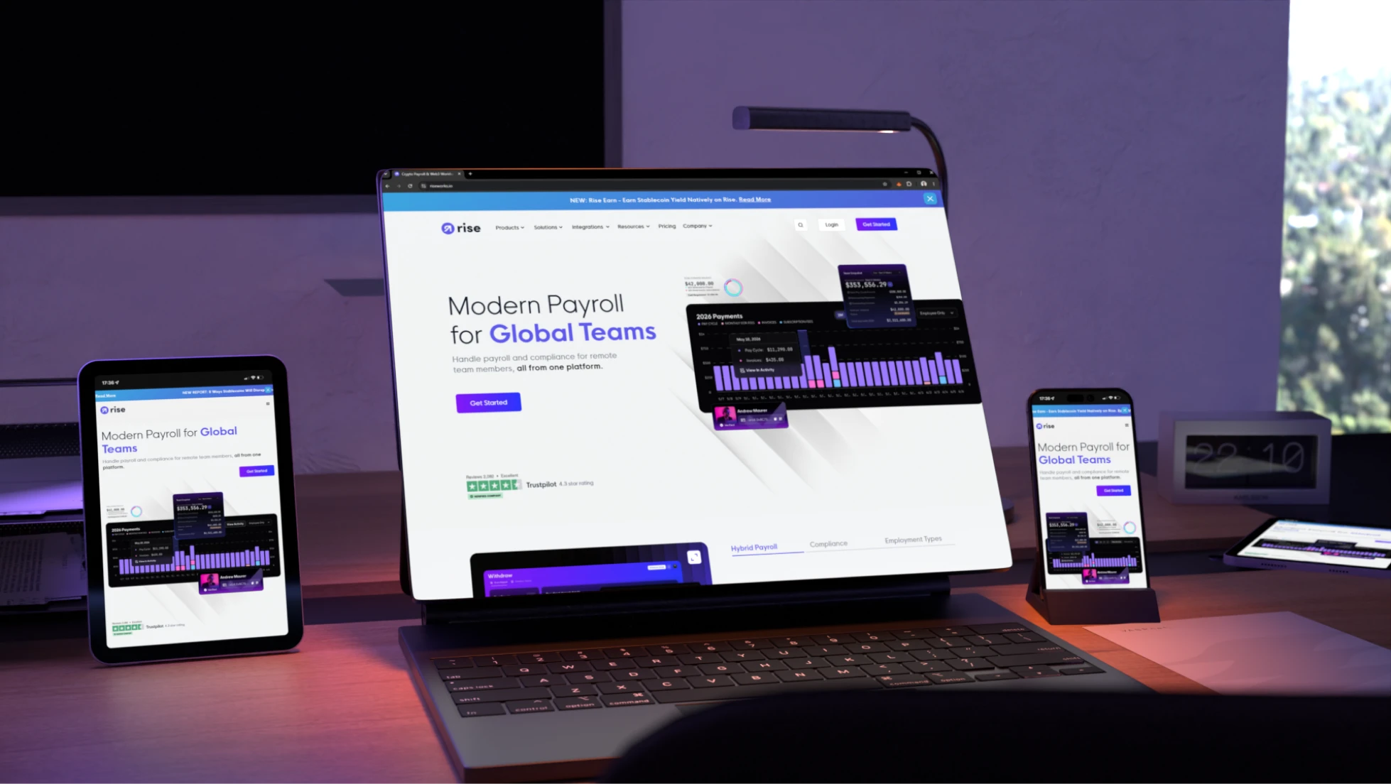
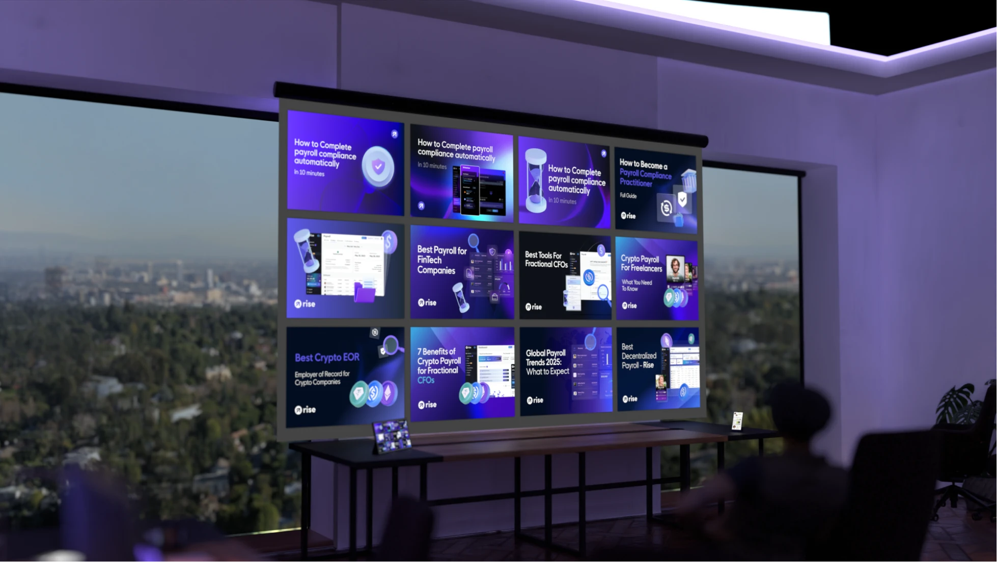
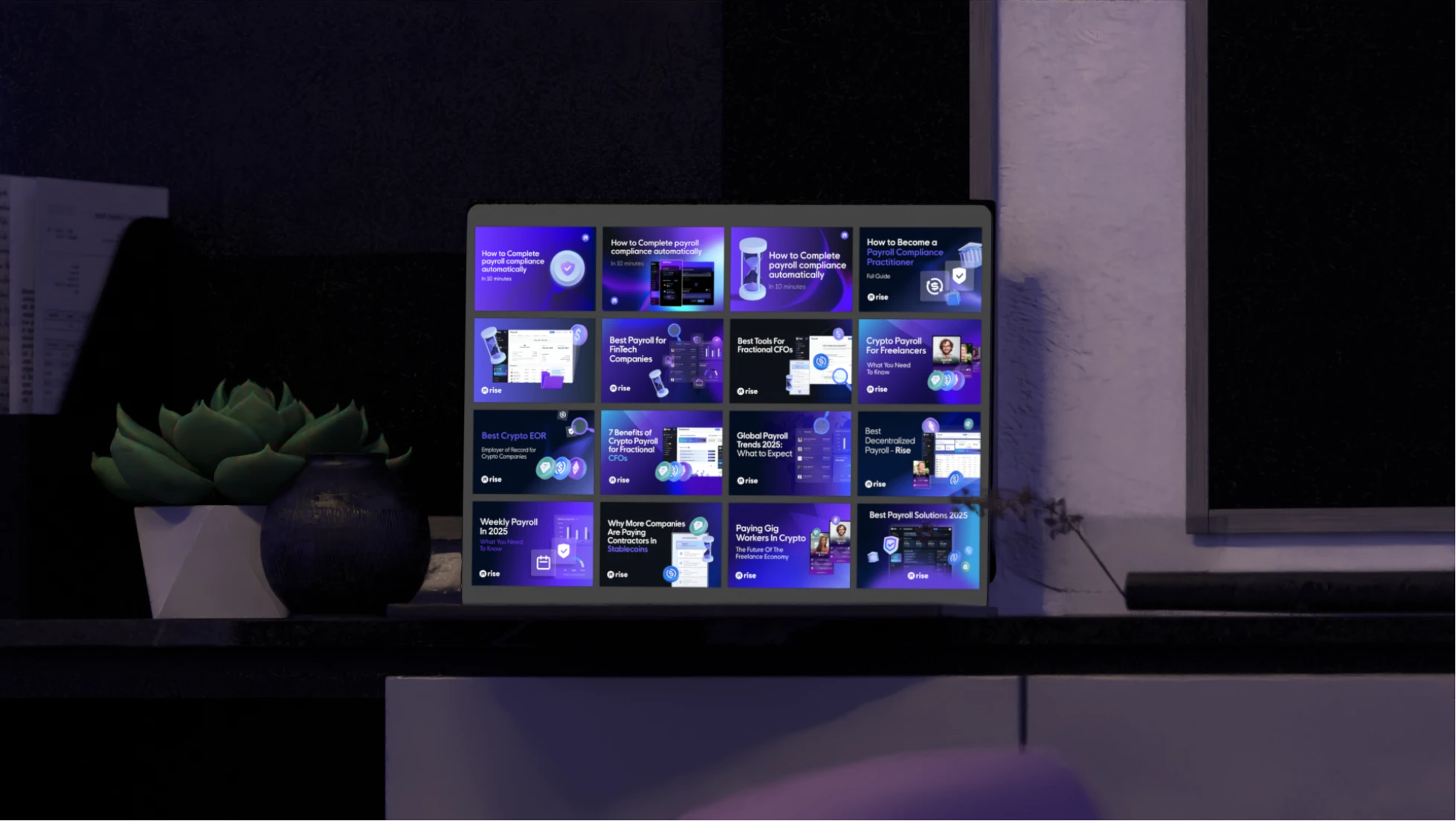
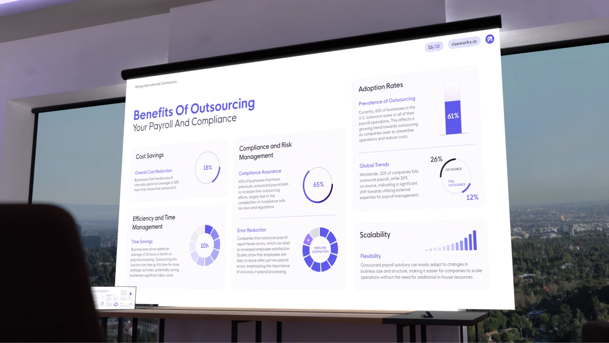
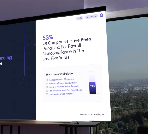
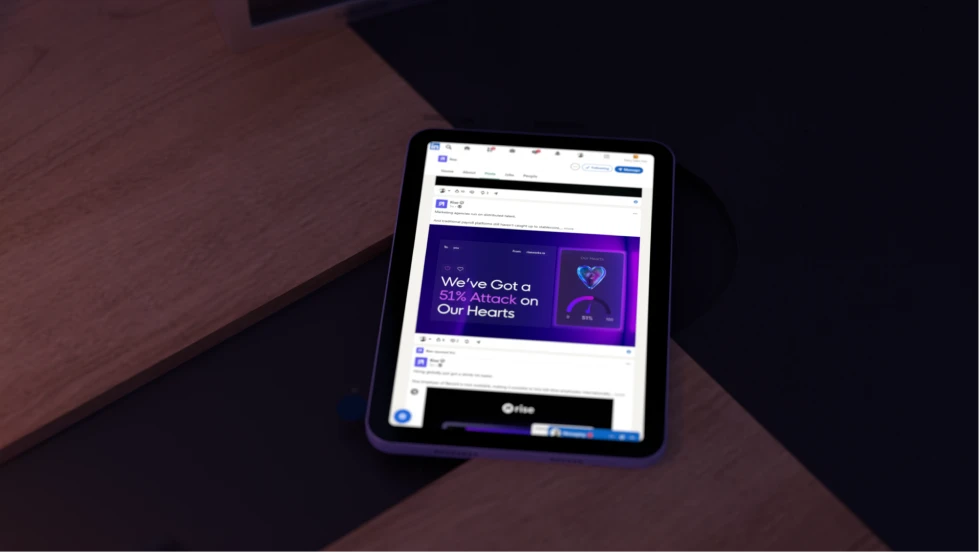
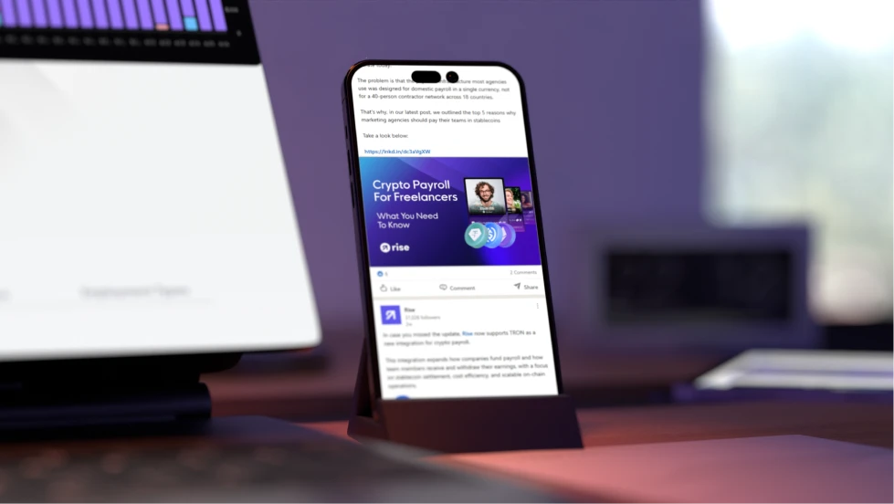
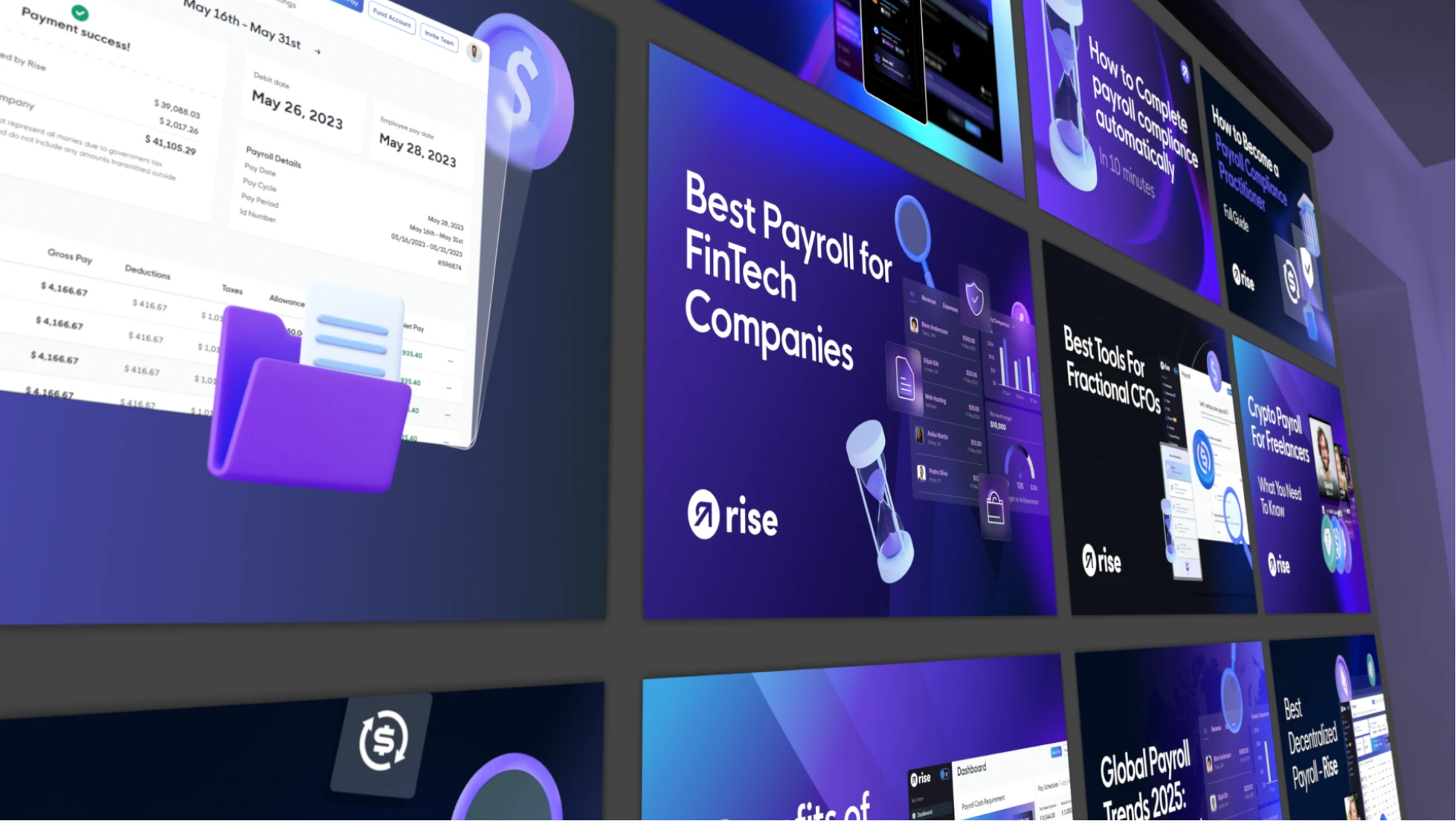
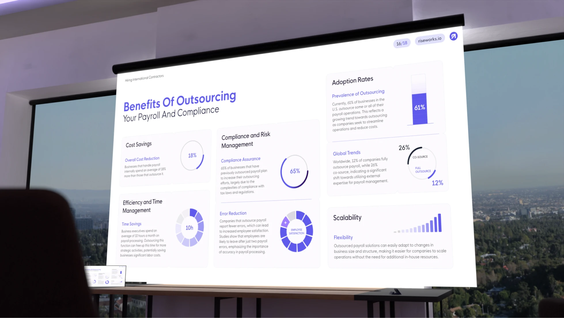
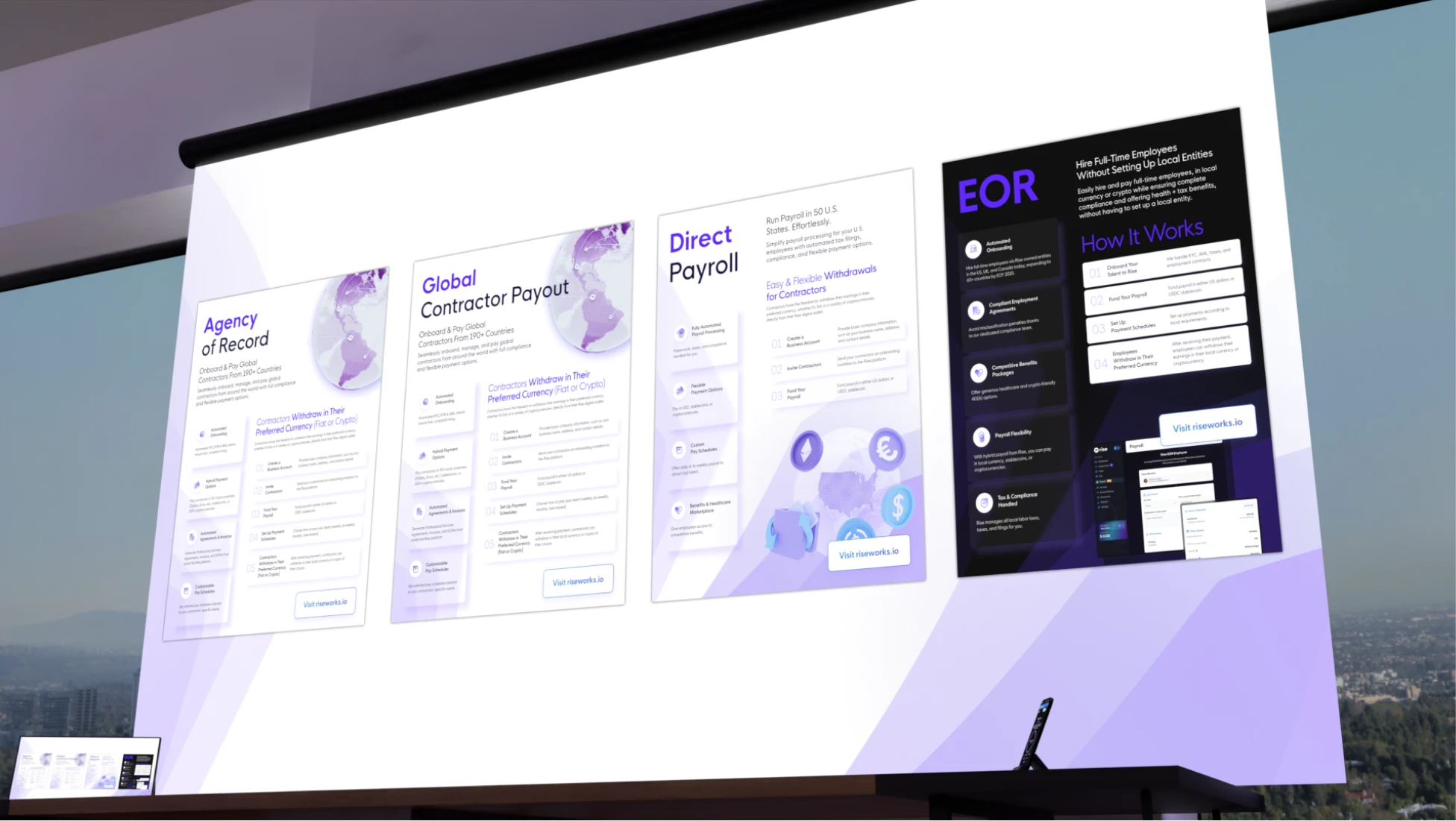
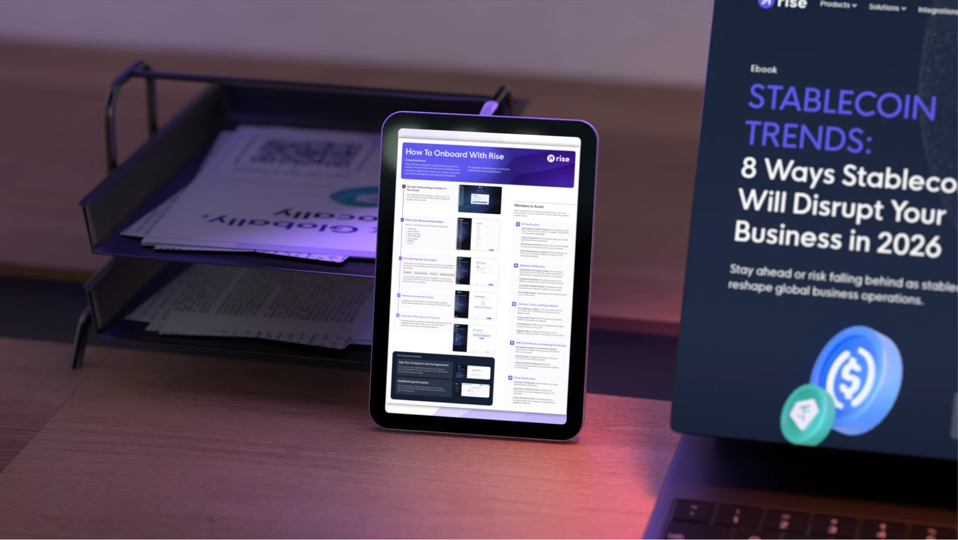
New structures and templates were designed to showcase features, products, app screens, campaigns, and social media content. Together they formed a cohesive identity system capable of supporting Rise's growth while remaining flexible across future releases.

Future-facing

The result gives Rise a renewed sense of ambition without abandoning the foundations that made the brand recognizable. The existing logo is now supported by a more advanced visual language built around glass morphism, organic gradients, refined 3D environments, and a scalable system of digital assets.
‍
A new bridge between product and marketing was established through custom icons, adapted interface elements, and carefully curated app representations, ensuring every touchpoint feels connected.

The result is innovative, expressive, and future-facing.
‍
What the client said

Project Outcome

Results

2060% Traffic Growth

Strategic positioning and messaging helped support growth from 35K to 756K monthly visitors, creating a stronger brand presence and greater market visibility.

From 35K to 756K Monthly Visitors

A clear brand foundation aligned marketing, content, and SEO efforts, helping scale traffic by more than 20x over the course of the engagement.

Stronger Brand, Bigger Clients

Refined brand perception and digital positioning helped attract larger clients, partnerships, and opportunities across multiple growth stages.

Trusted Growth Partner

By combining strategy and execution, we enabled the internal team to focus on key initiatives while confidently relying on consistent delivery.
Referrals
"Our team was able to move much faster, land bigger clients and partners"
Working with Trepa was always a pleasure, because their team is extremely proactive in all areas and are constantly suggesting new ways to improve, even if those tasks aren’t directly in their job description.Trepa understood our business objectives very well and their understanding of context allowed us to execute faster than expected. As a result of Trepa’s work, our team was able to move much faster, land bigger clients and partners, and focus on other high-priority projects while we knew Trepa was going to deliver exceptional results.

Austin Heaton
Head of Marketing at Rise


Related Work
Contact us

Are you looking for something similar?
Get in touch to discuss a solution for your project.
Let’s talk