Keep the motion growing

Client

Bounce

Services

Branding

Keep the motion growing

Client

Bounce

Services

Branding

Overview
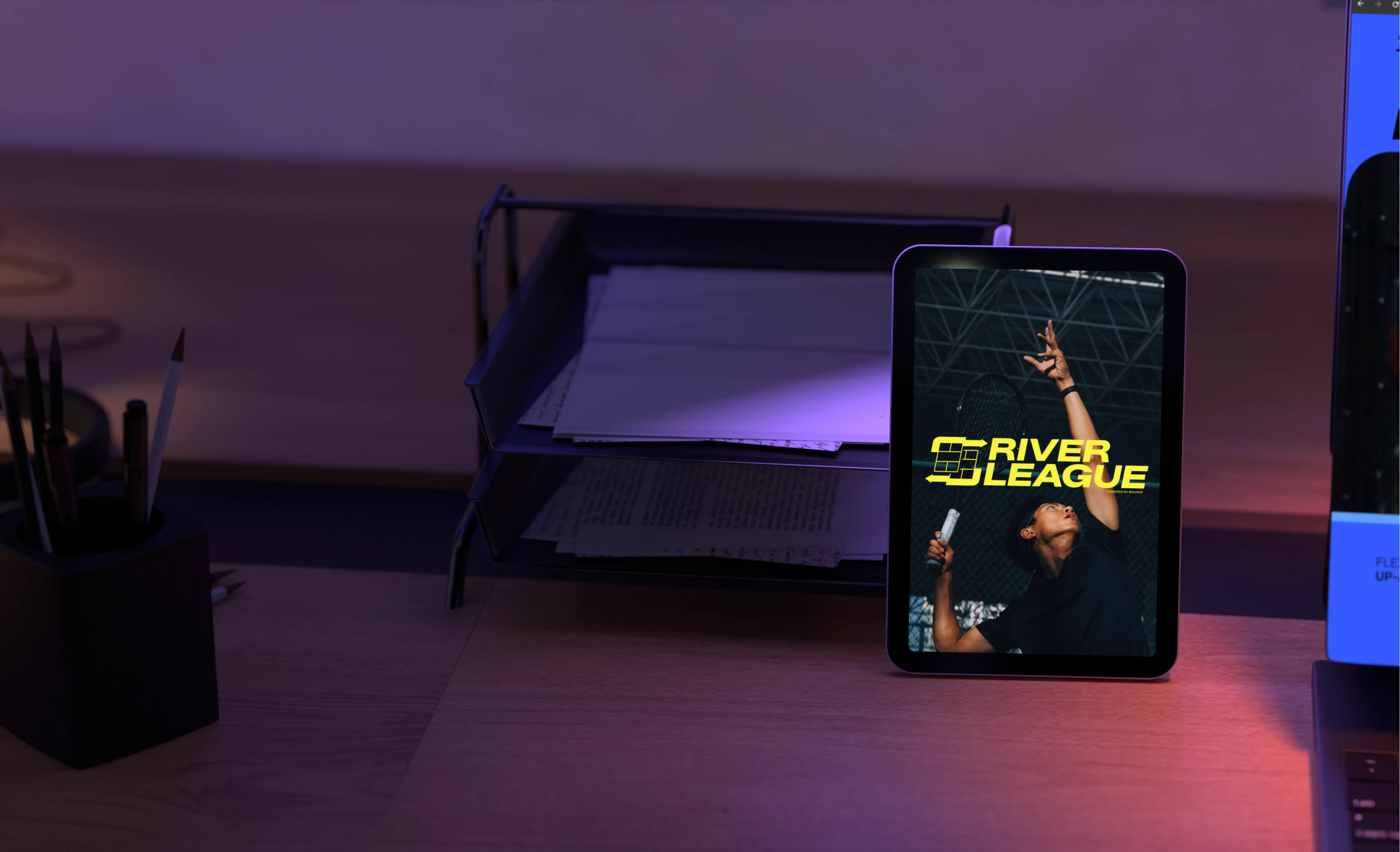
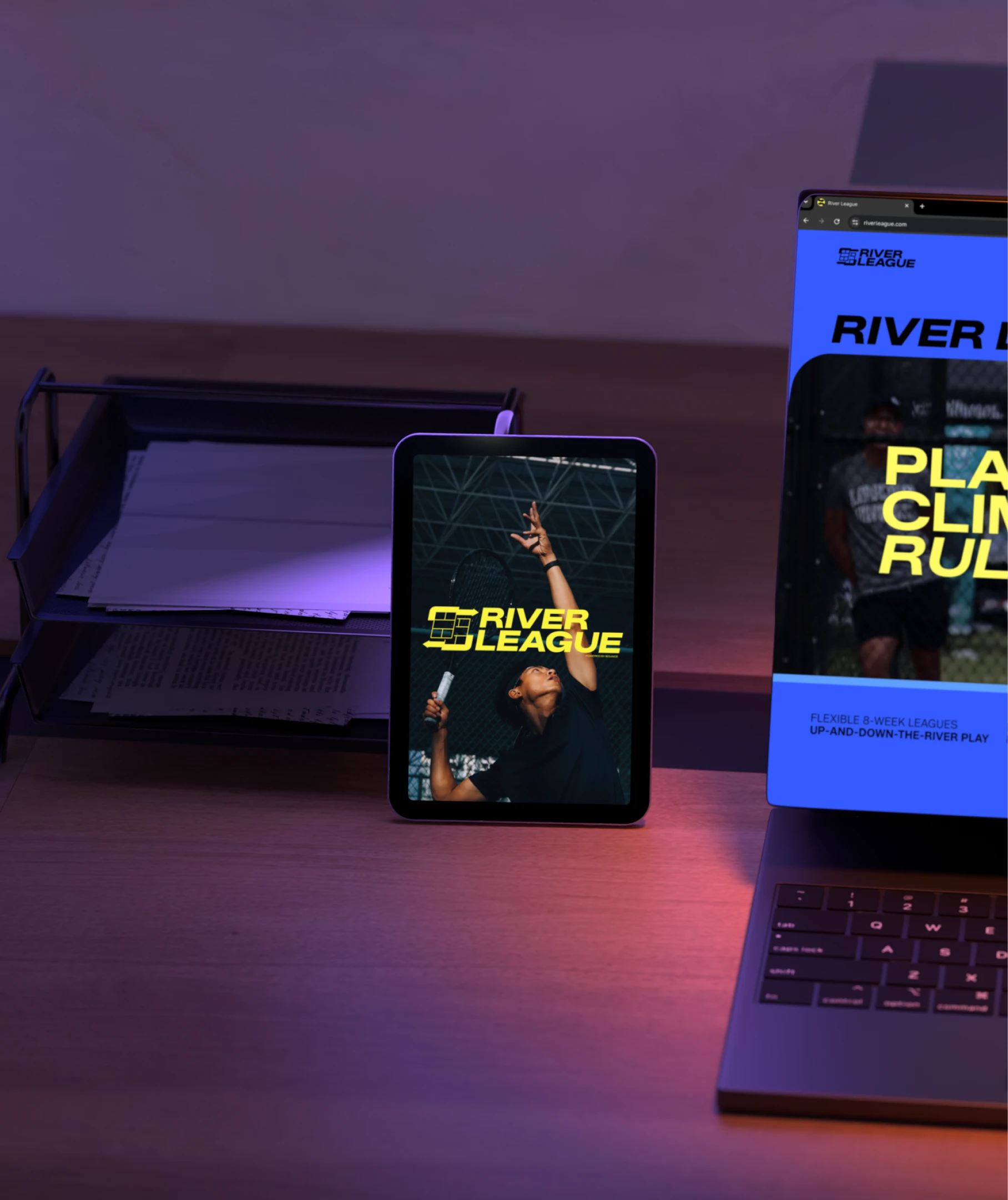
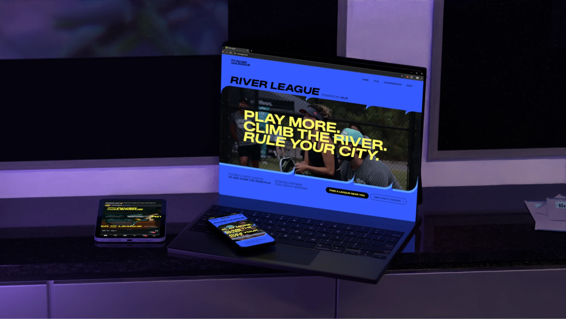
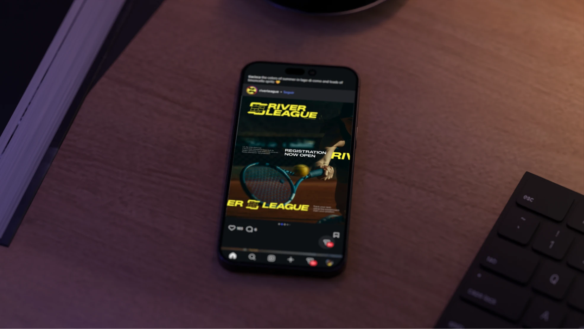
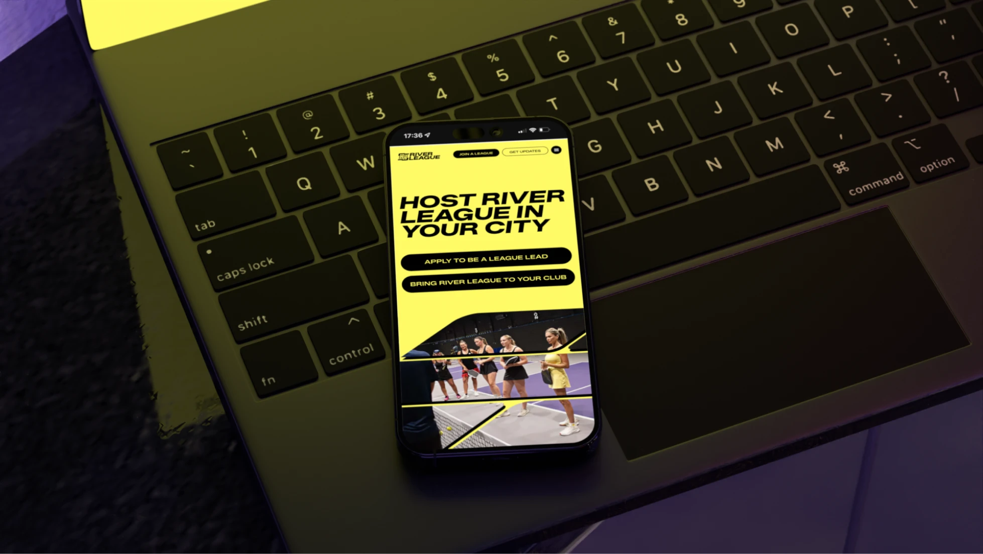
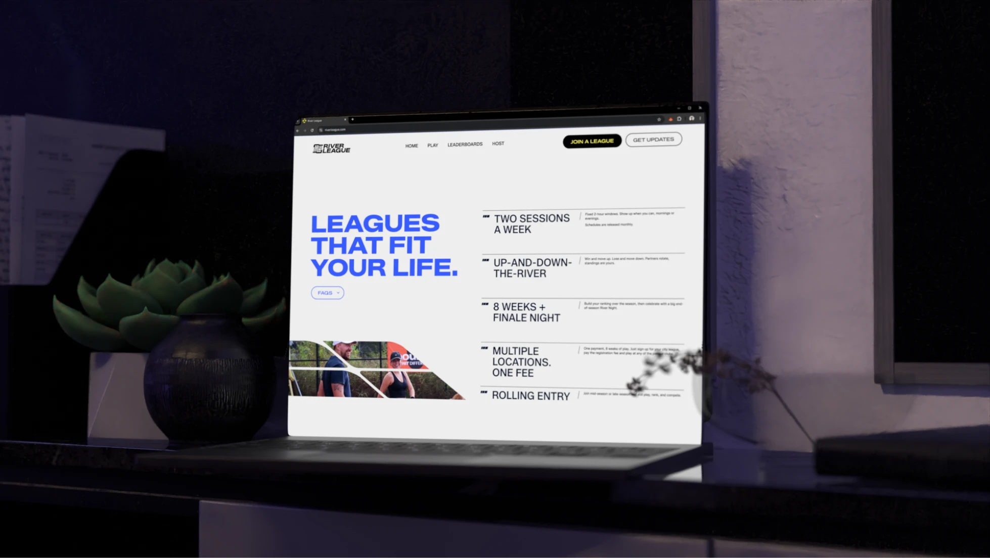
River League is a competitive, community-driven racket sports league, powered by Bounce, offering flexible 8-week seasons with rotating partners and an up-and-down-the-river ladder format. Trepa built a complete brand identity (logo, colors, typography) bold, electric, and always in motion, standing apart from typical racket sports branding.

Date
Feb 2026
Duration
1 to 3 months
Pricing range
3k to 5k

The plan

Timeline

Strategy

Grasped the concept, researched and defined key priorities

Drafting & Reviews

Drafted multiple options and styles to refine directions

Development

Refined the logo and designed the brand elements

Delivery & Support

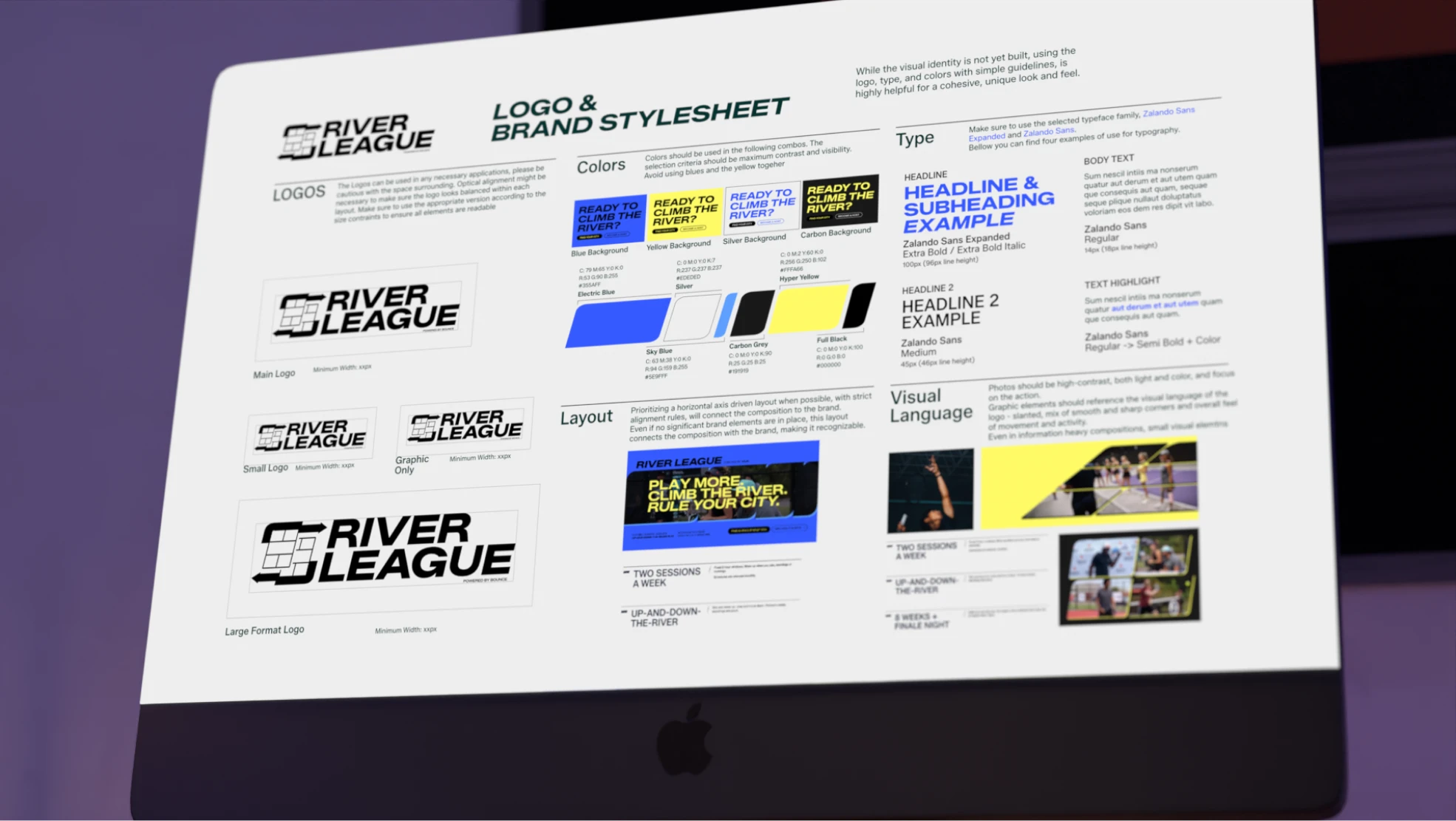
Delivered the full brand kit with an in-depth stylesheet

Pain points & solutions

The main challenge was representing River League's specific concept in a way that felt simple, iconic, and familiar, without being too literal or descriptive, which took multiple rounds to finally get right.
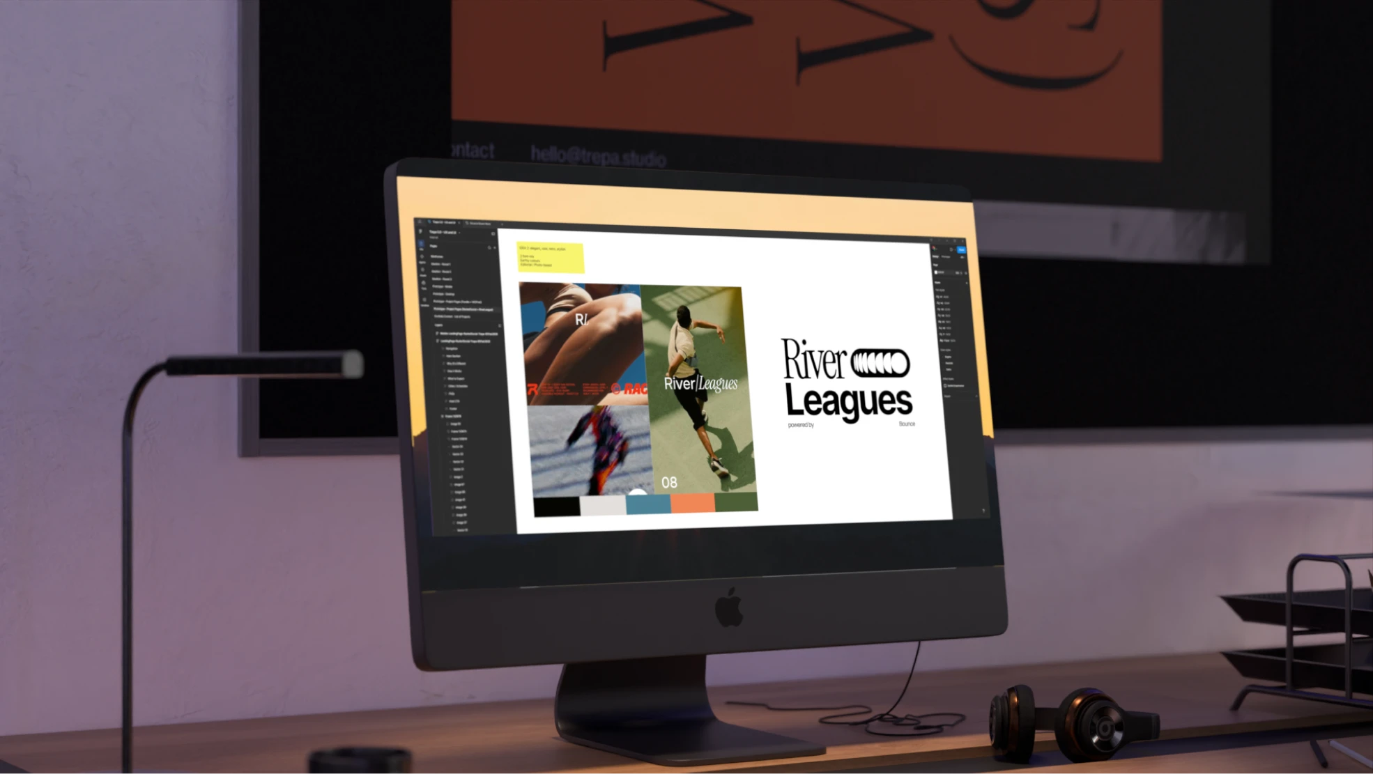
Early logo options leaned too classic and elegant, lacking the dynamic energy needed to properly represent the competitive, always-in-motion concept behind the entire River League brand and its fast-growing playing community.
Another direction felt too generic and failed to showcase the racket-sport foundation behind River League, while a third option, though abstract and motion-focused, lacked familiarity and used overly common industry colors.
Balancing familiar yet different was genuinely tricky, and combining motion, competition, and pickleball-court identity into a single icon was a high-intensity curation process across many rounds of iterative design work.
Solutions tested

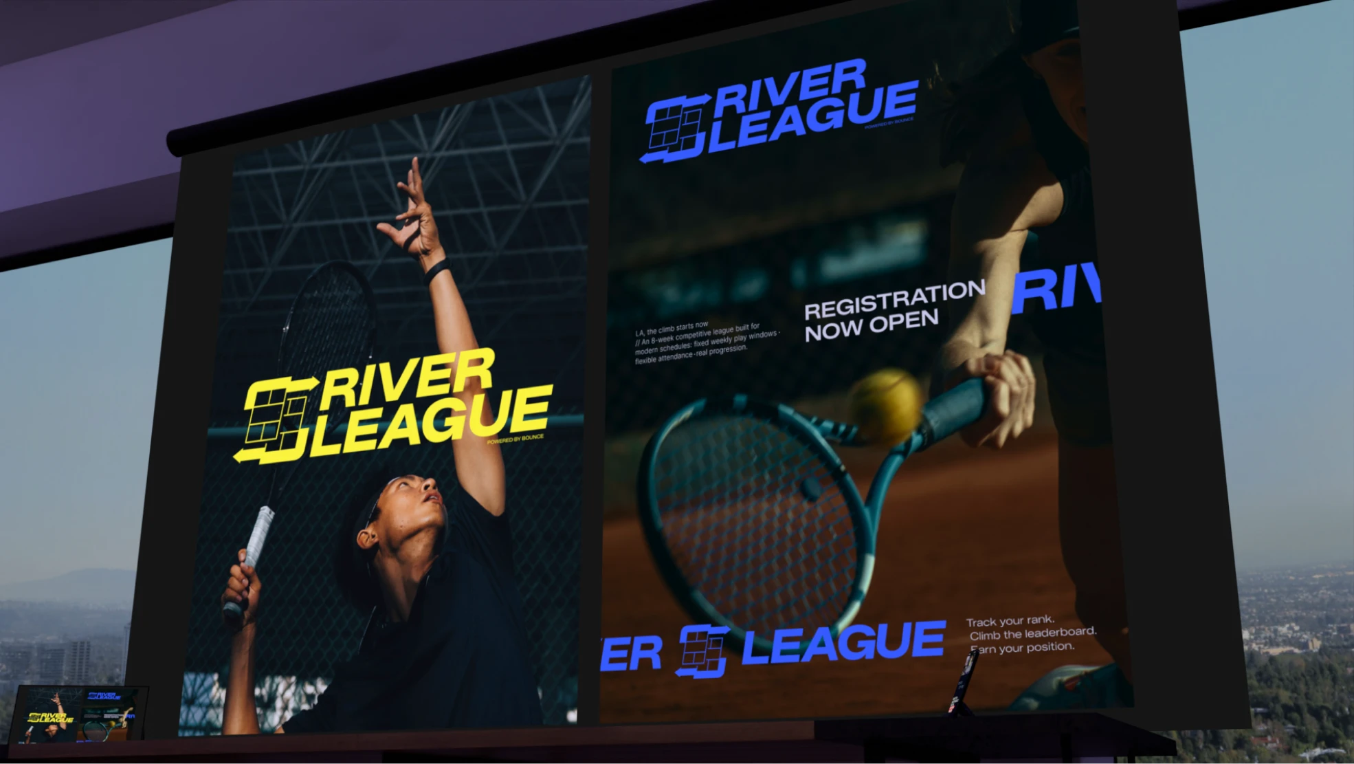
A true match: electric blue and hyper yellow

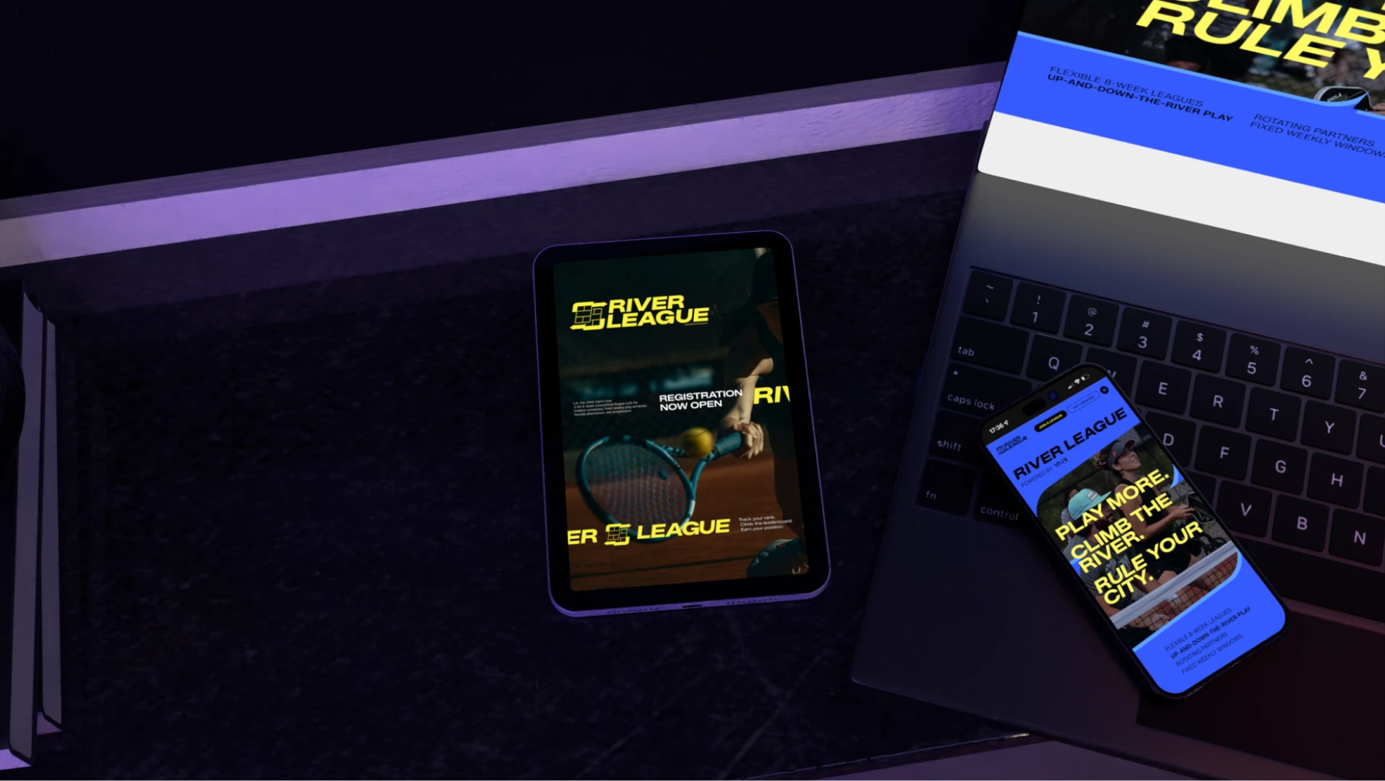
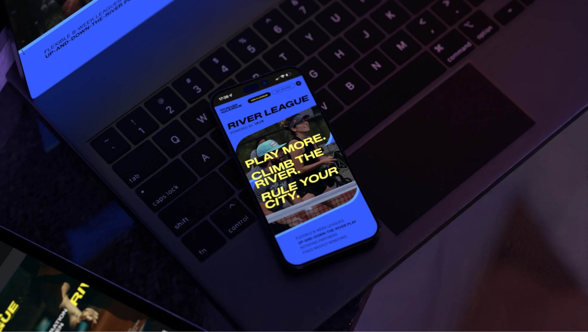
The palette moved away from the greens and oranges typical of racket sports, choosing instead a vibrant deep blue and a shiny, opposing yellow: two electric, high-energy colors that complement each other and bring real, standout energy to the entire field.

The always-in-motion icon

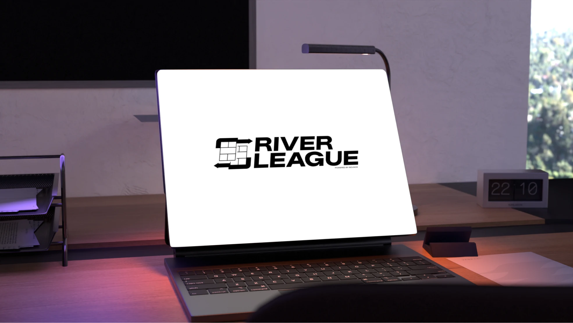
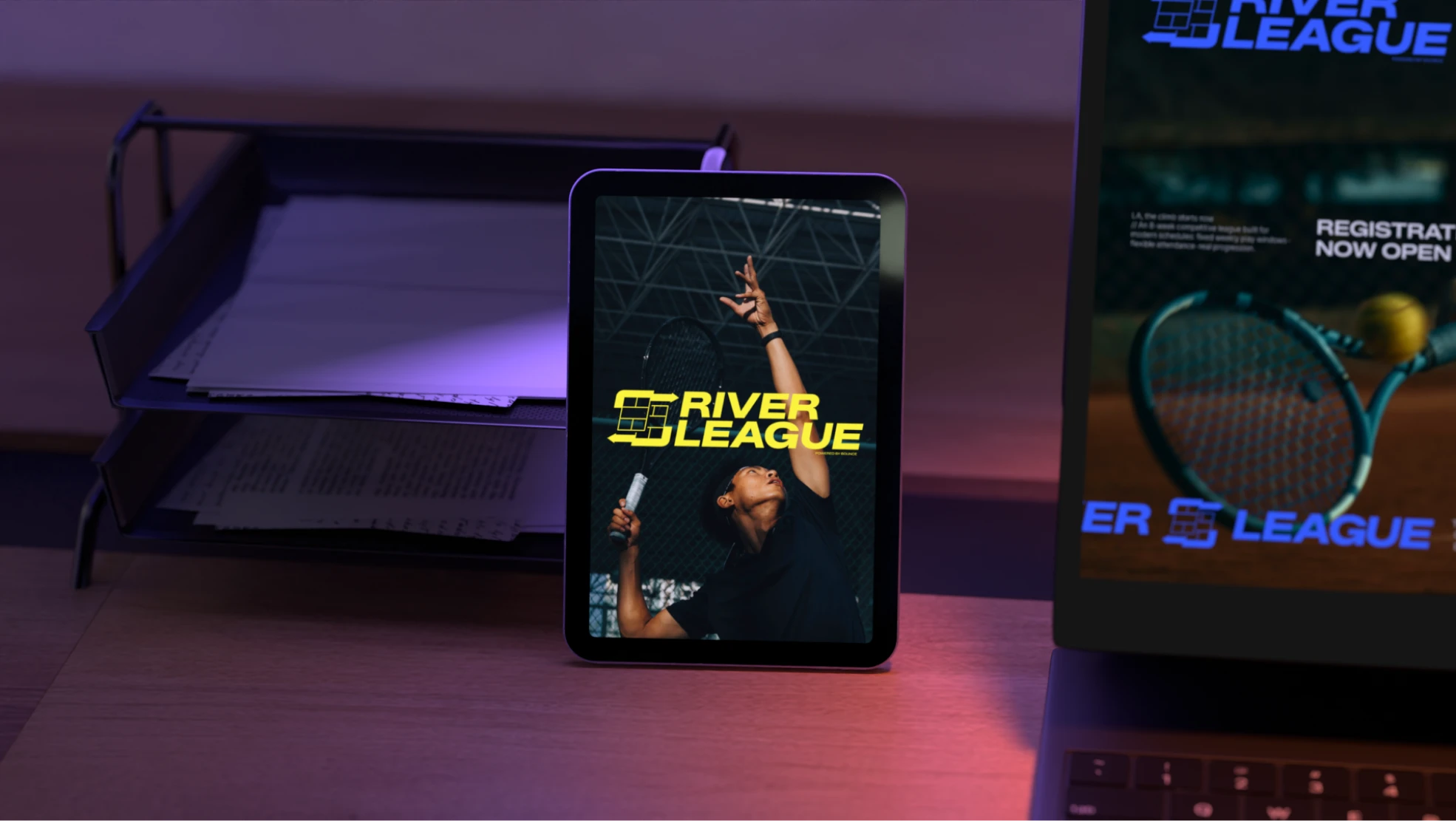
Inspired by refresh iconography, the final logo shows complementary playing fields always in motion, offering a familiar image of the courts themselves rather than a generic ball or racket, so the mark stands out while still staying recognizable and iconic.

Multiple iterations to tell the right story

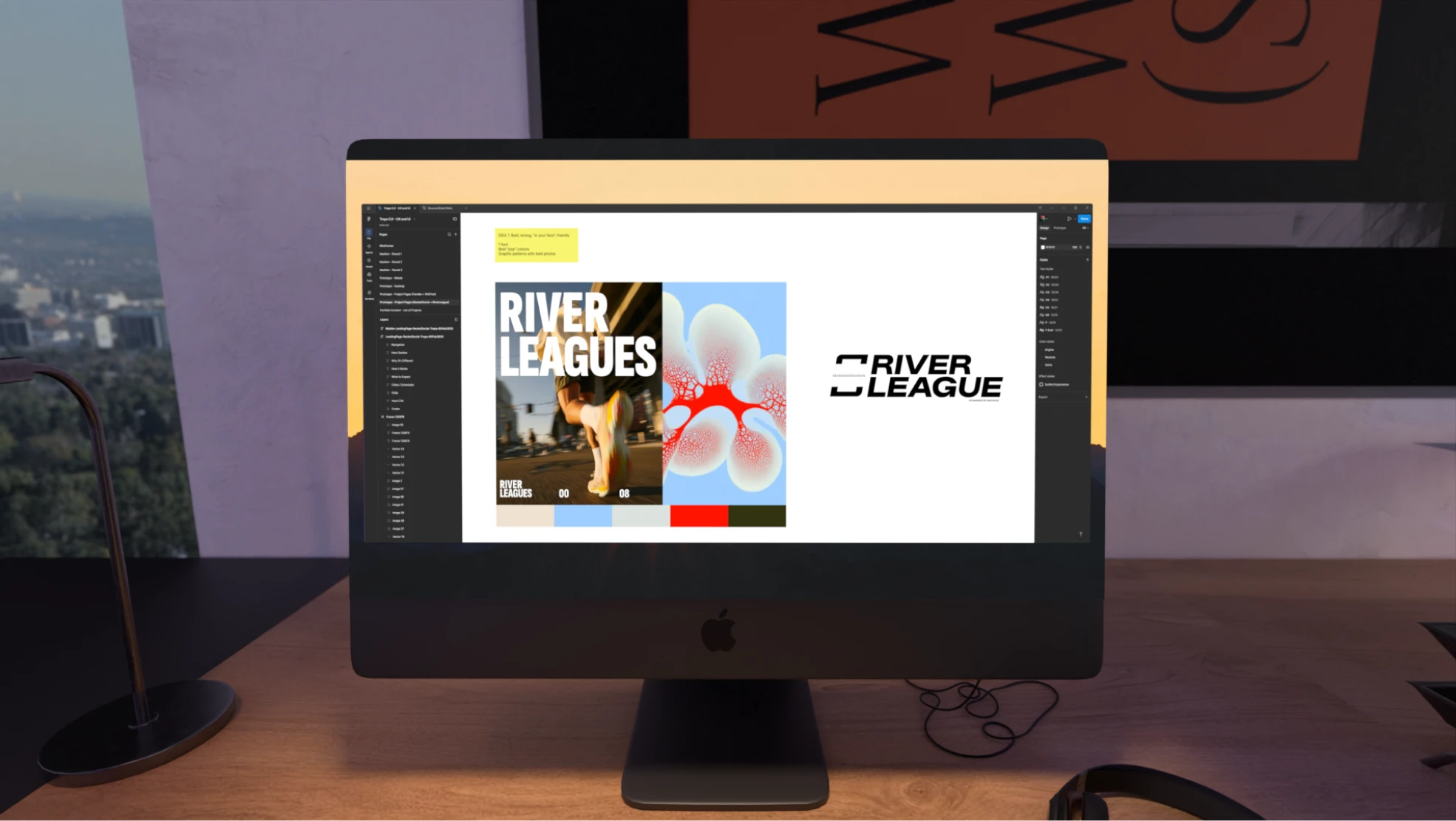
Iterating through several very different logo directions helped the team determine the best story to tell, drafting options that each represented one specific aspect of the concept until the strongest, most complete final solution was reached.

Bold typography

Strong, bold typography set in all caps was paired with the logo to create stability and a powerful, confident presence across every single brand touchpoint, matching the competitive, high-energy spirit of River League itself.

Always in motion

The final brand is bold, dynamic, and expansive, representing River League's core values of constant motion, competition, energy, and strength in every single detail, from logo to layout to language.

An electric blue and hyper yellow palette breaks away from the greens and oranges typical of racket-sport branding, a refresh-inspired icon captures the courts always in motion, and strong, all-caps typography gives the whole identity a stable, confident presence, one that stands apart from every other league brand out there, on and off the court.
‍
Related Work
Contact us

Are you looking for something similar?

Get in touch to discuss a solution for your project.
Let’s talk