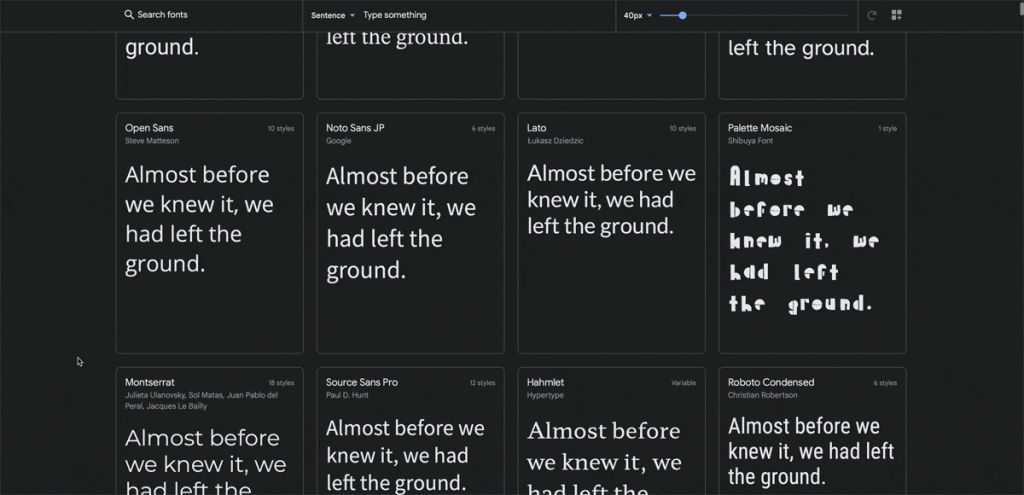
You have all these cool options and you just want to use them all… But after a few tries, it quickly becomes exhausting and none of the options feel right. And you end up wasting hours of your time, without any decision made. Sound familiar?
Full disclaimer… There’s no magic potion for this. However, as professional font pickers, we’re here to give you a few tips and tricks. Here’s what we’d like to cover today:
1. What to consider when choosing a font.
2. What are the types of fonts that exist.
3. How do we combine fonts.
4. Where can we find cool fonts. (free font options included)
The first thing to understand is that a font is a tool, just like a logo, a set of colours, a particular style of photography, and so on. Fonts communicate specific messages that serve a purpose.
If we’re talking about a brand, for example, you might want to communicate in a serious and neutral tone, and for that, you’d pick a certain type of font: perhaps more minimal, geometrical and one that almost fades in with the rest of the elements. But if you want to convey a loud and dynamic tone, maybe a quirky and more complex font would better serve your purpose.
So before choosing a font, ask yourself this:
1) Will your project be short-term or long-term
2) Who is your target audience?
3) What language do they speak?
4) Will you be using a lot of special characters like numbers?
5) What tone of voice do you want to convey?
The answer to these questions should help you filter some options already. But let’s see what are the options out there regarding types of fonts. Again, full disclaimer, these classifications vary from platform to platform. Here at Trepa we prefer to consider two main types: serif and sans-serif.
And from there we mess around with more complex ones (display, script, slab serif, variable, lettering…).
Typography is a subtle art… So the difference between the serif and sans-serif is… well, subtle. The main difference is in a small feature called “serif” that you can see in the image below.

And then you have all of these fun creations. The options are infinite…So our advice is: answer the questions above and create a “filter” that will narrow down your options until you have a top 3 or 4.

If you decide to have just one font, great. Nice and breezy. But there are other options. You can combine two sans-serif fonts / One serif and one sans-serif / One display and two sans-serif, and so on… For this, we recommend this free guide by Pangram Pangram, which will help you with some useful tips on how to make the perfect combination!
And last but not least, we want to share with you the places we go to find fonts!
For free!
Google fonts
Adobe fonts* (needs subscription)
Behance
Some paid options…
Pangram Pangram
Colophon foundry
Nova Type Foundry
Behance (it can have free or paid options)

